
9 Unexpected Fall Color Combinations to Welcome Autumn
- Evelyn Long

- Sep 30, 2025
- 6 min read
Updated: Jan 5
The air is cooler, the days are shorter and the trees are changing colors — autumn is almost here! One way to ensure your home is in tune with the season is to update its color scheme. Vibrant reds, oranges and yellows create that classic autumn feel, but if they’ve been your go-to theme for years, you might want to try something new. Here are unexpected fall color combinations that work.

1. Saffron Gold, Amber and Peacock Blue
Try a bold yet sophisticated combination. Instead of reds and browns, pair saffron gold and amber with stunning peacock blue. The deep, cool color balances the brightness of the orange and yellow, bringing a luxurious flair to the vibrant palette. Add a warm neutral color like peach cream to the mix to make these colors pop and prevent them from becoming overwhelming.
If you’re up for a long-term redesign, paint an entire room or feature wall rich peacock blue to establish the palette’s foundation. Then, paint an accent wall in saffron gold or amber. For a more seasonal update, mix and match throw pillows, curtains, and artwork with different combinations of the color scheme.

2. Burnt Umber, Olive and Amber Orange
Foliage colors steadily change from lush greens to rich autumn colors that people travel miles to see. Why not choose a color palette that captures the essence of that change?
Olive represents the start of the foliage’s transition, while amber orange and burnt umber show the end. Deep olive has a sense of earthy elegance that complements the richness of the other two. Add pastel olive to soften the intense hues.

3. Burnt Umber, Marigold and Mauve
Here’s another fall foliage-inspired palette. Besides yellows, oranges, browns and reds, some trees turn into purple and other wine-dark colors as the season progresses. Adding these dark shades to your usual red and orange palette can give it a fresh new look. Dark mauve brings depth and sophistication to the mix. To balance out the intensity of the other colors, add a lighter shade like rosy brown.

4. Moss Green and Burnt Orange
For a color scheme with an earthy vibe, moss green and burnt orange are great picks. You’ll find these colors in most fall landscapes. Moss green is calming, which creates a relaxing environment when used a lot in a space. Add burnt orange for playful pops of color. Using two shades of moss provides a solid foundation for the more vibrant orange.
Determine where you want to see this palette in your home. Moss green bedding can set a restful ambience for the bedroom. Add burnt orange accent pillows for contrast. For the kitchen, consider olive green cabinets offsetting burnt orange countertop accessories, cookware or bar stools.

5. Ochre, Olive and Tobacco Brown
No autumn is complete without pumpkins. Some people welcome the season with a pumpkin spice latte, while others decorate their homes with gourds of all shapes and sizes. If you fall in the latter category and would like to take the theme further, this pumpkin-inspired color scheme is for you.
Combining ochre, olive and tobacco brown produces a warm palette with deep undertones reminiscent of the season. Olive offers depth and tobacco is soothing, which balances ochre’s vitality.

6. Sage, Mushroom and Ivory Beige
If you want to go all in and paint your home for fall, choose a neutral color scheme. This will make it easier to coordinate colors when you furnish and decorate. Sage, mushroom and ivory beige are neutral fall colors that also look great with the other, more vibrant autumnal hues.
These colors also look good in and out of the house. If you want to use this palette for your home’s exterior, first determine the field color, which is the main color that covers the most surface area, then choose which colors will be the trim and accent shades.
For example, you could use ivory beige on your home’s siding and garage for the field color and incorporate sage and mushroom as accent shades on your front door, shutters, or porch decorations.
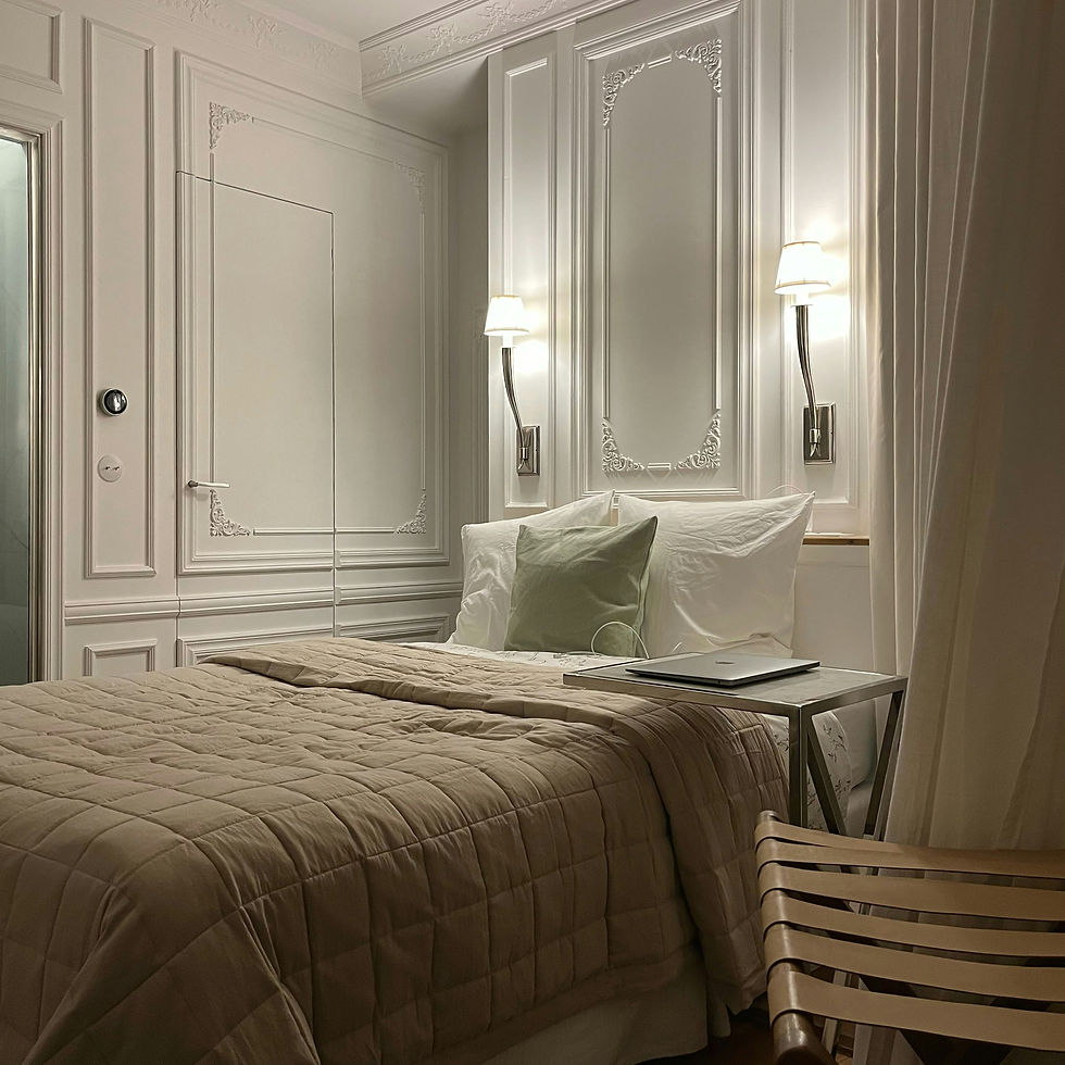
7. Brown, Taupe and Beige
Here’s another color scheme that’s perfect for those looking to paint their home to welcome the season. Brown, taupe and beige create a monochromatic palette. It’s not boring, as the different shades provide depth and dimension, especially when layered.
These earthy colors are deeply connected to nature. They’re in the rich browns of the trees, soil and harvested fields. Using this palette as your home scheme can make the space feel calm and inviting. It also offers a clean backdrop for colorful furnishings and fall decor.

8. Earthy Browns, Kelp and Peach Cream
Some retro color schemes are also great fall palettes. Earth brown, kelp and peach cream complement each other. Add bright birch brown to the mix, and the lineup is ready for the cozy season. The bold color brings life to the muted color scheme. If you want a more verdant green, Lithuanian forest green is a great alternative to kelp.

9. Navy Blue, Camel and Pastel Amber
Blue is seldom used in fall color schemes, so adding it to yours will add something unique to your design. Navy brings elegance to the earthy tones of clay brown and pastel amber. It also darkens the space, which can make it feel tranquil. If you want to brighten this combination, add bright accents in amber or burnt orange.

Tips for Making Your Own Fall Color Combinations
There’s no hard rule when it comes to decorating or painting your home for fall, so if these color ideas inspired you to make your own palette, go for it. Here are some things to keep in mind when you create autumn color schemes:
Note what you liked best in these color schemes. They will be a great starting point for your research.
Stick to one color resource. The Internet has different ideas of what purple looks like. To make sure you’re consistent, rely on The Official Register of Color Names when looking for colors.
Keep swatches. If you’re researching online, save images of your picks for quick reference. You can keep them in a folder set to large image icons.
Write down the color codes. It will help you find specific shades faster.
Review color psychology. Colors evoke different emotions both alone and in combinations, so pick ones that convey what you want to feel throughout the season.
How to Implement These Fall Colors in Your Home
Once you have a color palette, it’s time to use it to turn your home into an autumn retreat. Here are some tips to maximize your color scheme.
Follow Color Proportion Rules
Having a plan for how much to use each color in your palette will help you create a cohesive look inside and out. If your scheme has three colors, the 60-30-10 rule is a great guide. It involves picking a dominant color to use for 60% of your design, a secondary color for 30% and an accent color for the remaining 10%.
Consider the fifth color scheme as an example:
Tobacco brown can be the dominant color, so it could be the color of the walls or big furnishings.
Olive can be the secondary color. It can be on the curtains, rugs and other smaller furniture.
Ochre is the accent color. You could include it in cushions, throw blankets and other decorative objects.
If your color scheme has more than three elements, you can have multiple secondary or accent colors. On the other hand, if you only have two, it’s best to follow the 80/20 rule. Blend 80% of one color with 20% of a complementary color for visual impact.

Consider How Lighting Affects the Color
When it comes to interior design, different light sources and temperatures can change a color’s intensity and saturation. Here are some examples:
Natural light affects colors differently throughout the day and depending on the room.
Incandescent lights have a yellow tint that enhances warm colors and dilutes cool colors.
Fluorescent lights are bluish, making cool colors look more vivid and warm colors look washed out.
Make sure your lighting complements your fall color scheme. Consider getting neutral or daylight-balanced bulbs to avoid alterations. You can also layer your lighting instead of relying on one big fixture. Use several lamps, sconces and ceiling fixtures to illuminate the room from different areas and prevent shadows.
Get Creative With Your Color Combinations
Do you prefer layering vibrant golds with bold jewel tones? Or would you rather spend fall in rooms with soft neutrals and earthy accents? Mix and match different colors to create a space that captures your unique autumn vibes. As long as you’re happy with how it turned out, you can use any color scheme to celebrate the season.


