Beige Interiors Are Everywhere – Make Yours Less Latte
- Marieke Rijksen

- Jun 16, 2025
- 4 min read
Updated: Mar 23
There’s a fine line between serene and snooze-worthy – here’s how to avoid blending into the beige background.
Ah, beige.
Reliable, calming, inoffensive beige. It’s taken over Instagram, Pinterest, and every self-respecting lifestyle reel involving a ripple glass vase and a linen throw. And look – I get it.
Beige is timeless. It’s warm. It plays well with others. But there’s a fine line between serene and snooze-worthy, and far too many beige interiors are leaning dangerously towards the latter.
So if your space is starting to resemble an oat milk advert or a barely-there Pinterest board called “neutral vibes,” it might be time to give your beige a bit more… character.
Let’s talk about how.

1. Beige Is a Base, Not the Whole Story
Beige should be the canvas, not the entire painting. The key to keeping it interesting? Depth. Layer tones that shift just enough – think greige, taupe, mushroom, warm ivory, even soft camel. These subtle shifts stop a space from feeling one-note.
Practical tip:
Use a mix of fabrics and finishes in close but not identical tones. Try pairing a linen sofa in warm beige with a rug in mushroom, and walls in a slightly cooler greige. It’s all about visual movement within a tight palette.
Design note:
Keep undertones consistent – mixing cool and warm beige tones can work, but be intentional. Clashing undertones are the fastest way to create a space that feels "almost right."

2. Texture Is Essential (Seriously)
Texture is what gives neutral spaces life. Without it, everything flattens. With it, beige becomes dimensional, cosy, and rich.
Practical tip:
Combine three or more distinct textures in every space: for example, boucle upholstery, raw wood, and soft wool. Add ceramics with a matte finish, woven baskets, or ribbed glass accents to further elevate things.
Extra idea:
Use contrasting sheens – mix matte clay with glossy glaze, smooth leather with nubby linen. Light will bounce differently, giving your beige room an ever-changing quality throughout the day.

3. Play with Form and Scale
Muted colours let form do the talking. Use that to your advantage. Sculptural pieces add impact, especially when the colour doesn’t shout.
Practical tip:
Incorporate curved sofas, oversized lamps, arched mirrors or irregular coffee tables. Vary the heights of key elements to create visual rhythm.
Try this:
Use oversized items in small spaces and vice versa. A chunky side table next to a delicate cane chair creates visual tension that keeps the eye moving.

4. Add Contrast (Yes, Even in a Neutral Room)
Beige needs contrast to avoid becoming beige soup. Think of it as adding punctuation.
Practical tip:
Use black or dark brown in small doses – lamp bases, picture frames, door hardware. Or go for grounding tones like olive green, rust, or walnut. Even a charcoal linen cushion can stop the palette from drifting.
Quick fix:
A black-framed mirror or a dark-toned artwork can instantly ground a room and balance the visual softness of beige.

5. Avoid the Beige-on-Beige Clichés
You know the look: ripple glass, pampas grass, beige boucle chair, plinth table. We’ve seen it. Everywhere. And while there’s nothing wrong with any of those pieces, when they’re all together, your space risks becoming a copy-paste of the Instagram algorithm.
Practical tip:
Choose one or two of-the-moment items, and balance them with vintage or unexpected pieces. Think: a classic wooden bench next to a modern boucle armchair, or a sculptural vase atop a distressed sideboard.
Styling idea:
Add one “off” item that slightly disrupts the palette – a deep green velvet footstool, a framed vintage item, or a playful ceramic object. It keeps things human.

6. Personalise With Art and Objects
Beige works best when it supports, not suppresses, your story. Personality is what gives neutral rooms soul.
Practical tip:
Go big with artwork – large-scale pieces in muted tones still create drama. Style with books you actually read, objects you've collected, or family heirlooms that balance the softness with a sense of identity.
Pro tip:
Let your art dictate your accent palette. Even in a room that’s 90% neutral, pulling a tone from a painting or photograph and repeating it elsewhere can tie everything together beautifully.

7. Use Lighting to Bring It to Life
In neutral spaces, lighting makes or breaks the mood. Layering light adds both warmth and shape.
Practical tip:
Use a mix of sources – ceiling lights, floor lamps, wall sconces, candles. Look for warm light temperatures (2700K is ideal), and play with shadow to add depth to pale walls and materials.
Design insight:
Accent lighting across textured surfaces (like panelling, limewash or fabric) adds richness and subtle drama without colour. Light can become your statement.

8. Don’t Be Afraid of (Muted) Colour
Yes, you can absolutely keep a calm, neutral vibe and still play with colour – you just need to pick the right ones. Think soft, earthy tones that sit comfortably next to beige without overpowering it.
Practical tip:
Try muted sage, terracotta, dusky rose, ochre, stormy blue or even soft aubergine. These colours add life and warmth without disrupting the tranquil feel. Use them in cushions, ceramics, wall art or even an accent chair.
Style note:
The more saturated the tone, the smaller the dose. Think of it like spice in cooking – a little can go a long way.

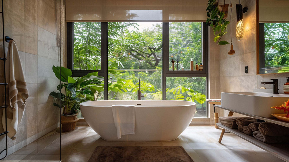
9. Don’t Underestimate the Power of Plants
Greenery and natural foliage are the unsung heroes of beige interiors. They instantly inject freshness, movement and a sense of life into a soft-toned space.
Practical tip:
Add a mix of heights and textures – a tall fiddle leaf fig, trailing pothos, or sculptural olive tree all work beautifully. Dried stems like eucalyptus or lunaria also add texture without introducing bold colour.
Pro move:
Use rustic or ceramic planters in natural finishes to blend with your palette. Avoid overly polished or bright-coloured pots unless you're using them deliberately as contrast.

Final Thoughts: Beige, But Make It Yours
Beige isn’t the problem. Done well, it’s calm, grounded, and quietly luxurious. But it does need contrast, texture, scale and – most of all – a bit of you. Don’t be afraid to mix eras, experiment with scale, or throw in something unexpected.
So yes, love your latte palette. Just don’t forget to add the espresso shot.