
Why A Material Board Tells You More Than Your Phone Ever Will

Zooming in rarely helps.
If anything, it usually makes things worse. By the time you've enlarged a fabric until the weave fills your entire screen and compared it with six screenshots taken under completely different lighting conditions, you've drifted a long way from the thing you're actually trying to buy. Reading another twenty reviews doesn't necessarily make the decision any easier, either. Somewhere along the way, it's easy to mistake familiarity for certainty.
The frustrating part is that none of this is anybody's fault. Manufacturers are working with cameras, websites are displaying images on thousands of different screens, and we're all making decisions on devices with their own brightness settings and colour profiles.
A photograph can tell you quite a lot, but it can't tell you everything. There are still qualities that only become obvious once a material is physically in front of you, and that's exactly why material boards remain such an important part of the design process.

Mood Boards, Sample Boards And Material Boards Are Not The Same Thing
The terminology gets muddled surprisingly often, partly because these boards can look quite similar at first glance. In reality, they're doing different jobs and understanding the distinction is useful whether you're studying interior design or simply trying to decorate your own home.
A mood board is about direction rather than decisions. It gathers inspiration images, colours, architecture, furniture and references that help communicate an overall feeling. At that stage, you're exploring possibilities and building a visual language for the project rather than committing to specific products.

A sample board starts introducing actual selections. Paint colours become more defined, flooring options begin to narrow down and fabrics become less about inspiration and more about what may genuinely be used.
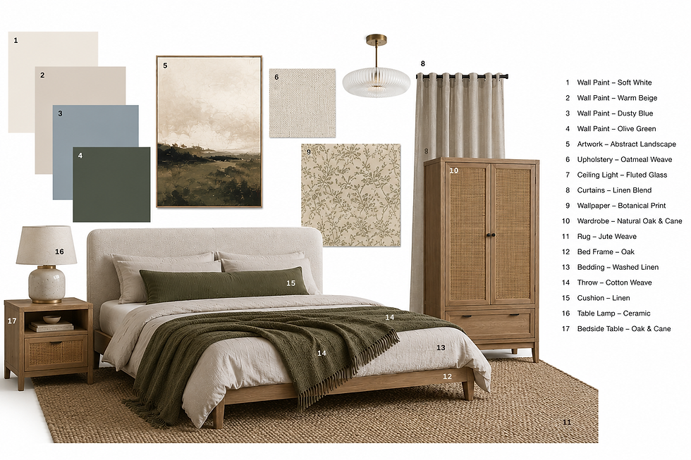
A material board builds on that by using the real materials themselves. Instead of looking at a picture of linen, you're looking at linen. Instead of imagining brushed brass against marble, you can place the two together and judge the combination properly.

In my own tutoring, I put a lot of emphasis on creating beautiful material boards because presentation matters. Being able to communicate a design concept clearly is an important skill in itself.
At the same time, the physical samples on that board are doing just as much work as the presentation because they're communicating qualities that photographs simply cannot.
Colour Is Only One Part Of Choosing Materials
People often think they're choosing colour when they're actually responding to texture.
It's interesting how often people describe themselves as choosing colours when they may not actually be responding to colour at all.
Someone might insist they're looking for the perfect off-white fabric, only to discover that another fabric in almost exactly the same shade leaves them completely unmoved. The difference wasn't really the white. It was the visible weave, the irregular slubs, the softness of the texture and the way it absorbed the light instead of reflecting it.
The same thing happens with timber. Two oak finishes can sit remarkably close together in terms of colour while creating completely different impressions because one has pronounced grain and natural variation, and the other has a smoother, more uniform appearance.

Brushed brass and polished brass don't simply differ in colour either. One reflects light softly while the other catches every highlight in the room. Even paint isn't just about colour. A matte finish and a soft-sheen finish can make the same wall feel surprisingly different.
I sometimes think people leave a showroom convinced they've chosen a colour when, in reality, what they fell in love with was texture.
Why Physical Samples Still Matter In Interior Design
There has never been more inspiration available than there is today. Pinterest, Instagram and AI-generated imagery can expose us to homes and ideas from every corner of the world, and that's genuinely exciting. It's much easier to experiment with different styles and combinations than it was twenty years ago.
At the same time, all of those images share the same limitation. They're still images. They can't tell you how a fabric drapes once it's made into full-length curtains. They can't tell you whether a handmade tile has tiny irregularities that add character or whether those same irregularities will become irritating once they're covering an entire splashback. They can't tell you whether a timber finish feels rich and natural or perfectly smooth beneath your hand, or whether a stone has more movement than you expected when viewed across a larger surface.

Scale can be equally misleading. A marble vein that looks subtle on a product page may become the dominant feature across a large kitchen island. A wallpaper that appears beautifully understated online can suddenly feel far busier when repeated across four walls.
Even something as simple as a boucle fabric can look almost flat in a photograph and wonderfully tactile in real life. Some information simply doesn't survive the journey from a real object to a digital image.
The best place to compare finishes is not on a screen but side by side.
A Material Board Helps You Compare Materials Together
Choosing individual finishes is only part of the process. The far more interesting question is what happens when those finishes start sharing the same room.
A timber floor can look perfect until it's placed beside the cabinetry. A paint colour you've been completely convinced about for weeks can suddenly reveal an unexpected undertone when it's held next to the sofa fabric. Brass may look beautiful against one marble sample and slightly flat against another. Linen that seemed exactly right online may suddenly feel too cool once it's sitting beside natural oak and a warm white paint.
This is where material boards become genuinely useful. Not because they look attractive, although a well-presented board absolutely has value, but because they allow relationships between materials to become visible. You stop evaluating everything in isolation and start looking at how one finish influences another.

For homeowners, that might simply mean gathering flooring samples, paint cards and fabric swatches together on the dining table for an afternoon. For designers, it often means creating carefully considered presentation boards that communicate a complete concept professionally.
The principle is exactly the same in both cases. Seeing materials side by side tells you far more than seeing them one by one on separate websites.

Lighting Changes More Than You Think
There are few decorating experiences quite as humbling as watching a paint colour look completely different over the course of a single day.
Morning light is different from afternoon light. A north-facing room will show finishes differently from a south-facing one. Then the lamps come on, and the whole room changes again.

Paint tends to get most of the attention in these conversations, but flooring, wallpaper, fabrics, metals and natural stone all respond to changing light as well. Timber can become warmer or cooler depending on the conditions. Marble can appear crisp in one setting and noticeably creamier in another. Metallic finishes shift constantly as light moves across their surface, and textured fabrics can look almost completely different once shadows begin to define the weave.
Holding real samples in the room where they'll actually be used removes a surprising amount of guesswork. Instead of imagining what something might look like in your home, you can simply place it by the window, move it into another room and come back later when the light has changed.

Pinterest, Instagram And AI Have Their Place
None of this is an argument against online inspiration. Far from it. I use it myself and would happily lose an hour looking at beautifully designed homes from around the world.
Pinterest remains one of the easiest ways to collect ideas and spot combinations that might never have crossed your mind otherwise. Instagram offers access to designers and interiors from every imaginable style and location. AI can be surprisingly useful for brainstorming and visualising a direction that previously only existed in your head.

The important distinction is between inspiration and specification. By the time something has been photographed, edited, uploaded and displayed on your own screen, you're already several steps removed from the real material. Colours shift, lighting changes, textures flatten and finishes lose some of the qualities that make them interesting in the first place.
Those images can absolutely help you decide where you want to go, but they're not always the best guide for deciding exactly what to buy once you get there.
Why Ordering Samples Can Save You Thousands
It's tempting to skip the samples and trust the images, particularly when everything looks convincing online, and you're eager to keep a project moving. Yet relatively inexpensive samples have a habit of preventing very expensive mistakes.
Comparing flooring against existing cabinetry may stop you from installing two timber finishes that compete with one another every single day. Looking at upholstery fabric in your own home may reveal that the undertone isn't quite what you thought. Holding several whites against your walls often explains why they looked almost identical online but completely different once they arrived.

The same goes for bespoke joinery, made-to-measure curtains, worktops and wallpaper. A few carefully chosen samples can provide far more reassurance than another evening spent scrolling through photographs.
A material board tells you more than your phone ever will.
The finished interiors we admire online are usually the result of hundreds of small decisions that nobody ever sees. Somewhere long before the styling, the photography and the beautifully edited final image, there was almost certainly a table covered with timber samples, fabric swatches, flooring pieces, paint cards and little bits of metal, all being compared with one another under ordinary daylight.
For all the convenience of a screen, there are still things it simply can't show you. That's why a material board tells you more than your phone ever will.


