
Why Texture Can Make or Break a Room

You can have a beautiful colour scheme, expensive furniture and everything arranged exactly where it should be, yet somehow the room still doesn't look quite right. Nothing is particularly wrong with it, but there's very little that makes you want to look twice.
Often, the problem has nothing to do with the colours or furniture you've chosen. It's the lack of contrast between the surfaces, and that's something texture can make an enormous difference to.
We talk about texture all the time in interior design, usually followed by the predictable advice to add a rug, a throw or a few cushions. Which is fine, but it doesn't really explain why texture matters in the first place.

There's a reason a room filled with smooth, shiny surfaces feels different from one with rough timber, linen and heavily textured walls. And it's not simply because one looks warmer than the other.
We See Texture Before We Touch It
One of the more interesting things about texture is that we don't actually have to touch a material to have a reaction to it. Our brains are quite good at making assumptions based on what something looks like, drawing on previous experiences with similar surfaces.
Our brains are quite good at making assumptions based on what something looks like.
We look at a velvet sofa and imagine softness, while a polished marble bench immediately suggests something cool and hard. Rough timber feels familiar and natural, whereas highly polished metal tends to look more precise and formal.

Of course, those assumptions aren't always correct. I've seen plenty of beautiful sofas that look wonderfully comfortable but turn out to be surprisingly unpleasant to sit on. Bouclé is a good example of a material that became incredibly popular partly because of how inviting it looks. All those little loops create a soft, tactile appearance, although the actual comfort depends on the fabric, upholstery and furniture underneath. And anyone who has tried to remove crumbs or pet hair from certain bouclé fabrics will know that looking inviting and being practical are two entirely different things.
This visual response to texture is one of the reasons interior photographs can be so appealing. You can almost imagine running your hand over a rough plaster wall or sinking into a deeply upholstered chair.
A photograph can't tell you how something actually feels, but your brain fills in quite a few of the details. Designers can use that to their advantage, choosing materials that suggest comfort, refinement or a particular atmosphere before anyone has physically experienced the room.

Texture Changes How We See Colour
I find this particularly interesting because colour tends to get most of the attention when people are decorating. We spend ages choosing exactly the right shade of beige, green or burgundy, comparing samples and worrying about undertones. Yet that same colour can look completely different depending on the material it's applied to.
A burgundy velvet sofa, a burgundy lacquered cabinet and a burgundy linen curtain might technically be similar shades, but visually they're doing very different things.
A smooth, glossy surface reflects light more directly, creating highlights that can make colours appear brighter or more intense. Matt finishes scatter light more evenly, while textured fabrics create tiny areas of light and shadow across their surfaces.

Velvet is particularly interesting because the direction of its pile changes how much light reaches your eyes. Walk around a velvet sofa and you may notice the colour becoming lighter or darker, even though nothing about the actual fabric has changed.
This is also why a room decorated entirely in neutral colours doesn't have to look boring. A pale plaster wall, a chunky woven rug, a smooth stone table and linen upholstery can all sit within a very restrained palette without looking remotely identical. The variation comes from the surfaces rather than the colours themselves. Equally, a room full of bold colours can still look surprisingly flat if every material has a similar finish.

Why Contrast Matters More Than Adding More
I'm not particularly interested in adding texture for the sake of it. There's a tendency to think that if a room needs more depth, the answer is to keep layering materials until every surface has something going on. Another cushion, another throw, a textured vase, perhaps a heavily patterned rug for good measure. Before long, you've got plenty of texture but very little visual clarity.
What interests me much more is the relationship between different materials. Put a smooth leather armchair against a rough brick wall and both surfaces become more noticeable. Place a glossy ceramic lamp on an old timber cabinet and the contrast draws attention to the qualities of each. Even a very simple room can look interesting when a few carefully chosen materials are allowed to stand out against one another.

This is also why I don't believe every interior needs to feel soft and cosy. I love interiors with strong lines, interesting materials and a bit of attitude, and sometimes a highly polished surface is exactly what a room needs.
A sleek marble table can look fantastic against textured upholstery, just as a chrome lamp can provide an interesting contrast to warm timber. You don't have to love every material individually to appreciate what it contributes to the overall design.

The trick is knowing when to stop. If every surface is trying to attract attention, the individual qualities of those materials become harder to appreciate. Sometimes the smooth painted wall is precisely what allows a beautiful textured piece of furniture to stand out. Contrast only works when there's something to contrast against.
Light Makes Texture Much More Interesting
Texture and lighting are closely connected, although it's something that's easily overlooked when choosing materials from small samples. A heavily textured wall might look fairly subtle under flat, even lighting, but completely different when sunlight hits it from the side.
The raised areas catch the light while the recesses create small shadows, making the texture much more visible. As the position of the sun changes throughout the day, those shadows change too.
You can see this particularly well with limewash, rough plaster, natural stone and certain wallpapers. In some lighting conditions, their surfaces look relatively uniform, while in others every irregularity becomes noticeable. That can be absolutely beautiful, especially when you want a wall to have character without introducing a strong pattern or colour.

But it's also worth remembering that directional lighting will highlight imperfections, which isn't necessarily desirable if you're dealing with a poorly finished wall.
Smooth and glossy surfaces respond differently. They reflect light more directly, which can make a room feel brighter but can also introduce glare and distracting reflections. A polished dining table underneath a pendant light might look spectacular in a photograph, yet become slightly annoying when you're sitting there in the evening with the light reflected straight back at you. It's worth considering how materials will look under both natural and artificial lighting, rather than making decisions based on a beautifully lit showroom.
Why Some Rooms Feel More Inviting Than Others
Our response to texture goes beyond whether something looks attractive. We also associate materials with experiences we've had before, and those associations influence how comfortable or welcoming we expect a room to be.
Soft fabrics suggest somewhere to relax, while hard, smooth surfaces often remind us of more formal environments. That doesn't mean one is better than the other, but it does help explain why two rooms with similar layouts can create completely different impressions.

Think about a living room with polished concrete floors, glass tables, leather seating and smooth painted walls. It might be beautifully designed, but the combination of hard surfaces could make it feel quite formal. Introduce a large woven rug, heavier curtains or a tactile upholstered chair and the impression changes, even if the furniture arrangement and colour scheme stay exactly the same. Those softer materials also absorb some sound, reducing the reflections that can make a room feel echoey.
There's a practical side to this as well. A room with lots of hard surfaces may look wonderful but sound rather unpleasant when several people are talking at once. Curtains, rugs and upholstered furniture can make a noticeable difference to the acoustics, although their effectiveness depends on the materials and construction. So the comfort we associate with certain textures isn't always just psychological. Sometimes the room genuinely is more pleasant to spend time in.

Texture Doesn't Automatically Mean Natural Materials
Somewhere along the way, texture seems to have become almost interchangeable with natural materials. Mention it in an interior design context and you'll inevitably see linen, rattan, timber, wool and perhaps a beautifully imperfect ceramic vase. I like many of those materials, but they're only part of the story. Texture can be smooth, glossy, ribbed, brushed, embossed, reflective or completely irregular, and manufactured materials can be every bit as interesting as natural ones.
Think about fluted glass, lacquered cabinetry, brushed stainless steel or a beautifully upholstered leather chair. Each has its own surface characteristics, and each interacts with the surrounding materials differently.
Even a perfectly smooth surface contributes something to a room because of the way it contrasts with everything around it. If every material had a rough or heavily textured finish, the result could become visually exhausting.
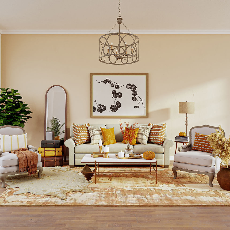
I also think we've become a little too predictable in our interpretation of tactile interiors. For a while, it seemed that every beautifully styled room had to contain bouclé furniture, a travertine table and some sort of oversized ceramic object. There's nothing wrong with any of those individually, but using the same combination everywhere rather defeats the purpose of creating an interesting interior.
Texture should reflect the character of the room and the people living in it, rather than simply following whichever material happens to be fashionable.
Texture should reflect the character of the room and the people living in it.
The Practical Side We Tend to Forget
There's another reason to think carefully about texture, and it's considerably less glamorous than how something photographs. Different surfaces come with different maintenance requirements, and the more pronounced the texture, the more attention some materials may need.
Deeply grooved furniture, heavily textured wall finishes and certain woven fabrics can collect dust and dirt in places that aren't particularly easy to clean. A beautiful surface loses some of its appeal when maintaining it becomes a regular battle.

That doesn't mean avoiding textured materials, but it does mean considering where you use them. A delicate fabric might be wonderful on an occasional chair but less suitable for the sofa that gets used every evening.
A heavily textured tile can look fantastic on a bathroom wall, while the same finish on the floor might be harder to keep clean. Natural stone can add wonderful variation, but its porosity, finish and maintenance requirements deserve just as much attention as its appearance.
It's worth knowing what you're signing up for.
I'm all for choosing beautiful things, and I certainly don't believe everything in a home has to be selected purely for practicality. But I do think it's worth knowing what you're signing up for. A material that looks fantastic in a carefully styled photograph may be rather less charming when you're trying to clean it on a Tuesday morning.
Good Texture Is Often Something You Notice Without Thinking About It
When I look at an interior I really like, I'm rarely thinking about how many different textures the designer has managed to squeeze into it. I'm looking at the overall composition, the colours, the proportions and how the materials work together. Some surfaces stand out immediately, while others provide a quieter background that allows those stronger elements to take centre stage. It's the variation between them that makes the result interesting.

And that's probably the biggest misconception about texture. It isn't necessarily something you add when a room feels unfinished, although it can certainly help. It influences how we perceive colour, how light falls across surfaces, what we expect materials to feel like and even how comfortable a room is to spend time in. Those are fairly significant considerations for something that so often gets reduced to a discussion about cushions.

A room doesn't need to be filled with tactile fabrics or rough finishes to have interesting texture. Sometimes a single contrast between two very different materials is enough to make you appreciate both of them more.
I'd much rather see a few materials chosen because they genuinely work together than an entire collection of fashionable finishes competing for attention. And if the result looks beautiful without requiring seventeen cushions to finish it off, even better.


