
Why Your Home Looks Dated (And The Styling Habits That Give It Away)
- Marieke Rijksen

- May 6
- 4 min read
You’ve updated the sofa. The walls are painted. You’ve added cushions, maybe a rug, a few accessories here and there. On paper, everything should work. And yet the space still feels… a bit dated.
This is usually the point where people assume they need to replace something big. New furniture, a different colour scheme, maybe even a renovation. But more often than not, that’s not where the problem sits. It’s in the styling.
It’s in the styling.

The small, well-intentioned additions that were once everywhere, that made a space feel finished at the time, but now subtly date it. Not because they are terrible choices, but because they’ve been repeated so often that they no longer feel personal or current.
If your home feels like it hasn’t quite moved on, chances are one or two of these habits are doing more than you think.
The Decorative Chain
There was a time when this felt like a clever, design-led detail. Minimal, slightly sculptural, easy to drop into any space that needed “something”.
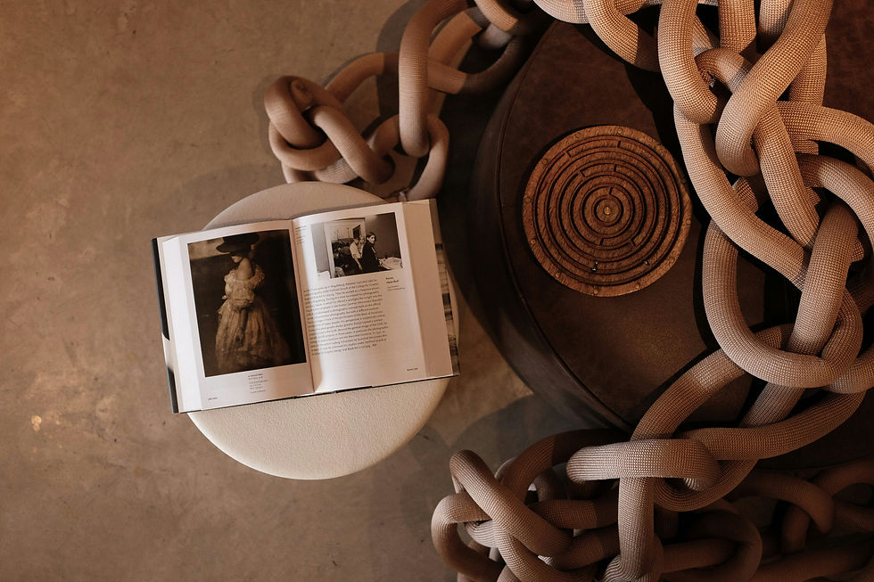
The problem is that it rarely adds anything beyond that. It doesn’t reflect the home, the person, or even the room it sits in. It’s there because empty surfaces started to feel unfinished, and this became the go-to solution. After seeing it repeated enough times, it now reads as filler rather than intention.
Spaces feel more current when objects have a reason to be there. That can be texture, irregularity, age, or simply meaning. Anything that feels chosen rather than placed.
Word Art And Wall Sayings
“Live, laugh, love” (or whatever) had a long run for a reason. It added warmth and personality quickly, especially in otherwise neutral spaces. But it also did all the work.

When a wall literally tells you how to feel, there’s very little left for the room itself to create. It becomes quite one-dimensional, especially compared to interiors where atmosphere comes from materials, contrast, and light.

This is why many homes with word art feel dated, even if everything else has been updated. The message stays stuck in a very specific moment in time.

The Overstyled Tray
A tray with candles, beads, and a small stack of books used to signal that a space was finished. Styled. Thought through. Now it often signals the opposite.
It looks like a formula has been applied rather than a space being lived in. Everything grouped, everything balanced, nothing moved. It creates a slightly staged feeling, as if the room is set up for a photo rather than everyday use.

Removing part of it tends to have more impact than adding to it. When fewer items are competing for attention, each piece has more presence, and the space feels more relaxed as a result.
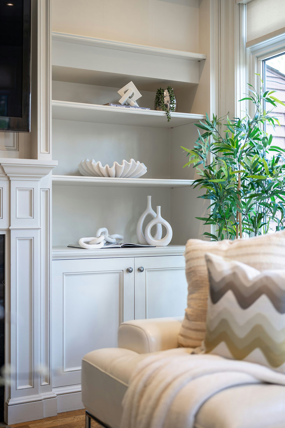
Books Turned Backwards
This trend came from a desire to simplify. Less visual noise, more calm, a softer palette. In practice, it removes one of the easiest ways to add personality to a room. Books tell stories before you even open them. Turning them around strips that away completely. What’s left is a very neutral, slightly anonymous look that doesn’t offer much in return. It is also hugely impractical when you're trying to find the book you actually want to read.
It’s a good example of where aesthetic control has gone a step too far, and the space loses character because of it.

Decorative Ladders That Don’t Function
A ladder with neatly draped blankets looks inviting in a photo. In real life, it often ends up being either unused or constantly adjusted to maintain the look. That disconnect is what dates it.
When styling leans too heavily into appearance without supporting how a space is actually used, it starts to feel artificial. And that’s something interiors have moved away from. Functional storage, or simply letting textiles exist more casually, tends to feel far more natural.

Perfect Symmetry Everywhere
Symmetry creates order, which is why it became so popular. Matching lamps, identical bedside tables, evenly spaced accessories. The issue is when it becomes the only approach.
Rooms that rely too heavily on symmetry can feel predictable and slightly flat. There’s no tension, no variation, nothing to draw the eye. It starts to resemble a showroom rather than a home. Introducing small differences, in height, shape, or material, breaks that uniformity and adds a layer of interest that feels more current.

Overly Coordinated Accessories
Everything matching used to be the goal. Same tones, same finishes, same level of polish.
Now it tends to have the opposite effect. When everything looks like it came from the same place at the same time, the room loses depth. It can feel a bit one-note, even if each individual piece is perfectly fine.

Spaces feel more layered when there is a mix. Different materials, slightly varied tones, a combination of old and new. That contrast is what keeps a room from feeling stuck.
Signs Your Home Looks Dated (Even If You Can’t See It)
If you’re not sure whether this applies, there are a few subtle indicators:
Surfaces that feel “filled” rather than considered
Accessories that don’t have a clear purpose or story
Styling that looks identical to what you’ve seen elsewhere
A space that feels finished, but not particularly personal
These are usually the things people sense before they can articulate what’s wrong.
How To Make Your Home Look More Current Without Replacing Everything
This is the part most people get wrong. They assume the fix is buying something new. In reality, it’s often about removing. Take a critical look at what’s purely there to complete a look. The filler pieces. The formula-driven combinations. Start there.
Then focus on what actually adds something. Texture, contrast, age, or meaning. Pieces that feel like they belong specifically in your home, not just in any home. A space starts to feel current again when it stops trying to follow a styling rule and instead reflects how it’s actually lived in.

The Takeaway
Homes don’t usually feel dated because nothing’s been updated. They feel dated because they’re still styled in a way that once worked, but doesn’t anymore. And that shift isn’t really about trends.

It’s more about letting go of those predictable formulas and moving towards spaces that feel more relaxed, more personal, and a lot less staged. That’s where a home stops trying to impress and starts feeling like somewhere you actually want to be.


