SEARCH RESULTS
319 results found with an empty search
- Four Ways To Style Your Bed
Styling a bed sounds simple until you try to get it right. You make it, step back, and somehow it still feels a bit off. Not bad, not wrong, just not quite there. Most people assume they are missing something. Another cushion, a better throw, nicer bedding. But more often than not, it has nothing to do with adding things. It comes down to how the bed is made in the first place, and whether that way actually suits how you live. Once you start paying attention, you notice that people tend to make their beds in very different ways. Not because they have studied styling, but because it fits their routine, their habits, and what they want their bedroom to feel like at the end of the day. Some want it neat and done. Others want it comfortable. Some want it to look styled, others just want it to feel right. And that is where things start to click. There is no single perfect bed. There are a few ways that work, depending on what suits you. The Crisp, Pulled-Together Bed This is the one that looks like it belongs in a well-run hotel, where everything sits exactly where you expect it to be and nothing feels accidental. The pillows are usually arranged upright and in pairs, the duvet is pulled tight or folded back with care, and the overall effect is one of calm and control. It works because it brings instant order to the room. Your eye knows where to go, and there is nothing competing for attention. The bed feels finished, which tends to make the rest of the space feel more resolved as well. This style often suits people who like things to feel sorted. Making the bed properly is part of the routine rather than something you rush through, and that small moment of structure carries through the rest of the day. Where it can fall slightly flat is when it becomes too perfect. If everything is pulled too tight and sits too flat, the bed can start to feel more like a display than somewhere to relax. Letting one element soften the look, such as using slightly textured bedding or allowing the top layer to sit more naturally, is usually enough to keep it feeling lived in without losing that sense of order. The Soft, Layered Bed This is the bed that looks inviting without trying too hard, the kind you want to fall into rather than admire from a distance. Instead of relying on precision, it builds its impact through layers that create depth and softness. The look usually comes from a slightly oversized duvet that gives the bed a fuller feel, combined with pillows in different sizes that are arranged with a bit more ease. A throw at the foot of the bed adds another layer, but it is placed in a way that feels natural rather than overly styled. What makes this approach work is that it feels generous. The bed has weight to it, visually and physically, which makes the whole room feel warmer and more comfortable. This tends to suit those who lean towards comfort first, but still want the room to look considered. You are not aiming for perfectly straight lines; you are aiming for something that feels good to come back to. The only thing to watch here is that layering does not turn into excess. Without some restraint, it can quickly feel like too much, where the bed starts to look heavy rather than relaxed. Keeping the palette consistent, or repeating one or two tones across the different layers, helps everything feel connected rather than crowded. The Relaxed, Everyday Bed This is probably the most common way of making a bed, but it is rarely talked about as a style. The duvet is pulled up, the pillows are put back, and that is more or less it. It is done quickly, without much thought, and then you move on with your day. And yet, when it is done well, it works. The difference here is not in the effort, but in the foundation. When the bedding is good, the proportions are right, and the colours sit well together, the bed does not need much styling to feel complete. The slight imperfection actually adds to it, because it feels natural rather than staged. This approach suits those who do not want their home to feel overly styled. There is an ease to it, and that ease is exactly what makes it appealing. Where it can fall short is when the base is not doing enough. If the duvet is too small, too thin, or lacks any real presence, the whole bed can start to feel unfinished rather than relaxed. In that case, upgrading the basics, a fuller duvet, better quality fabric, and more considered proportions, will do far more than adding extra layers on top. The Bed That Carries The Room And then there is the bed that does most of the work for you, the one that sets the tone the moment you walk into the room. In these bedrooms, the styling is not built up through multiple layers or careful arrangements, but through one strong decision that everything else follows. It might be a bold-colour duvet that immediately draws your eye, a patterned textile that adds depth without needing anything else, or a headboard with enough presence to anchor the entire wall. Because that one element is doing so much, the rest of the bed can stay relatively simple. You do not need a stack of cushions or multiple layers when the foundation already carries the space. In fact, adding too much often takes away from the effect rather than improving it. This style tends to suit those who are comfortable making a more defined choice and committing to it. Instead of building the bed through many smaller decisions, you are relying on one that is clear enough to hold everything together. The only real balance to strike is knowing when to stop. Once the bed becomes the focal point, everything around it needs to support that, which usually means keeping the rest of the room a little calmer so the main element can stand out properly. So Which One Are You? Most people recognise themselves in one of these straight away, or somewhere between two, and that is usually where things start to make more sense. Because styling a bed is not about following a set of rules or recreating a look you have seen elsewhere. It is about matching it to how you actually use the space. If you prefer something quick and unfussy, a highly structured, hotel-style setup is unlikely to last. If you like things neat and considered, a loose, layered look may start to feel messy rather than relaxed. Just get into bed. Once those expectations line up with your habits, everything becomes easier. You are no longer adjusting the bed to match an ideal version of it. You are simply working with what already suits you. And that is usually when you stop trying to improve it and just get into bed.
- Designing Impactful Interiors with a Single Color Family
When you walk into a room, color is usually the first thing you notice. Whether a space feels calm, cozy or energizing often comes down to how it’s used. That’s why designing with a single color family can be such a powerful approach. Instead of mixing multiple unrelated colors, you create a space that feels cohesive, intentional and easy to navigate visually. It simplifies your decisions while still allowing for creativity and depth. What Is a Color Family? A color family refers to a group of colors that share common characteristics , whether that’s a base hue, temperature or relationship on the color wheel. Color families can be grouped in several ways, including: Primary colors: Yellow, blue, red Secondary colors: Purple, green, orange Tertiary colors: Mixtures of primary and secondary colors Warm colors: Reds, oranges, yellows Cool colors: Blues, greens, purples Complementary colors: Opposites on the color wheel Analogous colors: Colors next to each other on the color wheel Neutral colors: Whites, grays, blacks, browns Monochromatic or hue-based families: Different shades of the same base color In interior design, when people talk about using a single color family, they’re usually referring to a monochromatic or hue-based family. Why Designing with One Color Family Works At first, this approach might sound limiting, but it provides you with a strong foundation for a cohesive design that brings a harmonious feeling to your home. It Creates a Cohesive, Pulled-Together Look All the colors are related, so they naturally work together, which creates visual harmony without requiring you to constantly second-guess your choices. Monochromatic palettes are widely used in design because they reduce visual conflict and create a unified composition. It Helps Set the Mood Color has a direct impact on how a space feels. Warm tones feel playful and cozy , while cool tones feel calm and refreshing. Using a single color family reinforces that feeling throughout the space, making the design feel more intentional. It Makes Your Home Feel More Connected When you carry a color family across multiple rooms, your home feels more cohesive overall. Color plays a key role in how people perceive and experience interior spaces, influencing both mood and spatial understanding. It Simplifies the Design Process Once you choose your color family , everything becomes easier. It saves you the extra effort of matching random colors when picking furniture or styling decor, since you’re simply choosing variations within your chosen palette. How to Use a Color Family in a Home The key to designing with a single color family is balance. You’re creating variation within a consistent palette so the space feels layered rather than flat. Beyond aesthetics, color choices also shape how a space is experienced. Color psychology shows that certain shades can make a room feel different ways. All of this influences how people respond to a space, and that impact doesn’t stop at your front door. Your exterior colors also play an important role in how your home is perceived. Layer Light, Medium and Dark Shades Start by building a range within your color family. For example, light tones could work for walls, mid-tones for furniture and dark tones for accents. This layering creates depth and keeps the room from feeling one-dimensional. It also helps define different areas within the space without needing multiple colors. Use Texture to Add Depth When you’re working within a limited color palette, texture becomes essential. Mixing materials like wood, fabric and metal helps create contrast and keep the room visually interesting, even if everything falls within the same color family. In fact, incorporating a variety of textures can make monochromatic schemes feel more dynamic and layered. Rough and smooth finishes, matte and reflective surfaces, or soft and structured fabrics introduce contrast without depending on new colors. Bring in Neutrals as Support A neutral base gives you a strong starting point, especially if you’re working with a tighter budget or simpler materials. Once that foundation is in place, you can layer in your chosen color family through accents like textiles, artwork or decor, keeping the look cohesive without overloading the space. Neutrals help you use contrast more intentionally, allowing your accent colors to stand out and draw attention where it matters most. Use Color to Shape the Feeling One of the biggest advantages of working within a color family is you can control the mood of the space. Color psychology shows that warm tones feel energetic and inviting, while cool tones feel calm and relaxing. However, not every room should use your color family in the same way. Think about how the space is used. For living areas, slightly warmer tones create an inviting atmosphere. For bedrooms, go for softer, calming shades. As for the kitchen, pick balanced, clean and fresh tones. Even within one color family, choosing warmer or cooler variations can completely change how the space feels. Use Color to Influence Perception of Space Color can also change how big or small a room feels. Lighter shades make spaces feel larger and more open, while darker shades add depth and coziness. Consistent color flow helps rooms feel connected, especially in open layouts or smaller homes. Don’t Forget About Lighting Lighting has a huge impact on how your color family looks in real life. The same shade can appear warmer, cooler, lighter or darker depending on the lighting conditions, which is why testing colors in your space is essential. Extend Your Color Family to the Exterior Your exterior plays a major role in how your home is perceived. Using your color family outside helps create a cohesive look. Choose a neutral base like warm white, gray or beige for siding and deeper shades for accents like doors, shutters or trim. Apply complementary tones to the garage door so it blends seamlessly rather than standing out awkwardly. Choosing a door type is also important because it should align with the overall design style you’re going for. Modern options offer a wide range of colors , helping you maintain the color palette you chose. Garage spaces themselves also benefit from thoughtful color choices. Lighter neutral tones inside make them feel brighter, reinforcing the overall impression of a well-kept home. Even small updates like repainting your garage door can elevate curb appeal while staying consistent with your overall palette. Different Ways to Apply a Color Family Designers often rely on the 60-30-10 rule to create balanced color palettes. In simple terms, about 60% of a space should feature a dominant color, 30% should be a secondary color for contrast and 10% can be an accent color for visual interest. This translates to using the dominant color on walls and large surfaces, the secondary color in furniture and textiles like cushions or rugs, and the accent color in decor pieces and smaller details. For a palette based on a single color family, there’s no one-size-fits-all method. You can use a color family in different ways depending on your style: Paint-focused design: Use a soft version of your color on walls and build the room around it. Furniture-led approach: Keep walls neutral and let furniture carry the color. Accent-based styling: Use your color family in smaller details like pillows, rugs, curtains and artwork. Tone-on-tone layering: Combine multiple shades of the same color throughout the space. How You Build Variety Within a Color Family Using one color doesn’t mean everything looks the same. The variation comes from how you adjust it. Color theory breaks this down into these three main components: Hue: The base color Value: How light or dark it is Saturation: How vivid or muted it appears By adjusting these, you can create a full palette within one family. For example, in a blue color family: Light: Powder blue Mid-tone: Denim Dark: Navy Muted: Slate blue Example of a Popular Color Family Right Now One of the most popular directions in interior design right now is earthy , nature-inspired colors. According to recent trends, shades of green like chartreuse and warm tones like truffle brown have been widely used because they feel grounded and timeless. Green, for example, is often associated with balance and calm, making it ideal for everyday living spaces. A green color family palette could work with neutrals like wood, white and beige. Creating a Space That Feels Effortless and Cohesive Choosing a color family and exploring its full range gives your space direction. You can create a home that feels cohesive, intentional and easy to live in. Add in texture, balance it with neutrals and vary your shades, and you’ll end up with a space that feels layered without being complicated.
- Hallway Ideas That Make You Look Twice
Hallways are often treated like the in-between. You walk through, drop your keys somewhere, and move on. Maybe you hang a mirror, add a light, call it done. It works, technically. But it rarely feels like part of your home. Which is a missed opportunity, because the hallway is doing quite an important job. It is your first impression when you walk in, and the last glance before you leave. It quietly sets the tone for everything else. The shift is not about adding more. It is about making a few better choices and actually following them through. Here are ideas that go a bit further than the usual, but still feel doable. A Drop Zone That Feels Considered, Not Chaotic The hallway will always collect things. That is not bad design, that is just life. What usually makes it feel messy is not the presence of things, but the lack of a clear place for them. Keys move around. Bags land wherever there is space. Post builds up in slightly random piles. The fix is not hiding everything away. It is giving those everyday items a defined spot. A tray for keys instantly removes that daily “where did I put them” moment. Hooks placed at the right height mean coats are hung, not draped. A basket or box for smaller items stops surfaces from becoming a catch-all. The important part is restraint. If you add too many compartments or zones, it becomes just as overwhelming. Keep it simple, and make sure everything you keep there actually belongs there on a daily basis. One Colour That Carries The Whole Space Hallways often end up with leftover colours from other rooms. A bit of white here, a different tone there, maybe a contrasting door for interest. On paper, it sounds layered. In reality, it often feels disconnected. Using one colour throughout changes that completely. When the walls, woodwork, and even the ceiling share the same tone, the space feels calmer and more intentional. It also softens all the lines and edges, which is especially helpful in narrower hallways. This does not mean it has to be dark or bold. A warm neutral, a soft clay tone, or a muted green can do the job beautifully. The key is consistency. It is one of those choices that looks simple, but makes everything else in the space feel more put together. Let One Piece Do The Talking It is tempting to fill a hallway with smaller items. A few frames, a small mirror, maybe a decorative object or two. Before you know it, there is a lot happening in a very limited space. Choosing one larger piece instead creates a completely different effect. A single artwork, properly scaled to the wall, gives the eye a clear focal point. A mirror with presence can reflect light and make the space feel larger without adding clutter. It is not about being minimal for the sake of it. It is about giving each piece enough space to be noticed. And interestingly, it often makes the hallway feel more confident, not less decorated. Create A Moment That Is Not Purely Functional Because hallways are used for movement, they tend to be designed only for function. Adding one small moment that serves no real purpose shifts that instantly. A stool with a book on it. A ledge with a favourite object. A small arrangement that you simply enjoy seeing when you pass by. It does not have to be big or styled. In fact, the less staged it feels, the better. The point is that it introduces personality into a space that is usually purely practical. It is also what makes a hallway feel connected to the rest of your home, rather than separate from it. Give The Floor A Bit More Attention Floors in hallways are often treated as an afterthought. Functional, durable, and that is about it. But the floor is one of the easiest ways to anchor the entire space. A runner can guide the eye through the hallway and soften the look of harder surfaces. Choosing one with texture rather than a busy pattern keeps it interesting without overwhelming the space. If a rug is not your thing, a painted border can achieve a similar effect. It subtly defines the walkway and adds character without adding physical bulk. Because hallways are already visually busy with doors and movement, keeping the interest lower down often works better than adding more at eye level. Lighting That Changes How The Space Feels Most hallways rely on a single overhead light. It does the job, but it rarely does anything more than that. Layering the lighting, even slightly, makes a noticeable difference. Wall lights can create a softer, more directional glow that highlights textures and colours. A small table lamp, if you have the space, introduces warmth and makes the hallway feel less transitional. And then there is the bulb itself. A warmer tone can take a hallway from stark to inviting without changing anything else. It is one of those details that is easy to overlook, but once adjusted, it is immediately noticeable. Repeat One Material To Tie Everything Together A hallway can easily feel like a mix of unrelated pieces. Different finishes, different tones, nothing quite connecting. Repeating one material creates subtle cohesion. This could be as simple as using the same metal for hooks, a frame, and a light fitting. Or carrying a wood tone through a bench, a shelf, and a small detail elsewhere. It is not about matching everything perfectly. It is about creating a thread that runs through the space. Most people will not consciously notice it, but they will feel that the space makes sense. Loosen Up The Way You Hang Things Hallways can quickly feel overly neat. Everything aligned, centred, and fixed in place. Introducing a bit of looseness changes the mood. Leaning artwork on a narrow shelf or console adds a more relaxed feel. Slight overlaps between frames can make things feel collected rather than arranged. It also gives you flexibility. Things can be moved, swapped, adjusted without leaving marks everywhere. That slight informality often makes the space feel more lived in and less like it is trying too hard. Storage That Feels Edited, Not Overloaded Open storage in hallways is practical, but it can also become visual noise very quickly. The difference lies in editing. If coats are in completely different colours and styles, the space can feel busy. Limiting the palette, even loosely, makes it feel calmer. Matching baskets or containers create a sense of order without needing to hide everything away. And sometimes the best decision is to reduce what is kept there altogether. A hallway does not need to store everything. Just the things you actually use every day. One Slightly Unexpected Element This is often the detail that makes people look twice, even if they cannot immediately say why. Adding something that is not strictly necessary introduces character. A chair that feels a bit too special for a hallway. A bold piece of art that stands out from the rest of the home. A vintage object that brings in a different layer. It does not need to match perfectly. In fact, it is often better if it does not. That small moment of contrast is what gives the space personality and stops it from feeling generic. A hallway does not need a full redesign to feel different. It just needs a few decisions that are made on purpose rather than by default. And once you start treating it as part of your home, rather than the bit in between, it tends to come together surprisingly quickly.
- The Five-Minute Easter Reset
Easter has a habit of sneaking up. One minute it is firmly winter, the next you are standing in your kitchen, wondering if a bag of chocolate eggs and a slightly apologetic bunch of flowers counts as effort. I have found myself there more than once. The truth is, I am not someone who naturally gravitates towards seasonal décor. I do not want cupboards full of once-a-year decorations, and I am not interested in completely reworking a space for a single weekend. But I do appreciate the feeling of marking a moment, even if it is done quietly. This is exactly why I rely on what I think of as a five-minute Easter reset. No shopping, no themed overload, and no pressure to transform your home. Just a few small, intentional shifts using what you already have, so the day feels considered rather than forgotten. I Avoid Overly Traditional Easter Decor There is something about overly themed décor that can feel slightly chaotic. Bright pastels, novelty pieces, and items that only make sense for one specific weekend rarely sit well within a thoughtfully designed home. When décor suddenly shifts into something overly decorative or gimmicky, it can disrupt a sense of calm. And then, just as quickly, it all has to be packed away again. Minimalist Easter décor, or perhaps more accurately, restrained Easter styling, feels like a much better fit. It allows you to acknowledge the season without losing the identity of your home. More importantly, it saves you from buying things you will quietly resent storing for the next eleven months. A Last Minute Reset If you have remembered that Easter is happening approximately twenty minutes ago, you are exactly the person this approach is for. A reset is different from decorating. It is faster, simpler, and far more forgiving. Instead of asking “what do I need to buy,” you are asking “what can I move, remove, or rethink.” There is no expectation of perfection. You are simply creating a small moment within your home that acknowledges the day. And realistically, that is all most of us are looking for. There is no expectation of perfection. Start By Clearing Something Before adding anything, I always take something away. This is the step people tend to skip, and it is the one that makes the biggest difference. Choose a surface. A coffee table, a console, or even a corner of your kitchen counter will do. Then remove everything from it, or at least most of it. Yes, even the items you are convinced must stay. What you are left with is space, which is surprisingly powerful. It immediately makes the room feel calmer and more intentional, even before you add anything back. Editing is not about deprivation; it is about clarity. Shop Your Own Home This is where things become interesting. Instead of heading to the shops, I look around my home with slightly different eyes. A ceramic bowl that usually lives on a shelf becomes a centrepiece. A stack of books turns into a base for a small display. A glass vase that has been largely ignored suddenly feels useful again. Easter home décor ideas do not need to involve anything remotely “Easter themed.” In fact, the less obvious, the better. You are creating a feeling, not a display. There is also something satisfying about making your home feel new without spending anything. It is design at its most resourceful, and arguably its most creative. Focus On One Surface Only It is very tempting, once you start, to move from one surface to another until the entire house is involved. This is how a five-minute reset becomes an afternoon project. One surface, styled well, has far more impact than several that are half considered. A dining table is an obvious choice if you are hosting, but it could just as easily be a hallway console or a coffee table. The key is that it feels intentional, not scattered. This is also what keeps the process realistic. You are far more likely to actually do it if it feels contained and manageable. Layer Lightness Into The Space Easter sits firmly at that point where winter starts to feel heavy. Even if the weather has not quite caught up, the light has changed, and your home can reflect that. I like to introduce lighter textures wherever possible. Linen napkins, a softer-toned cloth, or even just swapping out something dark for something a little brighter can shift the mood. This does not need to be dramatic. In fact, it should not be. A spring home refresh is about subtlety. You are easing your space into a new season, not forcing it there. Texture plays an important role here as well. Pairing smooth ceramics with soft fabric and natural wood creates a layered look that feels relaxed and appropriate for this time of year. Add One Nod To Easter This is the only point where Easter makes a direct appearance, and even then, I keep it understated. A bowl of eggs works beautifully. They do not have to be decorated, or even particularly styled. Their shape and simplicity are enough. Alternatively, a few branches in a vase, perhaps with early blossom or fresh greenery, can create the same effect. The key is to choose one element and stop there. This is not the moment to introduce multiple references or anything overly literal. Simple Easter styling works because it is restrained. It allows your home to remain itself, with just a slight seasonal shift. Edit Again And Then Stop Once everything is in place, I take a final look and usually remove one more thing. There is almost always something that does not need to be there. This final edit is what stops the arrangement from tipping into clutter. It keeps the overall look clean, calm, and intentional. And then, importantly, I stop. It is very easy to keep adjusting, adding, and refining, but that tends to undo the simplicity you started with. Five minutes should feel like five minutes. Five minutes should feel like five minutes. Let It Carry You Through Spring One of the most practical aspects of this approach is that it does not expire the moment Easter ends. The elements you have introduced, lighter textures, natural materials, and a simplified layout, can remain in place well beyond the weekend. This turns a last-minute reset into the beginning of a broader seasonal shift. If you are thinking about how to build on this, my guide to creating a timeless spring colour palette explores how to extend these ideas throughout your home without starting from scratch. A More Relaxed Way To Mark The Day For me, this approach strikes the right balance. It acknowledges Easter without overcommitting to it. It makes the day feel slightly more intentional, without requiring preparation, storage, or a shopping trip. Most importantly, it works even if Easter has completely crept up on you. You do not need themed decorations to make your home feel ready. You do not need to buy anything new. You just need a few minutes, a clear surface, and a willingness to see what you already own in a slightly different way. And if all else fails, a bowl of chocolate eggs placed with confidence has been known to pass as styling.
- Think Like a Designer: Achieve Luxury Looks for Less
Creating a high-end home doesn’t have to mean maxing out your budget. In fact, the most sophisticated interiors often come down to clever planning rather than eye-watering spending. Designers know that thoughtful choices — from the proportions of a window to the finish on a humble door handle — can achieve a polished, luxurious feel without the luxury price tag. Let’s explore how you can think like a designer and create a high-end look with smart decisions, not a runaway budget. The Power of Thoughtful Planning A sense of luxury begins on the drawing board. When you plan your layout and details with care, even standard products can look bespoke. Aligning the sightlines of your windows with your flooring pattern, for example, immediately feels considered and elegant. Similarly, basic interior doors can feel far more special if you invest in beautiful handles and hinges. Luxury is not necessarily about rare materials — it is about deliberate design, proportion, and balance. Always begin with a clear plan: where do you want to make an impact, and where can you stay simple? This will help you avoid expensive mistakes later. Luxury is not necessarily about rare materials — it is about deliberate design, proportion, and balance. Architectural Features: Save Without Sacrificing Style Statement architecture often carries a hefty price tag. Curved, arched, or angled windows are visually dramatic but complicated to manufacture, install, and maintain. If what you really want is an expansive view, a large rectangular window with a slim, elegant frame can offer the same wow-factor with far less cost and complexity. Likewise, pivot doors in steel or bespoke timber are breathtaking but expensive. A simpler pivot hinge on a standard-size timber door finished in a striking colour can create a similar sense of grandeur at a more modest price. Even double-height feature glazing, which looks spectacular, can be reimagined as stacked floor-to-ceiling windows with a discreet mullion. The design language is the same, but the bill is far smaller. Material Alternatives with a Luxury Finish Beautiful materials elevate a space, but they don’t have to be the rarest or most costly. Porcelain tiles, for example, can convincingly mimic natural stone at a fraction of the cost and with easier upkeep. Concrete-look porcelain is far more practical than a poured concrete floor but achieves the same contemporary mood. Crittall-style steel windows are gorgeous but expensive and prone to heat loss; slim, powder-coated aluminium windows can deliver the same aesthetic with far better insulation and a friendlier price. Likewise, timber slat walls are popular in luxury interiors, but veneered MDF slats or even painted timber alternatives give a nearly identical effect while keeping the budget in check. Design-Led Value: Features That Punch Above Their Price A high-end look is rarely about splashing cash on every element. Designers know where to focus. A good example is using affordable kitchen cabinet carcasses from IKEA, then pairing them with custom doors from suppliers like Plykea or Husk. You get a one-of-a-kind finish on a mass-produced foundation. Similarly, basic MDF panelling painted in a rich heritage colour can rival expensive bespoke wall panelling. Or consider a simple staircase elevated with a striking balustrade or carefully chosen handrail. These kinds of swaps deliver a huge visual impact without spiralling costs. Think Like a Designer: Prioritise Where to Spend One of the best ways to stretch your budget is to identify the “hero” features in each space. Splurge on these, and simplify everything else. For instance, invest in a stunning worktop or high-quality taps, but save money with flat-panel cabinet doors and affordable appliances. Good designers will often focus spending on handles, switches, or statement light fittings while keeping the background elements restrained and cost-effective. Clever lighting layouts with standard recessed spots plus one or two dramatic pendants can also create a luxury mood without luxury prices. Small Details, Big Impact Finishing details can make or break the look of a home. Coordinating switches and sockets, matching paint finishes, or running the same flooring through multiple rooms all contribute to a sophisticated and calm atmosphere. Minimal window dressings that frame — rather than hide — your glazing can showcase a great view or well-planned windows, reinforcing that high-end feel. These details are often affordable but require thought. And that’s the true secret: a well-planned space, however modest the budget, will always read as more luxurious than an expensive space built without care. Conclusion A luxury home is as much about design thinking as it is about money. A luxury home is as much about design thinking as it is about money. By planning carefully, prioritising where you splurge, and making thoughtful choices on materials and features, you can achieve a sophisticated, high-end look for far less than you might think. After all, the real mark of luxury is not just price — it is intention.
- Are Your Exteriors Missing Out on the Designer Touch? 12 Ways to Design Exteriors in Every Season
If you agonize over sofas and paint swatches, you understand the satisfaction of thoughtful design. However, for some, this careful attention stops at the front door. As a homeowner, you should treat the exterior as a dynamic canvas rather than a static shell. Here’s a guide to creating stunning curb appeal that evolves with every season. Awakening Your Home for a Spring Refresh Spring is refreshing, as homeowners take the time for thorough cleanings. Channel this same energy toward your home’s exterior by using these three strategies for exterior enhancement. 1. Give the Door a Fresh Coat of Paint The front door is similar to your interior accent wall. Adding one coat of paint can immediately redefine your home’s personality without a complete overhaul. This project costs $190 on average , depending on your preferred paint and the size and type of your door. For spring, pick vibrant and welcoming colors like yellow or crimson. Navy and glossy black could also work for timeless elegance. Regardless, it’s wise to complement the siding and trim. 2. Plant Layered Landscapes Garden beds are the living rooms of your exterior. You can use them to create a cohesive, multidimensional space. Create a foundation with evergreen shrubs and ornamental plants. These greenery examples maintain their shape with consistent pruning, making them solid options for your exterior. You could also add annuals and border plants for the extra wow factor. Petunias, impatiens and marigolds are popular options for the bed’s edges. 3. Pressure Wash Your Hardscapes A deep spring clean feels more complete once you pressure wash each hardscape. This foundational step revitalizes your property’s aesthetics and lets other design choices shine. Pressure washing is essential to exterior design after the winter beating. Each cold season brings dirt, mud and decomposed leaves. Washing lets you eliminate the built-up salt residue, mildew and other unwanted contaminants. Patios, decks and driveways deserve a thorough cleaning to help curb appeal. Embodying the Vibrancy of Summer Once the spring refresh is complete, it’s time to bask in the sun. These three tips help you embrace lush growth and bold statements in your exterior. 4. Define Outdoor Areas Your outdoor spaces should be an extension of your home. Instead of a few chairs on the porch, create designated areas for relaxing, dining and entertaining. Bring your vision to life with furniture arranged for conversation. For example, you could place an outdoor sofa and armchairs around a central coffee table. This setup is excellent for morning coffee and inviting guests to linger. Consider making the exterior pop with layered textiles, such as crochet throws and linen accent pillows. 5. Upgrade Windows and Shutters Windows and shutters are your architectural jewelry, like necklaces or cufflinks. These elements complete your exterior and serve as stylish finishing touches. Your windows are important because they affect heat loss in the winter. While functionality matters, you should also prioritize cohesiveness on the exterior. Match your window and shutter designs to your exterior style. For example, traditional and colonial homes may use double-hung windows. 6. Use Impactful Functional Designs Small details, such as cabinet hardware and faucet design, go a long way in completing interior spaces. Similar principles apply to the exterior, as you have numerous opportunities to infuse personality and a sense of high design. Find functional and small investments that pay huge dividends. For example, house numbers are impactful upgrades, especially when using matte black or brushed nickel. If you live in a farmhouse, you could use rustic or industrial styles. Embracing Autumn’s Warmth and Texture Once summer fades, autumn provides a new canvas for warmth and layered textures. It’s a terrific time to focus on making the exterior as cozy and inviting as the interior. 7. Transition Window Boxes Window boxes and planters deserve a thoughtful transition as the weather cools. When fall arrives, add ornamental grasses and natural branches for a rustic look. Consider fall-blooming bulbs, such as Japanese onion or autumn snowflake, as they flower after summer ends. Create a true designer arrangement by adding non-floral elements to embrace the harvest theme. Gourds, mini pumpkins and pinecones are terrific additions. 8. Introduce Warm-Toned Lighting Lighting is essential to enhancing visibility once the sun sets earlier. It can also fundamentally shape your home’s exterior by making it more inviting. Consider yellow or amber-toned lighting to align with the season. This welcoming glow is an effective contrast to the cool and dark evenings outside. A warm exterior gives guests a sense of comfort upon arriving at your home. Complement the exterior with warm neutrals – they appeal to buyers due to their forgiving nature, which hides minor imperfections on walls. 9. Design the Garage The cooler weather is terrific for removing summer grime from your garage and getting ready for the next season. Autumn design elements include flanking the doors with corn stalks, gourds and pumpkins. Once you handle these design elements, focus on the color to help it stand out. Neutral tones emphasize areas of interest and align with a minimalist design. Highlighting Structure in the Winter Curb appeal remains relevant in winter, so be mindful of your home’s architecture. As the cold rushes in, you can focus on being an architect and lighting designer with the exterior. 10. Showcase Architectural Bones Vibrant flowers and soft leaves are less accessible in the winter. So, it’s time to focus on your home’s fundamental structure. The trick is to use focused light to draw attention to textures, shapes and lines. For example, you could use spotlights at the bases of chimneys or tree trunks. You can also use light to emphasize shapes and create grandeur and intentionality. Smart designers place uplights on porch column bases to draw eyes and enhance importance. 11. Zero in on Evergreen Structures While architectural bones are essential, you can use similar principles to highlight structural plants. Evergreen plants help fill space and prevent the yard from seeming empty and desolate during the colder months. Incorporate hedges made of yew and boxwoods to define property lines or create garden rooms. They could even hide less attractive views, such as the utility box. 12. Create Safe and Stylish Entryways The entryway serves two functions in the winter — providing a safe welcome and blending practicality with the design. Start by keeping the pathway clear of ice and snow, as they make the ground unsafe to walk on. Ditch the rock salt by storing ice melt in lidded containers, such as galvanized storage bins. The doormat is another target for winter. A flimsy one may be vulnerable to the cold conditions, so consider a nonslip one. Your doormat may lead to the mudroom, which can get messy with kids and animals. Pet-friendly stations for things like paw-washing can help keep the mudroom tidy and easier to manage when the outdoors tries to come in. Ensuring a Stylish Exterior All Year The exterior of your home is a protective shell that introduces your personal story and style. If you treat it with intention and creativity, you can transform it into a dynamic and welcoming canvas. Each season lets you create a home that feels complete and alive.
- The Dining Room You’ll Actually Use
There is a version of the dining room that most of us have in our heads, and it is a good one. A beautifully set table, candles lit, long dinners that stretch further than planned, and no one in a hurry to leave. It is the kind of space that looks right in photos and even better in theory. And every now and then, it does happen. But most of the time, that is not how the room is used. Most dining tables see quick breakfasts, half-finished cups of coffee, laptops that appear somewhere mid-morning, and dinners that are more about getting something on the table than creating a moment around it. The reality is far less styled, but far more frequent. That is usually where things start to feel slightly off, because the room has been designed for a version of life that only shows up occasionally, while the everyday version has to work around it. The room has been designed for a version of life that only shows up occasionally. The aim is not to lower the bar or give up on those longer dinners, but to create a space that supports both. A dining room that works on a random weekday without effort, and still holds its own when you decide to make a bit more of it. It almost always starts with being honest about how you use it. Start With How You Actually Use It It sounds obvious, but it is the part that tends to be skipped. It is easy to design for the version of the room you would like to have, and much harder to design for the one you already do. If your dining table is just as likely to be used for work, helping with homework, or a quick lunch as it is for hosting, then it needs to hold up in all of those situations. A table that only works when it is perfectly styled is not going to be used nearly as often as one that feels easy to sit at at any time of day. That might mean choosing a surface that is forgiving rather than precious, or leaving enough space around the table so that moving in and out of it never feels like a small obstacle course. Once the room starts to support how you actually live, it naturally becomes part of your routine instead of something you save for later. Get The Table Size Right Table size is one of those decisions that does not draw attention to itself, but quietly shapes how the entire room functions. When it is right, everything feels balanced and easy. When it is not, the room never quite settles. A table that is too large tends to dominate the space, making it harder to move around and subtly discouraging use, even if it looks impressive at first glance. One that is too small can feel slightly lost, especially once chairs are added and the proportions start to feel off. Getting it right is less about fitting as many seats as possible and more about creating a setup that feels comfortable to move around without thinking about it. That ease is what makes a space inviting, not just how it looks when it is fully set. Make The Chairs Worth Sitting In Chairs are often chosen for how they look from a distance, which makes sense until you actually sit in them. A dining chair does not need to be overly soft or bulky, but it does need to be comfortable enough that you do not immediately want to get up again. Because the difference between a quick meal and a longer evening is often not the table, the lighting, or even the company, but whether you feel like staying where you are. There are plenty of options that strike that balance well, but it is one of those things that is worth testing rather than assuming. Hesitate before ordering dining chairs online. A chair that feels good to sit in will be used differently, and that alone changes how the entire room functions. Get The Lighting Right Lighting above a dining table has a bigger impact than it is usually given credit for, particularly once the day starts to shift into evening. During the day, it tends to play a supporting role, but later on, it becomes one of the main elements that shape how the space feels. A light that is hung too high can lose its connection to the table, while one that sits too low can feel slightly in the way, even if everything else is right. When the height and scale are right, the table starts to feel anchored, and the space becomes more cohesive as a result. Pairing that with a softer, warmer light in the evening changes the atmosphere almost immediately, turning the same table from something purely functional into somewhere you are more inclined to linger. Let It Feel Like Part Of Your Home The dining room often sits somewhere between functional and formal, and it can easily lean too far in either direction. If it becomes too formal, it turns into a space you save rather than use, something that looks good but is slightly disconnected from everyday life. If it leans too far the other way, it can start to feel like an extension of the kitchen rather than a space in its own right. Bringing in elements that you would use elsewhere in your home helps find that balance. A rug that softens the area, artwork that adds some presence to the walls, materials that feel consistent with the rest of your space. These are the things that make it feel connected, rather than like a separate zone with its own set of rules. The Dining Room You Thought You Wanted There is nothing wrong with that ideal version of the dining room, and there is no reason to let go of it. The long dinners, the candles, the moments where everything comes together still have their place. But they are not the only version that matters. Because once it works on a random Tuesday, the longer dinners tend to take care of themselves.
- The Home Office That Disappears At The End Of The Day
There is a very simple solution to working from home that solves more than most design advice ever will, and it has very little to do with desks, chairs, or clever storage. Close the door. If you are lucky enough to have a separate room for your home office, that one action does a surprising amount of heavy lifting. Work stays contained, the rest of your home stays your home, and at the end of the day, there is a clear moment where one stops, and the other begins. I have that setup, and I would not trade it. But even then, what sits behind that door still matters more than you might expect. Because if it feels like a temporary corner with a desk pushed against a wall, it is not somewhere you enjoy being during the day. And if it leans too far in the other direction and starts to feel like a corporate office, it has a way of lingering, even after you have shut the door. And for most people, there is no door to begin with. Work happens at the dining table, in a corner of the living room, or in a spare room that is quietly doing three other jobs at the same time. Which means the challenge is not just creating a place to work, but creating one that can step back again once you are done. That is where the design choices start to matter. Start With Where It Sits A home office rarely feels right when it has simply been placed wherever there was space left over. A desk against the nearest wall might work on paper, but in reality, it often leaves the room feeling slightly unsettled, as though something has been added rather than properly thought through. Even in a shared space, placement makes a noticeable difference. A desk that faces into the room feels more connected than one pushed directly against a wall, and tucking it into a natural corner gives it a sense of purpose without letting it take over. When it is positioned with a bit more intention, it starts to feel like part of the room rather than something that landed there by default. It does not need its own room, but it does need to make sense where it sits. Get The Basics Right First Before any of this works, the setup itself has to be right, and this is the part where aesthetics should not win. If you are working from home regularly, your chair and desk height are not decorative choices. A poor setup will catch up with you, whether that shows up in your back, your neck, or simply in how long you can comfortably sit there. That does not mean you need to bring in something that looks like it belongs in a corporate office. It just means you need to be more selective about what you choose. A good chair should support you properly, not just look nice when it is pushed under the desk. A desk should sit at the right height for how you work, not just fit the corner it has been placed in. These are the few elements where function genuinely comes first. The good news is that you are no longer limited to purely office-looking pieces. There are well-designed chairs that offer proper support without looking heavy or out of place, and desks that read as furniture rather than equipment. Once those basics are right, everything else becomes easier, because you are no longer trying to work around something that does not actually work. Make It Easy To Put Away If you want a home office to disappear at the end of the day, it has to be easy to close down without turning it into a whole separate task. When everything sits out in the open, from cables to paperwork to the small things that build up over the day, the space never really switches off. It stays present in the room, even if you are no longer using it. Storage that closes rather than displays changes that completely. Drawers that actually fit what you use, cupboards that take the edge off visual clutter, and a desk surface that is not permanently overloaded make it possible to reset the space in a matter of minutes. Not perfectly, but enough that it no longer feels like you are still working. Let The Lighting Shift Lighting is one of the easiest ways to change how a space feels, and it is often treated as purely functional in a home office. During the day, that makes sense. You need enough light to work comfortably, and good task lighting is essential. The problem is what happens after. When the workday ends and the same lighting stays on, the room often remains stuck in that same mode. What felt bright and useful earlier in the day starts to feel harsh in the evening, and the space never quite settles back into the rest of your home. Adding a softer layer of light changes that quickly. A table lamp, a floor lamp, something that belongs to the room rather than the desk, allows you to shift the atmosphere without moving anything around. Once the task lighting goes off and the softer light takes over, the space feels different almost straight away. Avoid The Office Look There is a version of the home office that works perfectly well but never quite feels right, and it usually looks exactly like what it is. A standard desk, a standard chair, a setup that would not look out of place in any office building. It does the job, but it rarely feels like part of your home. Changing that does not mean sacrificing function, it simply means bringing in elements that you would choose anyway. A rug that softens the space, artwork that you would hang regardless of where the desk sits, and materials that feel considered rather than purely practical. These are the details that help the workspace sit comfortably within the room instead of feeling like it was added in afterwards. Give It One Element That Grounds It What often makes the difference between a workspace that feels temporary and one that feels intentional is a single element that holds it together. Without it, even a well-set-up desk can look like something that could be moved or packed away at any moment. With it, the space feels more anchored, as though it belongs exactly where it is. That grounding element does not need to be complicated. It might be a piece of artwork behind the desk, a colour that carries through the room, or a desk that feels like a proper piece of furniture rather than something purely functional. Once that is in place, the rest of the setup starts to fall into line more naturally. And If You Do Have A Door Then use it. Close it at the end of the day and leave everything behind it where it is. Not perfectly styled, not cleared down to the last pen, just contained enough that it no longer asks for your attention. Because that is really the goal, whether your workspace sits in its own room or in the corner of another. To have something that works properly during the day, and then stops following you around once you are done. Or, if you are lucky, something you can quite literally shut the door on.
- Ergonomic Office Makeover To Improve My Health
'I love your office! Why would you change it?!" My office - BEFORE This is why I gave my home office a makeover This was a pretty common reaction when I told my followers I was busy giving my office a full make over. And truth be told, I loved it too! So why did I go ahead and changed everything? Well let me tell you. I have a bad back, courtesy of an elite rhythmic gymnastics career on international level in my childhood. It limits what I can do and I have to take daily medications to be able to get out of bed in the morning. It sucks but I've learnt to live with it and I just keep doing whatever I want to do. Having said that, spending a full day sitting down at my desk to work, which I often do, was an absolute killer. My posture was totally wrong Two main reasons (besides simply being injured) why I kept aggravating my back: a predominantly sedentary job (in other words, I need to get off my bum) and a chair and desk combo that were ergonomically totally incorrect for my body. How often do you really take a look at how you sit? I knew all the theory of course, but I can honestly say I never really analysed my own work spot. If I had done this sooner, I would have realised that my set up only compounded my back issues. My desk was too high, my seat too low. As simple as that. See this picture (courtesy of Sydney Sports and Exercise Physiology) as a reference for how one really should sit at their desk. I decided to go for a standing desk, one that I could set to the right height for both standing and sitting to address a) my posture and b) to get me off my bum. Then one thing led to another This led to the following practical issue... I had these gorgeous shelves above my desk. My screen would smash into them at standing height. Not ideal. So they had to come off. When they came off, my wall looked like Swiss cheese. Oh and did I mention the black paint was actually covering the wall paper that was there before, that I hadn't bothered to take off (as you should!)? In conclusion, it was messy. So I thought I might as well redo the entire wall, and then solve another practical problem I was facing in my office; the lack of storage. Wall shelves look great to display pretty things and your nicest books, they're not terribly useful to store things you actually want to hide. My office really isn't that big (about 3 by 2.5m) and I could use all the practical storage I could get. My design vision for a healthy home office I had this vision in my head of what my new office should look like and guess what? I found it exactly as I had in mind, ready to purchase of the internet! Yay! It was fully customisable to my taste and I had to contact them to get a quote. This is where the alarm bells should have started ringing to be honest. Yet I was still totally surprised that to my shock horror this beautiful unit was going to cost me over 5000 euro. My source of inspiration - gorgeous but expensive Sketch it with SketchUp Surely I could do better and I started designing my own budget friendly version. It took a bit of SketchUp planning as my space really is limited but customising basic IKEA Billy bookshelves would get me a long way! This is an impression of my vision, the quick and dirty way, but completely to scale. Makeover time! Some would say it's a 'look' So then the actual makeover. First I needed a clean canvas with a fresh coat of paint. I wanted a warmer look and feel, with a touch of a wabi sabi. This time I did decide to do the right thing and remove the wall paper to start from scratch. This was quite a disaster and I ended up removing most of the original paint underneath. Not all, no, that would have been nice; the most awful patches remained. I decided there and then that there was no way I was going to scrape off all those fiddly bits of paint, and that wall was going to be wallpapered again. Champagne taste on a beer budget Remember, this is the budget version of my vision. So I went to the local hardware store (Karwei) and bought this gorgeous textured wallpaper (Le Noir & Blanc vliesbehang uni zand (dessin 4081-11). It was on special, yay! Three rolls and it costs me still less than one roll of the high end (also gorgeous) brands. Then I went looking for a matching paint colour and settled for Histor colour 'intuitive' (Histor My Color muurverf extra mat intuitive). I love it. Why did I go for Histor? Well, it's a great paint brand and it was on special. Another bonus. I am not married to a certain paint brand. But just as a side note, I never used Histor paint before and I was thoroughly impressed with how easy it was to apply. Neat, no drips and smooth as a baby's bum. Painting was easy, wallpapering was not. Not because wallpapering is hard but because my ceilings are 3.3m high (yes really) and balancing on the top step of the kitchen ladder with both hands holding wallpaper while only just reaching the ceiling made me ache the next day in muscles I didn't even know I had. Anyway, blank canvas done! (Note to self: next time get the tall ladder out of the garden shed.) Hello Billy - say hi to the IKEA icon but then customised Next up, furniture assembly. I bought 3 IKEA Billy's . I intentionally did not buy the bigger size for the one side of my room as I liked the extra support and the look of the middle post. To make it look a little less Billy-ish I bought these gorgeous doorknobs of Zara Home to finish the look. I love them. They're solid, perfect size and perfect material. Stand up for what's right: a standing desk I bought the IKEA Idåsen desk . I liked the look and the mechanism. I insisted on an electric standing desk as I didn't want to do my back in by manually adjusting desk heights on and off. This was a splurge, you can find one that's half price. The lady in the IKEA was super helpful and I ended up buying the desk chair too (as much as my own personal rule is to not style entire rooms with items from the big yellow and blue shop). It was just so comfortable and perfect for my body. And as my entire reason for doing all this was improving my back health, I decided I just needed to live with an actual big standard office chair even though it hurts my design eye. And as far as desk chairs are concerned, the Mullfjället really isn't that ugly. In fact, she makes me happy. Work with what you've got I repurposed my old oak shelves. As they're a) beautiful, b) functional and c) add a bit of warmth and texture to the space. All I had to do was cut them to size. Easy. Let's get functional As this makeover was all about a functional (and healthy work space) I also decided to address another issue that had been annoying me for ages; lighting. My desk lamp was too small and shining downwards. My pendant hung in the middle of the room. As a result, it would cast a shadow on my face. I personally don't care really but it isn't very nice for people to look at during video calls. I needed to find a lamp that would fix this and function well, both in standing and seating position. I fell in love with this beauty of a light fixture of Nordlux. I am obsessed with the retro touch plus it's adjustable. Perfect. Custom finishing touches After a few days of hard work it was time for the styling and the finishing touches. As I promised myself to take it easy that day, I looked around in the room and my eye fell on the ugly radiator. Another thing that's been bothering me for ages. Nothing in my home is standard, neither is the size of my window sill or radiator. So buying a radiator cover was out of the question. I decided on the spot to make one myself, using the same oak I have used for the shelves above my desk. And I absolutely love it. Anyway, it ties the room together and adds the texture and warmth I was after. So then I started styling the space. The final result! My office - AFTER Done! I am stoked! I'm almost happy to be spending hours on end behind the computer. I kept my lazy corner of course (awesome comfy spot to be sitting in the sun looking out over the canal) for my instagramming time, but sit wit perfect posture (OK I try) when I do computer work. And as for the budget? In total, including all furniture and DIY materials, I spent about 1200 euro. A fair bit of money but not for everything I realised in this space. You can probably save a few hundred euro's and pick another desk if you want. I also consider it an investment in my health and it's a far cry from the 5000 quoted on the original office element I saw (and that's without sprucing up the walls). By the way, I like my own version much better. Because it's mine and I put my own blood, sweat and tears into it. Guess what, no disclosures! And now for the full disclosures... I have none! None of this was a collaboration. This was my own project, on my own terms, with my own money. Hubby only helped me to pick up all the IKEA goodies (you know, that sore back) so alright then, he gets a few brownie points for that. Other than that, it's all me. Health matters more than design Standing setting of my desk I'm happy to say, it's been about a week working at my new desk, in my new chair, and I can already feel the difference. Isn't that amazing? My back won't ever be the one of an elite gymnast again but at least I am no longer aggravating it. I even wrote this blog standing up, would you believe? The standing up part takes a bit of practice. I like it but I can't do it for long just yet. I guess that takes a bit of training too. Just as paying attention to your posture and overall health. Anyway, there you have it. The real reason for my office makeover and a great excuse to give it a stylish updated look at the same time. What do you think?
- DIY IKEA Billy Hack for a Custom High-End Workspace
When I first decided to revamp my home office with a DIY approach, I’ll admit, the vision in my head looked wildly more expensive than my budget allowed. But rather than abandoning my dreams of a Pinterest-worthy space, I leaned into the world of IKEA hacks - specifically, the trusty Billy cabinet - and the result is what you see here: a sleek, stylish, and totally custom home office that didn’t drain my bank account. If you’re staring at your mismatched furniture and dreaming of a workspace that actually inspires productivity, this DIY office makeover post is for you. Here’s how I pulled it all together and how you can too! Start with the Billy Cabinets The IKEA Billy cabinet is like the Swiss Army knife of furniture — versatile, affordable, and endlessly hackable. I used three black Billy bookcases as the backbone of my setup. The black finish instantly gives them a more high-end look, but they also create a striking contrast with lighter tones in the room. To keep it practical and chic, I added custom marble door pulls (yes, marble ) that I picked up from Zara Home . Adding custom handles might sound like a small detail, but trust me, it’s these little touches that make your IKEA hack feel less “flatpack” and more designer showroom. Add Simple Oak Shelves To give the space some warmth and visual balance, I mounted oak planks as floating shelves above the cabinets. These shelves are just simple wood boards from the local hardware store, paired with black metal brackets. I wanted to create the illusion of a whole wall cabinet, so I connected the Billy bookcases - two on the left and one on the right - with the shelves. This combination not only tied in beautifully with the Billy bookcases, but it also gave me a perfect spot to display books, décor, and plants. And yes, those plants are real - I’m just as surprised as anyone that I’ve managed to keep them alive. Tie It All Together with Wallpaper Here’s where things get fancy: the walls. Instead of painting, I opted for a refined wallpaper with a subtle texture. The wallpaper acts like the perfect backdrop for the black Billy cabinets and oak shelves, softening the overall look and making the space feel more finished. Wallpaper can add up, but mine didn’t because I got it from the local hardware store for just 25 euros per roll. It's worth shopping around. Pro tip: Choose a wallpaper that won’t overwhelm the room. You want it to complement the furniture, not compete with it. In my case, the muted tones of the wallpaper worked perfectly to tie everything together. The Desk That Works Hard and Looks Good A good desk is non-negotiable in a home office, and I went with IKEA’s IDÅSEN standing desk . It’s not just ergonomic — it’s sleek, functional, and blends seamlessly with the rest of the setup. Refer to this blog here to read more . Now, here’s a tip I wish someone had told me sooner: Leave enough space around your desk for standing. It sounds obvious, but when you’re arranging furniture, it’s easy to forget that the desk actually needs to move if you’re going to make the most of its standing feature. Accessories That Bring It to Life Once the furniture was in place, it was time to add some personality. I used a mix of practical and decorative items, including: A stylish wall-mounted lamp (make sure to leave enough space for the desk to be in a standing position!). A trailing ivy plant for a touch of greenery (and to pretend I’m a plant whisperer). Neutral-toned desk accessories to keep the clutter at bay. The black Billy cabinets, combined with oak accents and thoughtful styling, create a workspace that feels cohesive and elevated. It’s proof that you don’t need to drop a fortune to design a home office that looks like it belongs in an interior design magazine. Why This IKEA Hack Works What makes this setup work so well is its simplicity. By sticking to a restrained colour palette (black, oak, and neutral tones), the space feels polished rather than chaotic. The Billy cabinets provide ample storage, the shelves add warmth, and the wallpaper ties everything together into one harmonious look. Also, using economical pieces doesn’t mean sacrificing style. With a few custom touches — like the marble pulls and oak planks - you can create a space that feels entirely unique to you. Final Thoughts Transforming your home office with a DIY office makeover doesn’t have to cost a fortune or involve a team of contractors. With a bit of creativity and a willingness to tinker (and maybe curse a little while assembling furniture), you can achieve a custom look that’s high on style and low on budget. So, if you’ve been dreaming of an office that’s as productive as it is Pinterest-worthy, grab a couple of Billy cabinets and start hacking. And don’t forget to leave enough space for your IDÅSEN desk to stretch its legs — it’s a small detail, but your back will thank you later.
- Designing Forgotten Spaces to Complete Your Home
Your home may be a work in progress, or you thought you finished designing it long ago. Either way, you may feel as if something is missing. Every house has spaces homeowners tend to overlook, and applying your decorative skills to these areas can complete the style you're after. Here's how home decor impacts your mood and the most commonly hidden places needing design. How Does Home Decor Affect Your Mood? If walking into a doctor's office feels off-putting, it might be because it needs more decor. The same could be said for feeling little inspiration at work or school when the walls around you are eggshell white. Interior design can significantly affect your mood, especially at home. Paint, personal belongings, greenery, spaciousness and overall style all contribute to your happiness and contentment. Playing off of natural sunlight also enhances your outlook. According to one study, exposure to bright daylight increases concentration and reactivity , suppresses melatonin and awakens a higher consciousness. Color benefits psychological well-being. For instance, you may feel invigorated in a room painted bright emerald green but relaxed in a space covered in saturated blue-gray. Likewise, bright red may make you angry or anxious. Colors are either warm or cool and can induce similar feelings in a home's occupants. Yellows, oranges and reds are warm colors, while blues and greens are cooler. This is why people lean into red hues during winter and minty or turquoise shades in summer. 11 Overlooked Spaces to Revive and Make You Feel at Home Designing your home just how you like it may take a long time. However, it's easy to miss opportunities to make it feel complete while in the throes of design. Here are 11 overlooked areas you may want to consider decorating. 1. Outdoor Entryway Everyone tends to talk about curb appeal, which includes the front landscaping and your house's facade. The outdoor entryway is an important area, though, deserving attention and care. It's the first part of your home people see when they visit and should set the tone for the rest of your house. Fixes to the outdoor entryway may be minor or significant — hanging a seasonal wreath on the front door makes your home more welcoming, while you might also decide to paint it another color. According to a 2022 Zillow survey, a freshly painted black door could add $6,449 to your home value. However, a slate blue shade is most popular among homeowners and buyers. Ultimately, the best color is whatever makes you feel happy with where you live. 2. Foyer The foyer is just as important a design moment as the outdoor entry. Incorporate a console table against the wall with decorations and a mirror — some people also like placing a round table in the center of the foyer to make a statement when someone walks in. A bowl or key rack is perfect for storing keys so you don't lose them. If you want to instantly elevate this space, consider adding a striking piece of artwork that sets the tone for your home. Explore unique options when you shop The GOAT Wall art for a foyer that leaves a lasting impression. You can also set up a small bench with decorative pillows for people to sit on when putting on or taking off their shoes. Finally, place a large plant in the corner to complete the room. 3. Hallways Even a narrow hallway could benefit from design. Lay a runner on the ground to draw people's eyes and guide them into your home. This rug should seamlessly complement your house's aesthetic. You can also hang photos on a gallery wall. Select your favorite pictures of you and your loved ones and frame them. These may all be the same size and color or vary. Deciding how to display the photos is another question. Do you want them in a collage or evenly dispersed on the wall? 4. Doors Painting the front door is a great way to infuse your home with your personality. However, you can also paint the interior ones. Not everyone thinks of changing bedroom doors from white to colored paint, but it's a fun way to play off your style. For instance, a coastal cottage may have white walls to keep it bright and airy, but why not paint the interior doors aquamarine? Add a few natural elements like shells and driftwood, and your home will become an extension of the beach. 📷 Decor Pad Conversely, if you live in a historic house or collect antiques, you might paint your doors a shade of taupe. 5. Powder Room The en suite and guest bathrooms may have been on your radar from the moment you moved in, but what about the powder room in the hall? Half baths have a toilet and sink but no shower or bathtub. These small spaces allow you to try something fun and quirky from the rest of your home. For example, you may be inclined to spend more money on finishes if it's just for a small space. Install a unique lighting fixture, bold wallpaper print or patterned floor tile to make the powder room stand out. Adding floating shelves above the toilet is another way to maximize limited space and create function , such as displaying small plants and decor. 6. Behind the Couch Decorative pillows and throw blankets are a great way to spruce a sofa. However, behind the couch is one area you may have forgotten about. A console table can change the look and feel in an open floor plan where the sofa is freestanding in the middle of the room. Ideally, the console table should be at or below the backrest for a cohesive design element. Then, you can display decorative items, trinkets and family heirlooms on top. Just be sure to use the console for decor only, as it may become a place to throw your keys or mail on. 7. Ceiling The ceiling is often a blank slate for you to stretch your design skills — a place you might forget about if you never look up. Consider painting it a different color from your walls or adding wallpaper. For instance, if the walls are white, why not paint the interior of a tray ceiling black or navy blue? You might also select a funky wallpaper print if your decorative tastes lean whimsical. Designing the ceiling is an excellent space to infuse personality. It may also be a playful way to enhance a child's playroom or get the creative juices flowing in a home office. 8. Windowsills When done correctly, decorating windowsills can make your home feel more complete. The trick is to avoid cluttering the space with nonsensical trinkets and instead add warmth with greenery. Herbs are an excellent option for a kitchen windowsill. These easy-growing plants require about six hours of sunlight daily , which they can receive perched in the window. Basil, mint, chives, parsley and rosemary do exceptionally well indoors. Otherwise, you can decorate your windowsills with succulents in various sizes, shapes and colors to add interest. Succulents are ideal for those who struggle to keep plants alive, especially since they require little maintenance and only need watering when the soil is bone dry. 9. Laundry Room You might not think about decorating your laundry room, but it's a great space to incorporate a few design elements. Like the powder room, laundry rooms are typically small enough to explore decorative tastes and achieve a different aesthetic. If your laundry room doubles as the mudroom, add bright and colorful wallpaper and select durable floors. Shelving and cabinetry are another way to enhance the area and create storage for laundry detergent and other accessories. 10. Patio or Deck Homeowners use their outdoor spaces now more than ever before. According to Fixr.com 's Outdoor Living Trends 2024 report, 48% of experts say backyards must be multifunctional for entertaining purposes year-round. You should be able to sit outside for a barbecue during the summer and cozy up around the fire pit in the fall. Another 20% of respondents have noticed more people adding comfortable seating arrangements to their patios and decks. This generates more cohesiveness in indoor-outdoor living, making the space more inviting and enjoyable. Luxury outdoor upgrades could include a built-in kitchen, pizza oven, or large-screen television for movie nights and sports viewing. Lush landscaping will further enhance the space and create natural privacy. 11. Outlets Consider how often you turn the lights on and off during the day. The outlet cover plate is likely an overlooked space in your home. Standard versions are usually white plastic, placed over the switch to hide the electrical wires and ensure your safety — but they're not much to look at. Depending on your decorative tastes, you can purchase inexpensive outlet cover plates in various colors, finishes and patterns. For instance, a contemporary or luxe home interior may pair well with a marble pattern cover, while niche beadboard-style plates may be ideal for a coastal cottage. Outlet covers are also easy to replace on your own, usually requiring one or two screws to hold them in place on the wall. Design Your Home to Your Heart's Content Your home should always reflect you and be a haven to retreat in at the end of a long day. As such, every corner should bring you comfort and joy. Take a closer look at each space and decide how designing those areas can make it feel more complete.
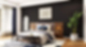
- The One Decision That Changes Your Entire Bedroom
Bedrooms are one of those spaces that look deceptively simple online. A bed, two lamps, a throw casually draped as if no one has ever actually slept there. Calm, curated, slightly smug. Real bedrooms are a bit different. They’re where clothes end up when you’re too tired to deal with them. Where lighting is either too bright at night or completely useless in the morning. Where the layout sort of works… but also doesn’t. And where, despite your best intentions, something always feels slightly off. It’s rarely because you need more stuff. It’s usually because one key decision wasn’t quite right to begin with. If you get that one right, everything else falls into place much more easily. If you don’t, you can keep styling and tweaking forever without really fixing the problem. Here are the decisions that actually change how your bedroom looks and feels. The Bed Placement (This Is The Big One) If your bedroom layout feels awkward, nine out of ten times it comes down to where the bed sits. The bed is the largest piece in the room. It dictates circulation , balance, and what your eye lands on first. Yet it’s often placed wherever it “fits”, rather than where it works. Look at it properly. Bed placed where it 'fits' - not where it looks good Is the bed anchored on a solid wall, or is it floating in a way that makes the room feel unsettled? Are you able to move around it comfortably, or are you squeezing past it every day? Does it align with the natural focal point of the room, or is something else unintentionally stealing attention? Sometimes shifting the bed by half a metre or moving it to a different wall changes everything. Suddenly, the room feels calmer. More logical. Like it’s been thought through. It’s the least glamorous change, but often the most effective one. The Headboard (Or Lack Of One) A bed without a headboard can work. But more often than not, it just looks unfinished. The headboard is what visually grounds the bed. It gives it presence. Without it, even a well-made bed can feel a bit temporary, as if you’ve just moved in and haven’t got around to finishing things yet. That doesn’t mean you need something oversized or overly styled. It does mean paying attention to scale and material. Too small, and it disappears. Too thin, and it lacks impact. Too trend-driven, and you’ll be over it before you’ve even worn in your bedding. A good headboard does not shout for attention, but it holds the whole room together. Once it’s right, you’ll notice you need far less decoration elsewhere. Bedroom Lighting That Works For Real Life Bedroom lighting is one of the most overlooked parts of a space, and one of the quickest ways to make a room feel either uncomfortable or considered. The standard setup is familiar. One central ceiling light and two bedside lamps that look nice but don’t actually do very much. It works on paper. In reality, it rarely does. Think about how you actually use your bedroom. Think about how you actually use your bedroom. You read in bed. You get dressed when natural light isn’t quite there yet. You want the room to feel softer in the evening, not like a dentist’s office. Layered bedroom lighting makes all the difference here. A mix of ambient light, practical bedside lighting, and one softer, indirect source changes how the room feels throughout the day. It also means you stop relying on one harsh overhead light for everything, which is usually the main culprit behind a bedroom that never quite feels right. Bedroom Curtains That Change The Room Curtains are often treated as an afterthought. They shouldn’t be. They influence light, acoustics, and how finished a bedroom feels. And yet, they’re frequently the thing that is just slightly off. Too short. Hung too low. Not wide enough. Or made from fabric that doesn’t quite suit the room. Full-length bedroom curtains, hung higher and wider than the window, can completely change the proportions of a space. The ceiling appears taller, the window feels more generous, and the room gains a softness that blinds alone rarely achieve. It’s one of those decisions that seems small, but has a noticeable impact every single day. One Element That Carries The Room There’s usually a moment when a bedroom tips from “this is fine” to “this actually feels like mine.” And it’s almost never because of ten perfectly styled accessories. It’s because of one thing that anchors everything else. You notice it straight away when you walk into a space. Some bedrooms are technically well put together. Nice colours, decent furniture, nothing wrong with them. But your eye doesn’t land anywhere. It just moves through the room and out again. Then there are rooms where your attention settles almost immediately. Not in a dramatic way, but in a way that makes the space feel grounded. Intentional. That one element does a lot of the work. It might be a large piece of artwork above the bed that finally feels in proportion, instead of something a bit too small that looks like it’s trying its best. Or a vintage rug that brings depth and character, even if it’s not perfectly colour-matched. Sometimes it’s a chair that actually earns its place. Not the one that collects clothes, but one that invites you to sit down for a moment. To read something. Or at least pretend you might. And sometimes it’s simply a colour that carries through the room in a way that feels deliberate. Not overdone, not themed, just enough to tie everything together. Without that element, a bedroom can feel like a checklist was completed. Bed, bedside tables, lamps, done. With it, the room has a point of view. It feels considered, rather than assembled. Why Small Fixes Rarely Work If your bedroom has been bothering you for a while, there’s a good chance you’ve already tried to fix it. A new set of cushions. A different throw. Maybe a plant that seemed like a good idea at the time, and then disappeared when it turned out that corner gets no light at all. Each change feels like it should help. And for a moment, it does. But then the room settles back into that same slightly unresolved feeling. That’s usually the point where people assume they just haven’t found the right accessories yet. In reality, it’s rarely about adding more. In reality, it’s rarely about adding more. Most of the time, the issue sits in the decisions that shape the room from the start. The bed might be slightly off in its placement, which makes everything else feel like it’s adjusting. The lighting might still be working against you, so the room never quite feels right in the evening. The curtains might be cutting the wall in half instead of framing it. No amount of styling can compensate for that. Once those bigger decisions are right, everything else becomes easier. You’re no longer trying to fix the room. You’re building on something that already works. And that’s when a bedroom starts to feel different. Not fuller, not more decorated, but simply more resolved. More like somewhere you actually want to be.