5 Surprising Shades Turning Up in Trendy Kitchens This Year
- Evelyn Long

- Feb 5
- 4 min read
While all-white kitchens have been a staple in home design blogs and magazines for the last decade, trends are shifting away from this classic, clean look. Many homeowners are moving away from these “safe” neutrals, choosing shades with more warmth, personality and joy for the heart of their home. Here are the surprising and exciting colors taking over trendy kitchens this year.

1. Earthy and Grounded — The Rise of Terracotta and Clay
Choose earthy tones like terracotta, rust and clay for your kitchen to create a welcoming, organic feel. They’re perfect for fostering a cozy, lived-in atmosphere that encourages gathering and conversation.
These shades also offer a solid base for biophilic designs, which focus on people’s innate need to connect with nature and life. A terracotta backdrop complements houseplants, natural light and other nature-inspired decor, creating a kitchen that feels both grounding and alive.

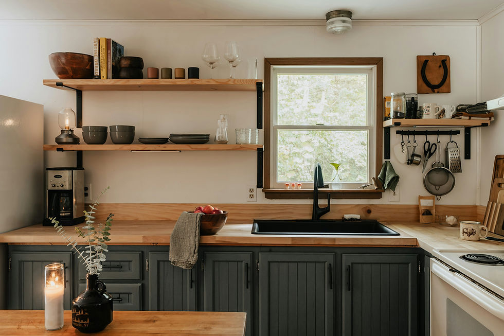
Terracotta, clay and other warm tones also shine alongside natural materials. Think beyond basic wood, and consider butcher block countertops, slate flooring, woven jute rugs, rattan light fixtures and countertops made of marble with earthy veins.
If you want to go big, you can use a matte terracotta on all lower or higher cabinets. For a subtler approach, consider installing a clay-colored backsplash or painting an accent wall with rustic hues.

2. Zesty and Daring — The Energy of Chartreuse and Ochre
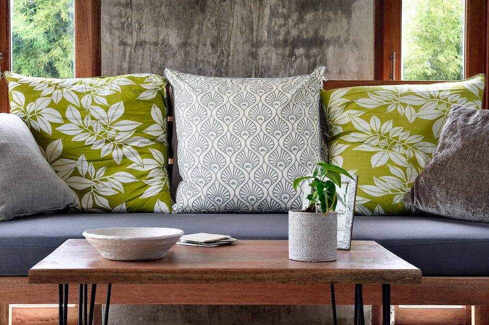
Make a statement with chartreuse and ochre. These bold hues are surprisingly versatile for injecting a high-design feel into kitchens. They can also make spaces feel more vibrant and inspiring, especially in the morning light.
Don’t just splash a zesty hue on all four walls — be strategic when integrating these yellow-green hues into your kitchen. Paint the interior of glass-front cabinets, choose a vintage-style refrigerator in an ochre shade or find bar stools with chartreuse upholstery. Use the colors in small doses or to create a focal point in the room.

These hues pop beautifully against neutrals. Imagine how a chartreuse backsplash can electrify a kitchen with sleek, charcoal gray cabinets. Similarly, a deep ochre island can add immense warmth and character to an otherwise all-white kitchen.
3. Bold and Vivacious — The Comeback of Red
Red is another surprisingly versatile and energetic choice. It feels both modern and classic, making it easy to blend into almost any kitchen style.
The shade of red you choose will dictate the space’s mood. A deep maroon or burgundy can create a sophisticated look, especially with dark hardwood floors. Meanwhile, fire-engine or bright cherry red lends a more playful, retro vibe.
Balance is key in keeping red from overwhelming the space. Pair red cabinets with calming, neutral elements like creamy off-white walls, light gray quartz countertops or a white subway tile backsplash.

You can also use the hardware to define the style. Polished chrome or nickel pulls can give red cabinets a sleek, contemporary look, while brass or bronze hardware can make them feel more classic and traditional.
4. Rich and Dramatic — The Allure of Inky Blues and Greens
Use dark, saturated colors like deep navy, forest green and even black to create drama, sophistication and a sense of intimacy. These shades can make your kitchen feel cozier, not smaller. In a large open-concept space, a moody green island can create a visual anchor and define the kitchen zone. In a smaller kitchen, it creates a rich, “jewel box” effect.
The finishes in the room are as important as the colors. A matte or eggshell finish on a dark blue cabinet provides a soft, velvety look that absorbs light and feels modern. On the other hand, a high-gloss finish adds drama, reflects light and feels glamorous.
Compatibility is also crucial. Consider pairing cool toned cabinets with stainless steel appliances to emphasize their modern feel. You can also create an elegant contrast with deep green cabinets and brushed gold or matte black hardware.

5. Soft and Dreamy — The New Take on Pastels
Today’s popular pastels — dusty rose, muted sage and soft lilac — are more subdued and sophisticated compared to the sugary hues of the past. They evoke feelings of tenderness and optimism, making kitchens feel light, airy and genuinely welcoming.
To keep the look contemporary, use these pastels on clean, simple cabinet styles like shaker or flat panel. You can use them on all the shelves for a dreamy, uniform look or just on uppers to draw the eye upward and make the room feel taller.
These soft hues pair beautifully with natural and refined materials. Think oak and other light wood flooring, classic white marble countertops, and warm metal hardware in brass or copper to add a touch of luxe.

How to Choose the Right Shade for Your Kitchen
How do you pick the right color? Consider these tips to choose hues for your kitchen you’ll love for years to come:
Analyze your light: North-facing rooms often have cool, blueish light that can make colors appear duller, making warmer shades ideal for them. Meanwhile, south-facing rooms typically get bright, intense light all day, making colors appear more vibrant.
Test the colors: Never choose a color from a small paint sample. Paint a large poster board with one you’re thinking of, and move it around the room at different times of the day to see how it changes with the light.
Consider the flow: Look at the colors in the adjacent rooms. Ideally, your kitchen should feel cohesive with your home’s overall palette, either by completing the nearby shades or providing a deliberate, pleasing contrast.

Your Kitchen, Your Canvas
The future of kitchen design is more vibrant, personal and expressive than ever before. Why not embrace the trend to make your kitchen feel more lived-in? Get creative with its palette and experiment with various color combinations.
You don’t need to paint walls or invest in new appliance sets to implement your new scheme. Start small with an accent or test colors. Find the perfect fit for your space and lighting with thoughtful color choices.


