
Chartreuse Is the Color You Didn’t Know You Needed in Your Home
- Evelyn Long

- Jun 12, 2025
- 5 min read
Updated: Feb 23
If you’ve been scrolling through Instagram or flipping through design magazines lately and noticed an electric pop of yellow-green stealing the spotlight, you're not alone. Chartreuse is having a serious main character moment in 2025, and your home might just need it too.
This vibrant hue is equal parts bold and playful, straddling the line between lime green and sunny yellow. It’s not quite neon, not quite pastel — it’s somewhere delightfully in-between, and it brings energy, warmth and a whole lot of personality to any room. While chartreuse isn’t exactly new to the design world, its recent comeback is hard to ignore.
Why Is Everyone Suddenly Obsessed With Chartreuse?
There’s always a handful of standout colors each year — and in 2025, chartreuse is definitely one of them. Part of its popularity comes from a broader shift in interior design — a move toward bolder, more expressive color palettes. After years of beige, greige and millennial pink, homeowners are craving something with personality. Enter chartreuse — a shade that practically vibrates with life.
Even trendsetters like Kylie Jenner have embraced chartreuse, incorporating the bold hue into her home’s fashion-forward aesthetic. Take her bathroom, for example — a chartreuse shower stall with a quirky circular cut-out adds instant personality, especially when paired with deep wood paneling.

She’s also mixed chartreuse with hunter green arches and glossy cobalt tiles, showing just how fun and fearless this color can be when you’re not afraid to get creative.
Fashion also plays a big role in color popularity. Chartreuse has dominated runway collections from Balenciaga to Bottega Veneta, and as we know, fashion trends often trickle down into home décor. The result? A growing love affair with a color that used to be considered “risky,” but now feels like a must-have.

So, What Is Chartreuse, Really?
Chartreuse sits somewhere between yellow and green — think of the zing of a lime wedge or the glow of a tennis ball, but dialed down to something more luxe and livable. It gets its name from the French liqueur of the same name and evokes feelings of freshness, energy and vibrancy.

Because chartreuse is a high-energy color, it often acts like visual caffeine — it perks up a room the second you use it. But when paired with the right colors, it can also feel calming and botanical. That duality makes it a powerful tool in your design toolbox.
How to Use Chartreuse in Your Home Without Going Overboard
You don’t have to repaint every wall to join the chartreuse party. Here are smart, stylish ways to bring this bold hue into your home.
Make a Statement With a Chartreuse Accent Wall
Want instant drama? A single chartreuse wall in a neutral room turns the entire vibe up a notch. If you’re planning to bring this vibrant color into your own home, a bold wallpaper in chartreuse tones can make an incredible statement.
Before starting your project, try this free wallpaper roll estimator - it helps you calculate exactly how many rolls you’ll need, so your accent wall looks seamless and professionally finished from the start.
Use chartreuse in spaces where you want high energy, like a home office, kitchen or entryway. Pair it with soft whites, muted grays or charcoal blacks to let the color shine without overwhelming the space.
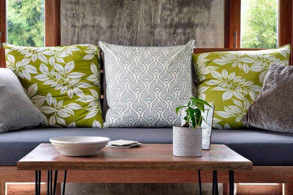
Swap in Some Chartreuse Soft Goods
Not ready to commit to paint? No problem. Pillows, throws, curtains and rugs are all great places to experiment. A set of chartreuse velvet cushions on a cream sofa? Instant modern glam. This approach is renter-friendly and easy to swap out if you ever crave a change.

Add a Pop With Chartreuse Furniture
If you're feeling a little daring, consider a single piece of furniture in chartreuse. Think vintage armchairs, velvet ottomans or even kitchen barstools. Because the color is so eye-catching, one piece is usually all you need to elevate a room.
If you want to achieve that high-end look without it feeling overwhelming, check out the curated collections at Nolan Interior, as their pieces provide the perfect neutral base or bold statement needed to anchor such a vibrant color, with cushions, for example.

Go Bold in the Kitchen
Chartreuse cabinetry might sound wild, but it works. Paired with white or wood countertops, it creates a retro-modern look that feels fresh and energizing. If full cabinets are too much, consider chartreuse backsplash tiles or even small appliances in the shade.
Use Chartreuse in Art and Accessories
This is the easiest and most accessible way to add the color to your space. A chartreuse abstract painting, a vase or even a sculptural lamp can tie a whole room together. These little touches often have the most significant impact.
Try It Outside
Chartreuse is more than just for interiors — it can liven up the outside of your home, too. A chartreuse front door, planter, or trim adds instant personality when paired with siding in soft neutrals or earthy tones. It also plays well with popular roof colors like charcoal, black or even clay-toned shingles. Just make sure to consider homeowners association rules, if any, before making bold changes.

What Colors Pair Well With Chartreuse?
Chartreuse plays surprisingly well with others. Here’s how to balance it:
Neutrals: White, beige, taupe and black help ground chartreuse and let it shine without feeling chaotic.
Blush and soft pinks: These create a chic, fashion-forward palette that feels modern and romantic.
Navy or indigo: Deep blues contrast beautifully with chartreuse and create a rich, balanced look.
Terracotta and earth tones: These warm up the space and add depth, giving off a slightly boho vibe.
Metallics: Gold, brass or chrome add a luxe finish to chartreuse-forward rooms.

Less Is More: The Art of Balance
Chartreuse makes a statement, which means a little goes a long way. Overdoing it can make your space feel like a tennis court. The trick is intentionally using it as a focal point or a fun surprise. Use the 60-30-10 rule from design theory — 60% of your room should be a dominant color, 30% a secondary color and 10% an accent (hello, chartreuse!).
Why Chartreuse Might Actually Boost Your Mood
Colors aren’t just pretty — they affect how we feel. According to color psychology, green hues are linked to harmony and peace. Yellow tones are associated with optimism and cognition. Combine the two, and you’ve got a color that can lift your spirits, boost creativity and even help with focus. It’s like a daily dose of sunshine for your brain.
Where Not to Use It (Yes, There Are Limits)
While chartreuse can be stunning, it’s not for every room. Avoid using large amounts in places for rest and relaxation, like bedrooms, unless paired with lots of calming neutrals or soft textures. It might also be too stimulating for nursery spaces unless used sparingly.

Ready to Try Chartreuse?
You don’t have to overhaul your entire home to get in on this color trend. With its electric yet elegant vibe, chartreuse is the kind of bold decision that pays off in personality. Whether you're splashing it on a statement wall or sneaking it in through throw pillows, this underrated hue can refresh your space and elevate your design game.


