
Color Capping Is the New Way to Add Depth and Dimension to Your Walls
- Evelyn Long
- Nov 26, 2025
- 6 min read
Color capping has quietly been climbing the design charts, and it’s finally getting the attention it deserves. It’s the kind of trend that gives your rooms an instant sense of intention without a complicated makeover.
If you’ve ever wanted your walls to feel a little more sculptural, more architectural or simply create interest, color capping is a technique worth exploring.
Discover everything you need to know before you start capping your vertical spaces with various shades, how to use the technique and how it measures up to the biggest paint trends of the past few years.

What Is Color Capping?
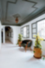
Color capping is a paint technique that creates a chromatic layer at the top or bottom of a room. Think of it as a chromatic band, usually darker than the walls, that runs across the ceiling and slightly down the upper portion of the vertical surfaces. This cap adds instant depth, gives the space polish and the contrast draws the eye upward, making it much more dynamic.
Designers love this trend because it frames the room without installing actual trim or molding. The darker hue at the top creates dimension, while the lighter surfaces below keep the space from feeling heavy.
It works in small areas, large spaces and with low and tall ceilings because it changes the visual proportions rather than the physical ones.
The effect can be cozy, dramatic or contemporary, depending on the tones you choose.

How Can You Bring Color Capping Into Your Home?
You can approach this aesthetic in multiple ways. Base your decisions on the architecture and the mood you want to create.
Cozy Enclosures and Capping Walls
This method extends the ceiling color down onto the walls by about 12 to 24 inches. It creates a soft, cocoon-like feel and makes tall ceilings appear friendlier. It also works well in wide or open spaces that need warmth and visual grounding.
Use this approach in bedrooms, libraries, dens and living areas where you want atmosphere over airiness. A darker cap paired with mid-tone surfaces gives you depth without overwhelming the space.
A lighter cap may enhance the appearance, blending the walls seamlessly into the ceiling without creating a visual barrier. It’s perfect for spaces with unique molding on the ceilings and light fixtures.
The natural light in the home will affect the appearance of your color swatches. In rooms with ample sunlight, warmer shades work well. Well-lit areas that lack natural sunlight, such as those with frosted windows, benefit from calm and cooling tones like sage green and violet blue.

Fifth Wall Statement and Capping the Ceiling
If the idea of color stretching down the walls feels too bold, cover only the ceiling. Designers refer to the ceiling as the “fifth wall,” and this technique gives it the attention it rarely gets.
This method keeps the vertical aspects crisp and bright while putting the contrast above you. It’s perfect when you want a pop of character but need your vertical space to stay open. It also pairs beautifully with crown molding, coffered ceilings and statement light fixtures.
Architectural Accent and Highlighting Features
Tonal banding doesn’t have to be room-wide. If you have architectural details, such as beams, tray ceilings, alcoves or dropped soffits, you can cap only those elements. Treating these features in a darker shade draws attention to them and creates natural contrast.
This version works well in contemporary homes, lofts or older homes with original detailing that deserves to stand out.
How Does Color Capping Compare to Other Paint Trends?
Adding layers of color to your walls fits into the growing category of “architectural paint tricks,” techniques that rely on color placement rather than structural change. Here’s how it compares to other big trends.
Color Drenching
When you use this technique, you wash the entire room, walls, floor and ceiling, in a single shade. It’s dramatic and monochrome. A two-tone upper wall plays with contrast and layering. You still get an impact, but it retains separation between surfaces.
If you like the idea of a bold, unified feel but want a little more breathing space, color capping is the more flexible and long-term sustainable approach.

Accent Wall
Feature or accent surfaces have dominated for years, but designers now favor treatments that feel more integrated. Instead of highlighting one wall, color capping draws attention upward across the entire room. It creates flow rather than a single focal point.
It’s a subtle evolution that feels more custom and current.
Textural Finishes
Limewash, Roman clay and plaster finishes add movement through texture. A crown-level treatment achieves its dimension through contrast. It’s ideal if you want depth without the cost or upkeep of textured techniques or if you prefer clean lines over organic finishes.

What Are the Perfect Paint Colors to Use?
Choosing the right shades is the key to making tonal bands feel intentional rather than accidental. Here’s how to simplify the process.
Use related tones: Choose colors from the same paint strip or the same tonal family. A lighter wall paired with a deeper cap creates a cohesive and polished look.
Match the mood: Warm tones create intimacy. Cool tones open up a space. Earthy neutrals lend subtle sophistication, while high-contrast pairings convey a modern and graphic feel.
Test in different lighting conditions: Color changes in various light qualities. Natural daylight shows the most natural hue, while incandescent and fluorescent lights alter the tonal qualities. Consider that what you see in the hardware store may not look the same in your home, so using sample swatches is essential.
Balance your palette: Even bold caps look best when the rest of the palette feels organized. Many designers still follow the 60-30-10 principle to maintain color harmony in rooms. It’s simple and it works across styles. To achieve this, reserve 60% of the space for your most dominant tone, which is usually not the darkest shade. Split 30% between the two main accents and add a pop of pigment with the remaining 10%.

What Styles are Color Capping Good For?
Tonal capping works well if you’re drawn to design details that stand out without overwhelming a room. You might like it if you enjoy warmth, architectural character or moody lighting in the evenings. It also suits anyone who appreciates contrast but doesn’t want to repaint an entire interior in a saturated hue. The trick is subtlety.
If your home leans toward a modern, transitional, or eclectic style, the technique blends in easily. Traditional homes also benefit, and a deep navy cap in a dining room or a rich olive on a library ceiling adds old-world charm without the need for heavy wood paneling.
Can You Keep a Color-Capped Room Feeling Cohesive?
A color-capped room can absolutely feel cohesive, especially since the cap creates a defined line, and the rest of your decor can support it. A few practical guidelines can help avoid clutter and visual disconnection.
When choosing your palette, try to:
Repeat the cap color: Add touches of the ceiling shade in pillows, art frames and small accessories. It connects the upper and lower halves of the venue.
Keep patterns strategic: Large-scale or high-contrast patterns can pull attention away from the cap. Choose patterns that echo the hues in your palette, and place the boldest ones lower in the room on sofas, rugs or bedding, so the upper colors still feel intentional.
Use lighting to enhance the effect: Warm bulbs soften darker hues. Cool bulbs make them appear crisper. Even small adjustments can change how defined the top band looks.
Are There Color Capping Dos and Don’ts?
You’ll find some guiding principles and laws that apply to all styles and trends. When you start capping, keep the following in mind.
Dos | Don’ts |
Use high-quality painter’s tape for a clean cap line. | Skip rework or rush the taping, or uneven edges will ruin the effect. |
Choose related tones so the palette feels cohesive. | Pair colors with clashing undertones that compete. |
Consider your ceiling height and how the band will shift proportions. | Assume darker caps always make spaces feel smaller, as placement matters more. |
Bring the cap into your decor through textiles or accents. | Leave the cap floating without any repetition. |
Test samples in morning and evening light to see undertones. | Rely on the swatch alone without seeing it in your home. |
Why Color Capping Works
Color capping shifts your attention upward. Instead of looking at four bare walls, your eye meets structure, contrast and unexpected design moments. It’s a simple trick that instantly makes a room feel more considered, and it gives your home personality without requiring new furniture or construction.
Whether you keep the palette soft or go bold on the ceiling, the technique brings depth, shape and subtle sophistication to any space. If you’re ready to add dimension without overwhelming your space, ceiling accenting is a creative and easy way to go.

