Using Color in Unexpected Ways for Original Designs: With Tips from the Pros
- Evelyn Long

- 2 days ago
- 4 min read
Color shapes the mood, personality and character of every room. Today's interiors move far beyond the traditional accent wall, embracing bold combinations, surprising placements and creative details that feel deeply personal. With a little curiosity and a willingness to try something new, you can create spaces that feel distinctive, inviting and uniquely yours.

With a little curiosity and a willingness to try something new, you can create spaces that feel distinctive, inviting and uniquely yours.
1. Commit to a Single Color Family for a Layered Look
One of the most creative ways to use color is to narrow your palette rather than expand it. Instead of filling a room with several contrasting shades, decorate with multiple tones from a single color family.
Green can promote relaxation naturally, making it a good option for a bedroom. You could feature sage walls, olive upholstery, emerald accessories and forest-green accents. The combination of different tones of the same family color helps create visual harmony, depth, and visual interest while maintaining a cohesive look. Variations in value and saturation can naturally create contrast, even when the hues remain closely related.
Apartment Therapy also notes that thoughtfully layered colors add richness to interiors. If you need inspiration, explore bedroom palettes that combine several shades of one hue. Dusty blues, warm terracottas and soft greens create calming spaces filled with subtle dimension.

2. Add Unexpected Color Inside Closets and Drawers
Homes & Gardens identifies unique details as one of the strongest interior trends for 2026. People are moving toward homes that feel more personal and lived-in. Some of the most memorable design moments may remain hidden until you open a door or drawer. Vibrant closet interiors, colorful pantry shelves and painted dresser drawers introduce personality in surprising ways.
These elements may become moments of joy in everyday life. Imagine opening a wardrobe lined in coral, reaching into a mustard-yellow dresser drawer or discovering bright teal shelves inside a cabinet. This approach allows you to experiment with saturated shades, playful patterns and dramatic jewel tones while adding charm to everyday routines.
Closets and drawers also provide an easy place to test colors before using them in larger areas of your home.

3. Rethink Window Trims and Frames With Unexpected Colors
Window trims often blend into the background, yet they can dramatically influence a room's atmosphere. A carefully chosen trim color draws attention to views, complements furnishings and strengthens the room's overall palette.
Warm terracotta trims enhance garden views, while deep navy frames create crisp contrast against light walls. Contemporary homes frequently feature black, bronze or deep green window trims to emphasize architectural lines. You can also paint door frames in bold shades while keeping the doors themselves neutral, turning ordinary transitions into standout design features.

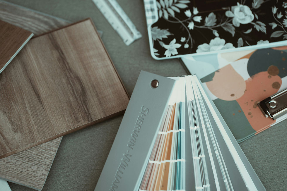
Paint selection plays a major role in the success of these projects. Different paint formulations influence durability, stain resistance, cleanability and long-term appearance. Water-based latex paint formulas are easy to clean, making them ideal for doors and trim. Durable enamel and specialty furniture paints help high-use pieces withstand everyday wear and tear.
4. Look Up and Paint the Ceiling
The ceiling is among the most overlooked opportunities for original design. Designers increasingly refer to it as the "fifth wall" because color overhead can transform a room's mood. When you approach design thoughtfully, “ceilings can elevate a space, enhancing its character with added height, texture or whimsy,” said designer Jackie Ho to Good Housekeeping.
A blush ceiling introduces warmth to a neutral bedroom, while a rich plum ceiling creates intimacy in a dining room. Soft blue overhead can evoke the feeling of an open sky, bringing a sense of calm to living areas.
Coordinating walls, trim and ceilings in related shades creates immersive, cocoon-like interiors that feel intentional and sophisticated. If you want a subtle introduction to ceiling color, begin with a shade just slightly deeper than your wall color.

5. Transform Furniture Into Functional Art
Furniture offers another canvas for creative color. Refreshing an existing piece often delivers more personality than purchasing something new. A vintage dresser painted cobalt blue, dining chairs finished in complementary jewel tones or a coral coffee table can quickly become the focal point of a room.
Designer Laura U highlights the versatility of jewel tones, explaining that although these colors can be intimidating at first, “Interior design is all about balance and foils.” Thoughtful color choices paired with the right finish allow furniture to function as both practical storage and artistic expression.

6. Mix Warm and Cool Colors Intentionally
Combining warm and cool colors often produces interiors with exceptional depth and balance. The key lies in using color temperature strategically. Pair warm terracotta with cool sage green, soften crisp blues with burgundy accents or energize gray spaces with mustard tones. These combinations create contrast while maintaining harmony.

Rooms with northern exposure benefit especially from thoughtful colors. Design experts at Whispering Bold recommend soft greiges, chalky warm whites, muted taupes and earthy neutrals since they can adapt better to the cooler, softer daylight of north-facing spaces. Soft taupes and muted blush shades also help balance cooler natural light and create a welcoming atmosphere.
Warm colors make rooms feel cozy and intimate, while cool colors foster calm and spaciousness. You can choose one dominant temperature and introduce accents from the opposite family to create balance. This approach keeps rooms visually engaging while preserving a cohesive overall design.

7. Use Color to Tell Your Story
The most original interiors often begin with personal experiences rather than trends. Colors connected to meaningful memories create spaces that feel authentic and memorable. A favorite vacation might inspire sea-glass blues in a bathroom. Family memories could shape a palette of lavender, moss green and soft floral tones.
Artwork, treasured textiles or beloved travel destinations can also guide your color choices. When your color palette reflects your experiences and interests, every room gains character and emotional resonance.

Designing Outside the Lines
Memorable interiors emerge when you approach color with curiosity and confidence. A painted ceiling, colorful trim or boldly refinished piece of furniture can transform familiar spaces into something extraordinary.

Experiment with unexpected placements, trust your instincts and allow your personal experiences to guide your choices. Through thoughtful color decisions, your home can become a creative reflection of who you are.