SEARCH RESULTS
319 results found with an empty search
- Indoor-Outdoor Living: Top Tips for the Ultimate Lifestyle
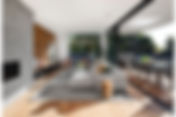
Imagine waking up each morning to a gentle breeze drifting through your bedroom, carrying the sweet scent of your garden inside. Or picture yourself cooking dinner while enjoying the view of a starlit skyline through floor-to-ceiling glass doors. This seamless blend of interior comfort with the beauty of nature is what indoor-outdoor living is all about. As renowned Michael Bell Sydney residential architects state: " When designing spaces that blur the line between indoors and out, it’s all about creating a seamless connection. Large, retractable glass doors, natural materials, and thoughtful landscaping can transform your home into an expansive living environment where nature and architecture work in harmony. It's not just about bringing the outdoors in, but also about making the outdoors feel like an extension of your home .” It is a lifestyle choice that is gaining popularity, and I am here to guide you through creating that perfect balance between your home's interior and the great outdoors. Indoor-outdoor modern living breaks down the barriers of traditional home design, encouraging a flow between the inside of your home and your outdoor living space. It's more than just having a nice garden; it's about creating a cohesive environment where the transition from your living room to your patio is almost imperceptible. The Concept of Indoor-Outdoor Living The essence of indoor-outdoor living lies in creating a living space that is not confined by walls. It's about opening up your home so that the outdoors becomes an extension of your indoor living area. The concept is rooted in the idea that our living spaces should enhance our connection with nature, promote well-being, and provide a sanctuary that is both restful and invigorating. Embracing indoor-outdoor living means designing versatile spaces, where the boundaries between inside and outside blur. Large glass doors and windows, sheltered patios, and the strategic use of materials and textures all play a role in crafting a home that celebrates the outdoors no matter what the season. The charm of this concept is that it can be adapted to any lifestyle, whether you are in a bustling city apartment with a balcony or a sprawling country house with acres of green. Benefits of Indoor-Outdoor Living The benefits of indoor-outdoor living are numerous, touching upon aspects of health, entertainment, and even the value of your property. Firstly, it promotes a healthier lifestyle. Greater exposure to natural light has been shown to improve mood and increase productivity. The easy access to an outdoor area encourages more frequent outdoor activities, which is beneficial for both physical and mental health. From a social perspective, homes designed with indoor-outdoor living in mind are fantastic for entertaining. They allow for larger, more fluid gatherings, with guests able to move easily between the comfort of the indoors and the freshness of the outdoors. Another advantage is the aesthetic appeal; such homes often feel more spacious and luxurious, which can significantly increase property values. Incorporating Plants into Your Indoor-Outdoor Living Space The Role of Plants in Indoor-Outdoor Living Plants are the heart and soul of any indoor-outdoor living space. They not only provide a visual connection between your indoor and outdoor areas but also improve air quality and add to the overall tranquillity of your home. When choosing plants, consider those that can thrive in both indoor and outdoor conditions to maintain a consistent theme throughout your living space. Choosing the Right Plants for Your Space Selecting the right plants for your indoor-outdoor living space is crucial. For indoor areas, look for species that can tolerate lower light levels, such as peace lilies or snake plants. For the outdoor part, choose plants that complement your home's architecture and can withstand the local climate. If you have a small balcony, opt for container-friendly plants like herbs or succulents, which are easy to care for and add a touch of greenery without requiring much space. Creating a Cohesive Plant Layout Creating a cohesive plant layout involves more than just placing a few potted plants around your home. It's about creating a visual flow that guides the eye naturally from indoors to outdoors. Use similar or complementary planters to create a sense of unity. Group plants in clusters to form a more impactful visual statement and consider the height and structure of the plants to add depth and interest to your layout. Garden Designs for Indoor-Outdoor Living Planning Your Garden Layout When planning your garden layout, consider how it will be viewed from the inside of your home. Aim for a design that draws the eye outward, creating a compelling and inviting view. Incorporate elements like paths or water features that can be seen from your indoor living areas, providing a visual and auditory connection to the outdoors. Choosing Garden Features That Complement Your Home The features you choose for your garden should complement the interior design of your home. If your home has a modern aesthetic, consider minimalist garden designs with clean lines and structured plantings. For a more traditional home, you may opt for a classic garden with lush flowerbeds and ornate details. Regardless of style, aim for harmony between your indoor and outdoor spaces. The Importance of Lighting in Your Garden Design Lighting plays a pivotal role in garden design, especially for indoor-outdoor living. It can create ambience, highlight features, and extend the usability of your outdoor space into the evening. To add depth and interest, use a mix of lighting types, such as spotlights, fairy lights, and lanterns. Ensure that the outdoor lighting complements the interior lighting to maintain a unified look. Interior Design Principles for Indoor-Outdoor Living Maximising Natural Light To truly embrace indoor-outdoor living, maximising natural light is essential. Consider installing skylights, large windows, or bi-fold doors to flood your interior spaces with sunlight. Not only does this connect you with the outdoors, but it also helps to make your rooms feel larger and more open. Using Materials That Transition Well Between Indoors and Outdoors The materials you choose should transition smoothly between your indoor and outdoor spaces. Natural materials like wood, stone, and slate can be used in both areas to create a sense of continuity. When selecting furnishings, opt for pieces that could easily belong indoors or outdoors, further blurring the lines between the two. Creating Flow with Open Plan Living Open-plan living is synonymous with indoor-outdoor living. Removing walls and barriers allows for uninterrupted flow between spaces. This openness encourages social interaction and creates a more flexible living environment. When designing an open-plan space, it's important to define areas with furniture placement and area rugs, maintaining a sense of order within the open layout. Interior Decorating Tips for Seamless Indoor-Outdoor Living Selecting a Harmonious Colour Palette A harmonious colour palette creates a seamless transition between indoor and outdoor living spaces. Choose colours that are inspired by nature and present in both your interior and exterior design. Soft greens, earthy browns, and sky blues are excellent choices that reflect the natural world and promote cohesion. Incorporating Textures and Fabrics Suitable for Both Environments Textures and fabrics play a significant role in uniting indoor and outdoor spaces. Opt for durable, weather-resistant fabrics for outdoor furniture that could also look at home indoors. Use similar textures, such as wicker or rattan, in both areas to tie the spaces together visually. Accessorising to Enhance the Indoor-Outdoor Experience Accessories can greatly enhance the indoor-outdoor experience. Consider adding elements like outdoor rugs, cushions, and throws that could just as easily belong in your living room. Mirrors can also be used outdoors to reflect greenery and light, further integrating the two areas. Remember to choose accessories that can withstand the elements while still complementing your interior décor. Top Products for Enhancing Indoor-Outdoor Living Innovative Sliding or Folding Door Systems One of the top products for enhancing indoor-outdoor living is innovative sliding or folding door systems. These doors provide the flexibility to open up entire walls, creating a clear and expansive passage between the interior and exterior of your home. When selecting a system, look for one with a low threshold to minimise tripping hazards and maintain a level transition. My own indoor outdoor living space with sliding doors Outdoor Heating and Cooling Solutions To make the most of your indoor-outdoor living space throughout the year, consider investing in an efficient outdoor heating unit and cooling solutions. Outdoor heaters can extend the usability of your space into the cooler months while misting fans or shade structures can make hot summers more bearable. Choose options that blend in with your décor and provide comfort without being obtrusive. Durable and Stylish Outdoor Furniture Outdoor furniture has come a long way in terms of style and durability. Look for pieces that are not only weather-resistant but also reflect the design sensibility of your indoor furnishings. Modular seating, extendable dining tables, and outdoor loungers can provide the comfort and functionality you need while also acting as an extension of your home's style. Garden Pods: Your Flexible Outdoor Living Retreat For those looking to extend their living space without major renovations, a garden pod is a smart and stylish option. These compact, insulated structures are perfect for creating a private workspace, yoga studio, guest room, or relaxation nook—just steps from your back door. A garden pod allows you to enjoy the benefits of indoor comfort while staying connected to nature, making it a fantastic solution for year-round indoor-outdoor living. With sleek designs and minimal installation hassle, it’s a fast way to enhance both the function and value of your outdoor space. To elevate your outdoor retreat even further, consider pairing your garden pod with one of the best barrel saunas for the ultimate relaxation experience. These saunas not only complement the natural aesthetic of your garden but also provide a rejuvenating wellness escape right at home. Create Your Ultimate Indoor-Outdoor Lifestyle Experience Crafting your ultimate indoor-outdoor lifestyle experience is an exciting journey. It's about blending the comfort and style of your interior with the freshness and freedom of the outdoors. By incorporating the right plants, garden designs, interior design principles, and decorating tips, you can create a space that not only looks beautiful but also enhances your quality of life. Remember to select products that will withstand time and weather, as these will be the backbone of your indoor-outdoor living space. And don't forget to personalise – this is your haven, a reflection of your taste and lifestyle, so infuse it with elements that bring you joy. I hope this blog has inspired you to explore the endless possibilities of indoor-outdoor living. Whether you're starting from scratch or looking to improve your existing space, there's always room to bring more of the outdoors in and take the indoors out. So, roll up your sleeves, let your creativity flow, and start making your indoor-outdoor dream a reality.
- French Doors or Folding Doors? How to Pick
When planning how to connect your indoor and outdoor spaces, the decision often comes down to three main contenders: French doors, folding (bifold) doors, and sliding doors. Each has its strengths – aesthetically and functionally – but choosing the right system involves far more than just picking what looks nice in a showroom. From door swing to threshold height, panel stacking to insect protection, this guide unpacks the key things to consider before making a decision. I’ll also share what I chose for my own home – and what I would do differently next time. Understanding the Main Door Types French Doors Two hinged doors that swing open from the centre, typically outwards. French doors are often used in smaller openings and suit traditional or cottage-style homes. They’re relatively simple to install and have an enduring charm. Pros: Symmetrical appearance Easy to operate Good for ventilation Compatible with fly screens Generally more affordable Cons: Only suitable for smaller openings Framing interrupts views Limited wow-factor in open-plan spaces Folding (Bifold) Doors Multiple glass panels hinged together that slide and fold to the side. These systems can open up entire walls, making them ideal for maximising flow between inside and out. Pros: Fully openable wall for seamless connection Great for entertaining and open-plan living High impact visually Cons: Higher cost Can interrupt view when closed due to more framing Requires stacking space Not all systems support fly screens Sliding Doors Panels that slide over one another along a track. They offer large expanses of uninterrupted glass but don’t open as widely as bifolds. Pros: Clean, minimal sightlines Easy operation Works well in tight or windy areas Cons: Only partial opening (usually half the total width) Less ventilation flexibility What I Chose: A 4-Panel Folding Door with a Separate Traffic Door For our renovation, I chose a 4-leaf outward-opening bifold door system – made from wood. Initially, I had my heart set on steel-framed doors for their clean lines and timeless appeal. But in the end, I changed course for two reasons: the lead time was far too long, and I was concerned about steel’s tendency to transmit heat and cold – not ideal in a home where energy efficiency matters. Instead, I opted for timber frames and painted them black to create that same steel-look aesthetic, but with better thermal performance and more flexibility. Choosing wood gave me more room to adapt the sizing and incorporate details like the transom windows above, which wouldn’t have been as easily possible with rigid steel profiles. The doors open outward to avoid disrupting the interior layout, and I included a separate traffic door for daily access – highly recommended if you don’t want to swing open the entire system every time you step outside. Height, Weight and Why I Added Top Windows Initially, I wanted the doors to go as tall as possible to bring in more light. However, I quickly discovered that bifold panels can’t exceed around 2.4–2.5 metres in height without becoming prohibitively heavy. Beyond that, you’re looking at additional structural support, premium hardware and more labour – which wasn’t feasible in our case. Instead, we added fixed windows above the bifolds (also called transom or clerestory windows), which brought in the light I wanted without overloading the door system. It’s a neat solution if you’re facing height limitations, and aesthetically it helps avoid a stunted or chopped-in-half look. The One Thing I Missed: Insect Screens This is my biggest regret. I live in a region where warm days mean open doors – and unfortunately, open doors mean insects. I didn’t realise until too late that many bifold systems, especially those opening outward like mine, do not support integrated fly screens. Retrofitting them is tricky and often unsightly. If I were starting again, I’d prioritise a door system that could incorporate a flush, retractable insect screen – ideally one that slides across discreetly when needed and disappears when not. Credit: Homepoint Key Practical Considerations 1. Width and Height of Opening French doors suit openings up to around 2.2m Bifold systems can cover 4–7m or more Sliding doors are often ideal for openings around 3–5m For taller installations, consider transom windows if structural support is a concern 2. Panel Configuration and Opening Direction Bifold doors can be configured as all panels folding one way (e.g. 4+0) or split (e.g. 2+2) You can choose inward or outward opening – I chose outward to protect the indoor layout Think about where the panels stack when open, and whether they will obstruct furniture or pathways 3. Everyday Access (Traffic Doors) If you don’t want to open the entire bifold just to let the dog out, install a dedicated traffic door. These open independently like a normal door and make daily life much easier. 4. Ventilation and Use French doors and traffic doors are best for quick airflow. Bifolds and sliders tend to be all or nothing unless designed with partial opening in mind. If you like having the doors open just a crack, plan for this during selection. 5. Thermal Performance and Weather Sealing Low U-values (ideally 1.1 W/m²K or lower) Thermally broken frames (especially with aluminium) Multi-point locks and weather-resistant thresholds 6. Fly Screens Ask early whether the door system you’re considering can support integrated fly screens – especially if you live near water or in a buggy area. This detail is often overlooked. 7. Material Pros and Cons Timber : Natural insulation, aesthetic flexibility, easier to customise, but requires maintenance Aluminium : Sleek and strong, low-maintenance, but requires thermal breaks to avoid heat/cold transfer uPVC : Affordable and practical, but bulkier and not ideal for large openings 8. Threshold Design Flush thresholds provide seamless transition but may compromise weather resistance Raised thresholds offer better protection from rain and draughts 9. Glazing and Security Consider double or triple glazing, Low-E coatings, laminated glass for security Multi-point locking systems and anti-lift tracks provide peace of mind 10. Installation Tips Ensure frames are properly sealed and aligned – timber may need additional treatment Structural beams or lintels are often needed for wider openings Flooring must be levelled correctly for smooth operation Cost Comparison (Estimates) French Doors: €1,500–€3,000 / £1,300–£2,600 / $1,600–$3,200 Easier and cheaper to install Suitable for most homes with smaller openings 4-Panel Bifold Doors: €4,000–€8,000 / £3,400–£6,900 / $4,300–$8,600 Price depends on size, material, glazing, and brand Additional costs for installation, lintels, transoms, and custom thresholds Sliding Doors: €2,500–€6,500 / £2,200–£5,600 / $2,700–$7,000 Typically less complex than bifolds More frame visible when fully opened Final Thoughts If I were doing it again, I’d choose a system that allows for integrated fly screens. If you’re trying to create a seamless connection between indoor and outdoor living, the door you choose plays a crucial role in how the space feels – and functions – year-round. French doors are charming, functional, and affordable. Folding doors make a big visual impact and are ideal for large openings, especially if you want to create a real sense of openness. Sliding doors offer a sleek alternative but can limit access and ventilation. Personally, I love the light and openness my bifolds bring, and the outward-opening configuration was the right call for our layout. Choosing timber gave me control over the finish and sizing, and painting them black gave me the steel look I originally wanted – without the thermal or timing compromises. But if I were doing it again, I’d absolutely choose a system that allows for integrated fly screens.
- Magic of Small Touches: Recipe for an Inviting Home
Your home is your retreat — a sanctuary from the hectic and bustling world. Imagine coming home after a long tiring day at work to a warm, inviting space where you can snuggle up with a mug of coffee and relax and rewind. A cozy space doesn’t happen overnight. You need to plan and strategize many aspects of interior design to create a comfortable space. Luckily, it is entirely achievable to make your home a welcoming place with simple touches and a conscious effort. Here are some aspects you should consider in making your house cozy and inviting: Paint Colors One of the first things people who walk into your space notice is the color. If it is too vibrant, the room may feel overwhelming. If it is too muted, the space may feel bland. The trick is to choose the right colors to make your home cozy and pleasant. Colors that connect to nature evoke a sense of warmth and coziness. Choose an earthy palette with green or brown, or pick neutral tones, like rich camel or beige. Opt for lighter colors, like blue or pink, if you want brighter tones. Wallpapers Wallpapers play an essential role in making your room appear snuggly. An example is cottages with floral wallpapers. These evoke a sense of warmth, contributing to a welcoming feel. You can never go wrong with classic wallpapers with simple geometric patterns. In addition, consider nature-themed wallpapers like those with flowers, wood or forest prints. Also, look for classic damask patterns for added elegance and comfort, but in muted colors so they don't overshadow the rest of the room. For added intrigue, you can add wallpaper to your ceiling. If your walls have “heavy-design” wallpapers, opt for simpler and muted ones for the ceiling that match your lights. Fabric There are many types of fabrics you can incorporate into your space. Cotton and wool rule the comfort factor, as these fabrics instantly give a sense of coziness and relaxation. Cotton is also a safe choice as it is hypoallergenic , reducing skin reactions and respiratory issues. For a more elegant feel, choose silk or faux fur. These materials also provide a sensory experience, adding a welcoming aura. Blended fabrics are also functional choices for homes. Poly-wool, a hybrid of wool and polyester, combines wool’s softness with polyester’s resilience. It is usually used for blankets, sofa covers and curtains. Furniture Beyond the walls and ceilings, furniture is another aspect people look for in a cozy home. Having a cushy armchair or sofa inviting people to settle in right away is a must to make your space pleasant. If you have the budget, look for an oversized sofa and make it the statement piece of your space. These sofas are spacious enough for ample seating and lazing on, creating a snuggly feel. Living room @whisperingbold You can also upcycle old ottomans into stools to prop feet on by the sofa. Incorporate bookshelves and add some plants to make the space more welcoming. You can also add lamps that emanate warm light to give a comfy feel. Layout Strategically arranging your furniture and placing accessories is integral to making your room feel cozy. Consider arranging sofas to face each other and putting a rug and a coffee table in the middle to promote conversation. Place a seating area by the fireplace — perhaps facing it — for a warm atmosphere, especially during the cold months. Nothing spells coziness more than a reading nook or a perch by a bay window. Place seating on the sill and repurpose the space below to fit a bookshelf. You also can add a table and chairs by the window to make a breakfast perch where you can relax while watching nature. Pillows and Blankets Throw pillows and cushions are one of the easiest ways to ensure your space is comfortable and delightful. They are also rising in demand among homeowners, with the decorative pillow market projected to grow to more than $6 billion by 2032. They add an extra layer of comfort to your seating. Even if your space has a minimalist theme, these pillows accentuate it and improve its welcoming aura. Your pillows can be in various sizes and fabrics. Choose colors that complement or contrast your theme tones, but don’t overdo it. Overdoing it can cause an overwhelmed look. If you are concerned about clutter, use smaller pillows in muted colors. You can also use throw blankets to add coziness. Chunky knitted blankets are trendy and give an extra layer of warmth, particularly in fall and winter. But if you prefer simpler styles, go for cotton or wool blankets as an accessory to your sofa. Personal Touch A space becomes inviting when it reflects your life and likes. Leverage your personal life to make your home more comfortable and cozy. Add photos from your childhood and your life now on side tables and mantels. You can also hang them on walls and add fairy lights for a whimsical touch. If you are a bookworm, bring your collections to the main space and fill the shelves. You also can place your turntable and vinyl record collection in the living room. Artwork Adding artwork to the wall is a great way to bring coziness to your space. It improves wall attractiveness while also adding dimension. Consider artworks with motivational quotes on them. These give an optimistic feel to occupants, improving morale and nurturing a welcoming ambience. Besides that, look for pictures with natural elements like forests, skies, butterflies and birds to give a refreshed sense of comfort. Bonus tip: Choose artwork with white bleed space for a cleaner effect. This can reduce an art piece’s feeling of being cramped. Small Touches Can Make a Big Difference in Your Home Making your space cozy and inviting doesn’t have to be difficult and involve grand gestures. It’s all about making small yet clever efforts to transform your home into a welcoming sanctuary.
- Invisible Design: The Psychology of Thresholds and Transitions
Not every design decision wants the spotlight. Some are loud and obvious — the moody green wall, the velvet sofa, the chandelier that screams for attention. And then there are the quiet ones. The choices people barely notice but absolutely feel. Thresholds and transitions sit firmly in that camp. They’re the unsung heroes that shift your mood before you’ve even realised you’ve crossed the line. Doorways That Do More Than Open A doorway isn’t just a hole in the wall — it’s a reset button. Step through a heavy pair of double doors, and suddenly the room feels serious. Glide through a slim frame into a sunny kitchen, and you’re instantly lighter. Even a change underfoot, from cool stone to warm timber, cues your brain that the story has turned a page. It’s invisible design at work, and it’s far more powerful than it lets on. Hallways That Set the Scene People love to dismiss hallways as wasted space, but they’re anything but. A long, pale corridor is pure theatre — a slow drumroll before the big reveal. A short passage lined with art and washed in warm light gives the game away immediately — you already know who’s waiting on the other side. Hallways aren’t filler. They’re the opening act. Steps That Change the Story Sometimes a single step changes everything. Sink into a sunken lounge, and your shoulders drop — it’s an unspoken cue to lounge, linger, unwind. Lift a dining space onto a low platform, and the mood shifts instantly — the table feels elevated, and the meal becomes more of an occasion. It isn’t theatre for the sake of it. These small level changes nudge us into different rhythms without us even realising. Design Tricks That Work Quietly You don’t need a brass band to mark a transition. Flooring swaps — timber to tile, polished concrete to carpet — signal the change beautifully. Lighting shifts are even more subtle, with brightness dropping as you move into a more intimate zone. A darker paint shade at the end of a hallway can pull you forward, while a low ceiling before a high one sets up that glorious sense of release. The trick is not to shout but to let the space whisper what’s coming next. The Power of Subtle Design Invisible design is about shaping a feeling without pointing to the culprit — no one credits a feature wall for the mood it creates. It’s a mood that sneaks in quietly. Thresholds and transitions don’t win the Instagram spotlight, but they dictate how a home is experienced, how movement feels from one space to another. They’re the quiet choreography that turns four walls into a story, not just a floor plan. Creating Your Own Transitions So, how can you incorporate these subtle design elements into your own space? Think about the transitions in your home. Are they working for you? Consider adding a bold colour to a doorway or using different flooring materials to create a visual cue. You might even think about how lighting can change the mood of a room. Imagine walking into a room where the light gradually dims as you enter, creating a sense of calm. Or picture a hallway that draws you in with art and colour, making you eager to see what lies ahead. These are the small changes that can make a big difference. Final Thoughts In the end, it’s all about the experience. The way we move through our homes shapes our daily lives. By paying attention to these quiet design elements, we can create spaces that not only look good but also feel good. So, the next time you step through a doorway or walk down a hallway, take a moment to appreciate the invisible design at work. It’s there, shaping your experience in ways you might not even notice. Let’s embrace the subtlety of design and allow our spaces to tell a story that resonates with us. After all, isn’t that what home is all about?
- Hallway facelift with stickers!
Stickers that last the distance It's no secret I hate my hallway tiles (red ones, yuk). It's also no secret that I covered them up with stickers ( see here ). And to my utter amazement, these Moonwallstickers work a treat! I had them for 18 months, heavy traffic, furniture moving in and out (I tend to change this up a bit, hazard of the trade), cleaning / mopping as per usual (WITH cleaning products), 2 kids, a husband and a puppy dog. So you'd think these stickers would be toast. Honestly, they are not! Yes, minor signs of wear and tear (if you look up close), but they easily could have lasted a fair bit longer. Fancied a change I do like a change however. I have to admit I looked into retiling the hallway, with tiles that would remain forever. But, after consulting with a handyman, we came to the conclusion that it required major work, the entire hallway floor had to be removed and resurfaced, and my home would be a work site and covered in brick for at least a week. And clearly, all this labour wasn't exactly free of charge either. Hallway Facelift So Moonwallstickers came to the party and provided another round of stickers for a complete facelift of my hallway! I chose the ' Valencia ' design (because I miss our place) for the ultimate Mediterranean spring look. And I love it. It's too easy really. The stickers stick without bubbles, and you tear them off without residue. I cannot rave enough about the quality and durability. Check out my video for the before, during and after here! Apart from the incredibly sore muscles of squatting to apply 800 odd stickers, this makeover was a piece of cake! What do you think of the result? Moonwallstickers has a huge selection of tile stickers (with or without floor finish, check out my blog on my toilet wall stickers here ). If you're on a budget, renting or simply like to change your home often (guilty) then take a look here !
- Optimal Distance Between Furniture and Fixtures
As an interior designer, one of the most crucial aspects of creating a functional and aesthetically pleasing space is space planning. Space planning involves strategically arranging furniture and fixtures to optimize the flow and functionality of a room. Whether you are designing a small apartment or a large commercial space, understanding the principles of space planning is essential. Understanding the Importance of Spatial Awareness Spatial awareness is the foundation of effective space planning. It is the ability to perceive and understand the dimensions and proportions of a space. By having a keen sense of spatial awareness, designers can create a harmonious and balanced environment. This involves considering factors such as traffic flow, natural light sources, and the purpose of the space. When you have a clear understanding of the spatial dynamics, you can make informed decisions about the placement of furniture and fixtures. By considering the size and scale of each element, you can create a space that not only looks visually appealing but also functions efficiently. Key Principles of Effective Space Planning There are several key principles that guide effective space planning. These principles help designers create layouts that maximise the use of space while ensuring comfort and functionality. Here are some essential principles to keep in mind: Proportion and Scale : Maintaining proportion and scale is crucial in space planning. Furniture and fixtures should be appropriately sized to fit the room while leaving enough space for movement. Oversized or undersized elements can disrupt the overall balance of the space. Traffic Flow : Consider how people will move through the room and arrange furniture accordingly. Ensure that there are clear pathways and that furniture placement does not hinder movement. This is especially important in high-traffic areas such as living rooms and kitchens. Functionality : Understand the purpose of the space and design accordingly. For example, in a workspace, consider the need for storage, adequate lighting, and ergonomic furniture. By prioritising functionality, you can create a space that meets the specific needs of its occupants. Essential Tips for Floor Planning Floor planning is a crucial step in space planning as it involves mapping out the placement of furniture and fixtures on a floor plan. Here are some essential tips to help you with floor planning: Measurements : Accurate measurements are essential for successful floor planning. Measure the dimensions of the room and create a scaled floor plan. This will allow you to visualise how different elements fit within the space. Focal Point : Identify the room's focal point and arrange furniture around it. This could be a fireplace, a large window, or a statement piece of furniture. By creating a focal point, you draw attention to a specific area and create a sense of balance within the room. Balance and Symmetry : Consider the visual balance and symmetry of the room. Arrange furniture in a way that creates a sense of harmony. For example, if you have a large sofa on one side of the room, balance it out with a group of chairs or an entertainment unit on the other side. Optimal Distances Between Furniture and Fixtures in Metric Measurements When it comes to space planning, understanding the optimal distances between furniture and fixtures is crucial for creating a comfortable and functional environment. Here are some recommended distances in metric measurements (for imperial click here) : Seating Area : The ideal distance between a sofa and a coffee table should be approximately 35 to 45 centimetres. This distance is close enough to reach for items like a remote or a drink comfortably, but far enough to allow for legroom and movement. It's worth noting that this distance may need to be adjusted slightly depending on the size of the sofa and the overall dimensions of the room. If you have additional seating, maintain a distance of at least 50 centimetres between chairs or between a chair and a table. Furthermore, it's recommended to leave around 50cm of space between the armrests of the sofa and what’s directly next to it for maximum comfort. Dining Area : For a dining table, leave a minimum of 90 centimetres between the edge of the table and the wall or other furniture. This allows for easy movement around the table and ensures comfortable seating. The minimum space per person at the dining table is somewhere between 50 and 60 centimetres wide, but 75 to 90 centimetres per person is more comfortable. Bedroom : In a bedroom, leave a minimum of 60 centimetres between the edge of the bed and the wall or other furniture. This provides ample space to manoeuvre around the bed and allows for easy access to bedside tables. Walkways : Maintain a minimum walkway width of 90 centimetres to ensure easy movement through the room. This is particularly important in high-traffic areas such as hallways and entrances. Kitchen: Maintain a minimum walkway width of 90 centimetres between an island and a counter. The kitchen triangle, which is the space between the sink, refrigerator, and stove, should be positioned in a triangular fashion for optimum efficiency and comfort. Laundry: While there are no specific measurements for a laundry room, it's crucial to consider the size of your appliances. Ensure there's enough space for doors to open fully and for you to move comfortably. An allowance of about 90-100 centimetres in front of the machines is a good rule of thumb. Bathroom: The recommended space per person is at least 61 centimetres wide, though 76 to 92 centimetres per person is more common and comfortable for bathroom fixtures. Remember to allow sufficient space for the bathroom door to open and close easily. The recommended distance from the centreline of the toilet to any side wall, fixture, or obstruction should not be less than 40 centimetres. In addition, there should be at least 60 centimetres of clear space in front of the toilet for comfortable legroom and easy accessibility. These measurements ensure enough space for most users to sit, stand, and move around comfortably, while also allowing for easy cleaning and maintenance. However, these are just guidelines, and the specific needs and preferences of the user. These measurements are a starting point and a guide only. There is no definitive right or wrong, sometimes you have to make do with the space you have on hand. However, it's important to consider the specific dimensions of your space and the people using it. Always ensure there's ample space for movement and comfort. Optimal Distances Between Furniture and Fixtures in Imperial Measurements For those who prefer imperial measurements, here are the recommended distances between furniture and fixtures: Seating Area: The ideal distance between a sofa and a coffee table should be approximately 14 to 18 inches. This distance is close enough to reach for items like a remote or a drink comfortably, but far enough to allow for legroom and movement. It's worth noting that this distance may need to be adjusted slightly depending on the size of the sofa and the overall dimensions of the room. If you have additional seating, maintain a distance of at least 20 inches between chairs or between a chair and a table. Furthermore, it's recommended to leave around 20 inches of space between the armrests of the sofa and what’s directly next to it for maximum comfort. Dining Area: For a dining table, leave a minimum of 35 inches between the edge of the table and the wall or other furniture. This allows for easy movement around the table and ensures comfortable seating. The minimum space per person at the dining table is somewhere between 20 and 24 inches wide, but 30 to 35 inches per person is more comfortable. Bedroom: In a bedroom, leave a minimum of 24 inches between the edge of the bed and the wall or other furniture. This provides ample space to manoeuvre around the bed and allows for easy access to bedside tables. Walkways: Maintain a minimum walkway width of 35 inches to ensure easy movement through the room. This is particularly important in high-traffic areas such as hallways and entrances. Kitchen: Maintain a minimum walkway width of 35 inches between an island and a counter. The kitchen triangle, which is the space between the sink, refrigerator, and stove, should be positioned in a triangular fashion for optimum efficiency and comfort. Laundry: While there are no specific measurements for a laundry room, it's crucial to consider the size of your appliances. Ensure there's enough space for doors to open fully and for you to move comfortably. An allowance of about 35-40 inches in front of the machines is a good rule of thumb. Bathroom: The recommended space per person is at least 24 inches wide, though 30 to 36 inches per person is more common and comfortable for bathroom fixtures. Remember to allow sufficient space for the bathroom door to open and close easily. The recommended distance from the centerline of the toilet to any side wall, fixture, or obstruction should not be less than 16 inches. In addition, there should be at least 24 inches of clear space in front of the toilet for comfortable legroom and easy accessibility. These measurements ensure enough space for most users to sit, stand, and move around comfortably, while also allowing for easy cleaning and maintenance. However, these are just guidelines, and the specific needs and preferences of the user. As mentioned, these measurements are a starting point and a guide only. There is no definitive right or wrong, sometimes you have to make do with the space you have on hand. However, it's important to consider the specific dimensions of your space and the people using it. Always ensure there's ample space for movement and comfort. Common Mistakes in Space Planning Despite its importance, considerate floor planning is often overlooked or underestimated. Many people focus on the aesthetics of interior design, neglecting the functional aspects of the layout. This can lead to common mistakes that can impact the usability and enjoyment of the space. Creating a floor plan is a crucial step in the design process, and avoiding common mistakes can help ensure your space is both functional and aesthetically pleasing. While space planning is a skill that can be honed over time, there are common mistakes that even experienced designers can make. Being aware of these mistakes can help you avoid them in your own projects. Here are some common general mistakes in space planning: Overcrowding : One of the most common mistakes is overcrowding a space with too much furniture. This can make the room feel cramped and hinder movement. Be mindful of the size of the room and choose furniture that fits comfortably within the space. Lack of Functionality : Focusing solely on aesthetics without considering functionality can result in a space that looks great but fails to meet the needs of its occupants. Always prioritise functionality and consider how the space will be used. Poor Traffic Flow : Inadequate consideration of traffic flow can lead to awkward and inefficient movement within a room. Ensure that there are clear pathways and that furniture placement does not obstruct movement. If you like to get a more extensive list of common floor plan mistakes and pitfalls, read: Mastering the Art of Floor Planning: Top Mistakes to Avoid for a Practical and Efficient Layout. Incorporating Space Planning in Your Interior Design Strategy Space planning should be an integral part of your overall interior design strategy. By incorporating space planning from the early stages of a project, you can create a well-designed and functional space. Here are some tips on how to incorporate space planning in your interior design strategy: Start with a Plan : Begin by creating a detailed floor plan and consider the dimensions and proportions of the space. This will serve as a blueprint for furniture and fixture placement. Consider the Purpose : Understand the purpose of the space and design accordingly. For example, if you are designing a living room, consider the need for comfortable seating, entertainment options, and storage. Experiment with Layouts : Don't be afraid to try different layout options before finalising your design. Use software or physical templates to test different furniture arrangements and see which one works best for the space. Download my free space planner for practical help, without using software. Final Words Space planning involves curating a balanced and practical atmosphere. This requires a thorough assessment of the area's dimensions and proportions to create a visually pleasing and functional room that caters to its occupants' needs. Don’t underestimate the significance of understanding the space's purpose and its users. Each space is distinct and necessitates a personalised strategy. By acknowledging the lifestyle and preferences of the occupants, a space can be designed that genuinely encapsulates their needs and character. Space planning is an art that requires a keen understanding of spatial awareness and design principles. By carefully considering the optimal distances between furniture and fixtures and avoiding common mistakes, you can create a space that is both visually pleasing and functional. Remember, effective space planning should be an integral part of your interior design strategy. By incorporating space planning from the early stages of a project, you can ensure that every inch of your space is utilised to its fullest potential. So, the next time you embark on an interior design project, take the time to plan and arrange your space thoughtfully.
- What Are Zellige Tiles? And Why They’re Trending
Zellige tiles have quietly made their way from traditional Moroccan courtyards to the mood boards of every designer worth their Pinterest password. You might not know how to pronounce them ( it’s zell-ij, in case you were wondering ), but you’ve almost certainly admired them – glistening on a bathroom wall, tucked behind a stylish espresso machine, or shimmering gently in a sunlit kitchen. If you’ve ever wondered what are zellige tiles and why is everyone using them, you’re in the right place. Let’s dig in. What Are Zellige Tiles? Zellige tiles are handmade, glazed terracotta tiles originating from Morocco. Each one is chipped by hand, irregular in shape and tone, and proudly imperfect – which, in a world of machine-made sameness, is precisely their appeal. Traditionally crafted in Fez using centuries-old techniques, zellige tiles are known for their high-gloss finish, nuanced colouring and ability to bounce light in wonderfully unpredictable ways. No two tiles are exactly the same, which is part of the magic (and occasionally the frustration – but more on that later). Why Are They Trending in Contemporary Design? Zellige tiles offer something interiors have been crying out for – warmth, soul and texture. In an age where many spaces feel overly curated and squeaky-clean, zellige brings a bit of humanity back into design. Their uneven surface and tonal variation create a sense of movement and depth that flat, factory-made tiles just can’t replicate. Designers are increasingly leaning into natural materials and imperfection – the wobbly edges, pooled glaze and subtle tonal shifts of zellige tap beautifully into that tactile, lived-in aesthetic. And if you’re trying to make your minimalist kitchen feel a little less cold or give your bathroom that boutique hotel glow, zellige does a lot of heavy lifting with very little surface area. Credit: tegelstudio.nl Where Do Zellige Tiles Work Best? While you can use zellige tiles just about anywhere (floors included, if you don’t mind the occasional uneven toe tap), they really shine in: Kitchen splashbacks – especially in soft neutrals or milky whites Bathrooms – either full-height or just behind a basin or bath Fireplace surrounds – for texture without bulk Niches and entryways – small moments that deserve a little flair The small tile size and handmade nature make them ideal for areas where you want detail and texture without it becoming overwhelming. Credit: cottoceramix.nl How to Pair Zellige with Modern Materials If you’re worried about things looking too holiday souvenir shop, fear not. Zellige plays surprisingly well with contemporary finishes – think microcement walls, steel taps, warm oak joinery or even raw plaster. The key is contrast: balance the visual irregularity of zellige with calm, matte surfaces and neutral tones elsewhere. Soft sage greens, chalky pinks and smoky blues work especially well if you want colour without going full peacock. And of course, the classic ivory or bone-white glaze is endlessly versatile (and wonderfully forgiving of the occasional coffee splash). Credit: marazzigroup.com Imperfect but Perfect: A Nod to Wabi-Sabi There’s a certain quiet charm in things that don’t try too hard – which is perhaps why zellige tiles feel so right, right now. They channel the wabi-sabi philosophy of embracing imperfection and celebrating the handmade. You’ll never get a totally uniform finish, and that’s precisely the point. Yes, laying them requires patience. Yes, some tiles will be chipped or slightly misshapen. And yes, you may briefly question all your life decisions during installation. But the final result? Glorious. In Summary So, what are zellige tiles? They’re imperfect, high-gloss, handmade wonders that bring texture, colour and warmth to even the most stripped-back of spaces. They’re as timeless as they are trendy – and when paired with modern materials, they strike a beautiful balance between old-world charm and contemporary edge. If you’re considering them for your next project, don’t be afraid of the quirks – lean into them. Zellige doesn’t just finish a room – it gives it character. If you enjoyed this post, you might like my other design articles or want to sign up for my newsletter, where I share design insights, visual inspiration and the occasional tile-related confession.
- Why Tile Size Matters: Impact on Design, Cost and Space
Tile size is often treated as an afterthought — just another box to tick once you’ve chosen a colour or pattern. But the dimensions of your tiles deserve far more attention. From visual impact to budget, laying patterns to maintenance, tile size has a ripple effect across nearly every aspect of your project. I’ve seen firsthand how the right (or wrong) tile format can change a space dramatically. It’s not only about personal taste; it’s about how your rooms work, feel, and even how much they cost to finish. Let's explore why tile size is important and how to make choices that balance style and practicality. Understanding Tile Sizes Tiles come in all shapes and sizes, but generally break down into a few categories: Small format: 10x10 cm (4x4 inches), 15x15 cm (6x6 inches), metro tiles, mosaics Medium format: around 30x30 cm to 60x60 cm (12x12 to 24x24 inches) Large format: 80x80 cm to 120x120 cm (32x32 to 48x48 inches) Slabs/XL tiles: up to 3 metres (9.8 feet) or longer Small tiles bring rhythm and texture to a space, while larger formats offer a sleek, modern and more expansive look. There is no universal “best” — but there are clear differences worth understanding. The Visual Impact of Tile Size Tile size affects how you perceive a room. Large tiles, especially in pale or stone-effect finishes, create fewer grout lines and a more seamless surface. That can make a smaller room feel bigger and calmer. Smaller tiles, on the other hand, naturally break up a surface. That pattern and texture can feel intimate, warm and full of character, particularly in older or traditional homes. Think of a small-format herringbone floor in a 19th-century hallway — timeless and inviting. Oversized tiles in a very tight bathroom can sometimes look overwhelming or simply impractical to install. Likewise, tiny mosaics across a vast open-plan floor might feel far too busy. Balance really is key. Patterns and Laying Considerations Tile size directly influences the patterns you can use. Small tiles open the door to classic layouts like herringbone, basketweave or checkerboard. These patterns can bring energy, movement and a handcrafted feel to a room. Larger tiles tend to be laid in simpler grid or stacked patterns, partly because of their weight and handling. This simpler look makes them a favourite for modern and minimalist interiors. And then there are the grout lines. Bigger tiles mean fewer joints, which can be easier to clean and more restful to look at. Small tiles naturally bring more grout lines to maintain — something worth remembering if you dread scrubbing with a toothbrush. Practical Challenges and Opportunities Each tile size comes with practical trade-offs. Smaller tiles are easier to carry, cut and replace, and can be more forgiving if your walls or floors aren’t perfectly level. Larger tiles, however, require a flawless subfloor or wall surface to avoid lippage (uneven edges). They’re heavier, harder to move, and often need specialist equipment or an extra pair of strong hands — which brings me to a lesson I learned the hard way. When I chose 2.4 metre (about 8 foot) high tiles for my own primary bedroom, my tiler was not amused. They needed special lifting gear to manoeuvre them upstairs, one slight crack would have meant replacing an entire enormous panel, and it was certainly no fun getting them through tight Haarlem staircases. But I have to say, the end result is absolutely worth it. Sometimes you need to push through the headaches to get the look you want. My own bathroom in Haarlem Oversized tiles can also result in more cutting waste, especially in rooms with awkward corners. That waste is not only environmentally frustrating but can hit your budget hard if you underestimate the overage. Cost Considerations It’s easy to assume bigger tiles automatically cost more. Sometimes they do — but installation is where the bigger difference often appears. Smaller tiles: cheaper per tile, but more labour to lay, grout and level Larger tiles: pricier per tile, but faster to cover large areas — though only if you have a perfect surface and skilled installers Always get a clear estimate including prep work, materials and labour, because tile size can tip the budget in surprising directions. Trends and Personal Style Right now, large-format tiles and slab sizes are very much in vogue, especially for calm, minimalist looks. They create uninterrupted surfaces that mimic poured concrete or natural stone. At the same time, smaller formats like metro tiles, mosaics and encaustic patterns are still going strong, especially in kitchens, bathrooms and hallways where detail and pattern are welcome. In my own house, I’ve mixed both: larger tiles where I wanted a seamless, calm atmosphere, and smaller, more intricate formats in rooms that needed a bit of character. It’s a reminder you don’t have to commit to one tile size throughout — each space deserves its own solution. How to Choose Tile Sizes for Your Home A few practical tips before you decide: Measure properly — a small cloakroom rarely suits a 120x120 cm (48x48 inch) slab Think about ceiling height — large tiles can make a low ceiling feel even lower Respect the style of your home — older buildings suit traditional smaller formats beautifully Plan for future repairs — smaller tiles are easier to match and replace Lay out samples — always view tiles in your own space, not just in the showroom Conclusion Tile size goes far beyond personal preference. It affects how your room feels, how it functions, what it costs, and how easy it is to live with day to day. The right size can make your home look larger, calmer and more cohesive — or bring pattern and character where you want it most. Next time you’re choosing tiles, don’t just focus on the colour and finish. Think about scale, handling, and practical challenges, because size — in tiling as in most things — really does matter.
- Beige Interiors Are Everywhere – Make Yours Less Latte
There’s a fine line between serene and snooze-worthy – here’s how to avoid blending into the beige background. Ah, beige. Reliable, calming, inoffensive beige. It’s taken over Instagram, Pinterest, and every self-respecting lifestyle reel involving a ripple glass vase and a linen throw. And look – I get it. Beige is timeless. It’s warm. It plays well with others. But there’s a fine line between serene and snooze-worthy, and far too many beige interiors are leaning dangerously towards the latter. So if your space is starting to resemble an oat milk advert or a barely-there Pinterest board called “neutral vibes,” it might be time to give your beige a bit more… character. Let’s talk about how. 1. Beige Is a Base, Not the Whole Story Beige should be the canvas, not the entire painting. The key to keeping it interesting? Depth. Layer tones that shift just enough – think greige, taupe, mushroom, warm ivory, even soft camel. These subtle shifts stop a space from feeling one-note. Practical tip: Use a mix of fabrics and finishes in close but not identical tones. Try pairing a linen sofa in warm beige with a rug in mushroom, and walls in a slightly cooler greige. It’s all about visual movement within a tight palette. Design note: Keep undertones consistent – mixing cool and warm beige tones can work, but be intentional. Clashing undertones are the fastest way to create a space that feels "almost right." 2. Texture Is Essential (Seriously) Texture is what gives neutral spaces life. Without it, everything flattens. With it, beige becomes dimensional, cosy, and rich. Practical tip: Combine three or more distinct textures in every space: for example, boucle upholstery, raw wood, and soft wool. Add ceramics with a matte finish, woven baskets, or ribbed glass accents to further elevate things. Extra idea: Use contrasting sheens – mix matte clay with glossy glaze, smooth leather with nubby linen. Light will bounce differently, giving your beige room an ever-changing quality throughout the day. 3. Play with Form and Scale Muted colours let form do the talking. Use that to your advantage. Sculptural pieces add impact, especially when the colour doesn’t shout. Practical tip: Incorporate curved sofas, oversized lamps, arched mirrors or irregular coffee tables. Vary the heights of key elements to create visual rhythm. Try this: Use oversized items in small spaces and vice versa. A chunky side table next to a delicate cane chair creates visual tension that keeps the eye moving. 4. Add Contrast (Yes, Even in a Neutral Room) Beige needs contrast to avoid becoming beige soup. Think of it as adding punctuation. Practical tip: Use black or dark brown in small doses – lamp bases, picture frames, door hardware. Or go for grounding tones like olive green, rust, or walnut. Even a charcoal linen cushion can stop the palette from drifting. Quick fix: A black-framed mirror or a dark-toned artwork can instantly ground a room and balance the visual softness of beige. 5. Avoid the Beige-on-Beige Clichés You know the look: ripple glass, pampas grass, beige boucle chair, plinth table. We’ve seen it. Everywhere. And while there’s nothing wrong with any of those pieces, when they’re all together, your space risks becoming a copy-paste of the Instagram algorithm. Practical tip: Choose one or two of-the-moment items, and balance them with vintage or unexpected pieces. Think: a classic wooden bench next to a modern boucle armchair, or a sculptural vase atop a distressed sideboard. Styling idea: Add one “off” item that slightly disrupts the palette – a deep green velvet footstool, a framed vintage item, or a playful ceramic object. It keeps things human. 6. Personalise With Art and Objects Beige works best when it supports, not suppresses, your story. Personality is what gives neutral rooms soul. Practical tip: Go big with artwork – large-scale pieces in muted tones still create drama. Style with books you actually read, objects you've collected, or family heirlooms that balance the softness with a sense of identity. Pro tip: Let your art dictate your accent palette. Even in a room that’s 90% neutral, pulling a tone from a painting or photograph and repeating it elsewhere can tie everything together beautifully. 7. Use Lighting to Bring It to Life In neutral spaces, lighting makes or breaks the mood. Layering light adds both warmth and shape. Practical tip: Use a mix of sources – ceiling lights, floor lamps, wall sconces, candles. Look for warm light temperatures (2700K is ideal), and play with shadow to add depth to pale walls and materials. Design insight: Accent lighting across textured surfaces (like panelling, limewash or fabric) adds richness and subtle drama without colour. Light can become your statement. 8. Don’t Be Afraid of (Muted) Colour Yes, you can absolutely keep a calm, neutral vibe and still play with colour – you just need to pick the right ones. Think soft, earthy tones that sit comfortably next to beige without overpowering it. Practical tip: Try muted sage, terracotta, dusky rose, ochre, stormy blue or even soft aubergine. These colours add life and warmth without disrupting the tranquil feel. Use them in cushions, ceramics, wall art or even an accent chair. Style note: The more saturated the tone, the smaller the dose. Think of it like spice in cooking – a little can go a long way. 9. Don’t Underestimate the Power of Plants Greenery and natural foliage are the unsung heroes of beige interiors. They instantly inject freshness, movement and a sense of life into a soft-toned space. Practical tip: Add a mix of heights and textures – a tall fiddle leaf fig, trailing pothos, or sculptural olive tree all work beautifully. Dried stems like eucalyptus or lunaria also add texture without introducing bold colour. Pro move: Use rustic or ceramic planters in natural finishes to blend with your palette. Avoid overly polished or bright-coloured pots unless you're using them deliberately as contrast. Final Thoughts: Beige, But Make It Yours Beige isn’t the problem. Done well, it’s calm, grounded, and quietly luxurious. But it does need contrast, texture, scale and – most of all – a bit of you. Don’t be afraid to mix eras, experiment with scale, or throw in something unexpected. So yes, love your latte palette. Just don’t forget to add the espresso shot.
- Struggling to Arrange Your Space? How to Plan Like a Pro
Whether you’ve just moved in or you’re giving your space a much-needed shake-up, arranging furniture can feel like solving a puzzle without the picture on the box. We’ve all been there — dragging the sofa around for the third time, swapping chairs like it’s musical chairs for adults, and realising none of it quite works. Cue the frustration, a bruised shin, and a few new scuffs on the floor for good measure. What if I told you that the feeling of a "new home" doesn’t necessarily come from moving house or purchasing all new furniture? Sometimes, it’s as simple as rethinking the way your current space is arranged. Thoughtful space planning is the key to maximising what you already have, and with the right approach, you can create an entirely new atmosphere without lifting a single box. Why Space Planning Matters - Even If You’re Staying Put Many people believe they need to move or buy new pieces to transform their home, but that’s not always true. With smart space planning, you can achieve a fresh, functional look that revitalises your living space without spending a fortune. Whether you're working with a sprawling living room or a cosy flat, space planning ensures your furniture enhances your home, maximising flow and comfort. Space planning is about more than just making things fit. It’s about how a room feels when you walk into it, how you move through it, and how you interact with the pieces inside. A well-thought-out layout can create balance, bring in more natural light, or make a small room feel spacious. Conversely, poor layout choices can leave a room feeling cramped, disconnected, or uninviting. That’s why a little planning goes a long way. Jump to the free downloadable space planner. Measure Twice, Move Once The foundation of good space planning lies in accurate measurements. It's tempting to eyeball a room and assume certain pieces will fit, but this often leads to unpleasant surprises. Before making any changes, take precise measurements of your space, including doors, walkways, and obstacles like radiators or windows. These elements will impact how your furniture sits and how easy it is to move around your room. It's also important to consider the functionality of your room. For example, does the current arrangement make it easy to walk through, or are you constantly weaving around furniture? Are you maximising natural light, or are your windows blocked by large items? Taking the time to assess how you use your space is crucial to creating a layout that works for you. Visualise Before You Arrange Before you start pushing furniture around, it’s a good idea to visualise your options. This is where planning comes into play. A simple floor plan drawn on paper can save you hours of physical effort, allowing you to experiment with different layouts without breaking a sweat. By moving scaled cut-outs of your furniture on a drawn-to-scale floor plan, you can see how everything will fit and flow in your room. This process helps avoid headaches later. For instance, you may realise that your current sofa position blocks the natural flow of light or that a particular piece feels oversized in its current spot. By experimenting on paper first, you’re less likely to end up frustrated by having to repeatedly rearrange heavy furniture. Think Beyond Furniture: Creating Zones Space planning isn’t just about where the furniture goes—it's also about how you use the space. Especially in open-plan areas, zoning can play a critical role in how a room functions. You can create separate areas for dining, lounging, or working simply by rearranging your furniture strategically. For example, if you want to designate a cosy reading nook in your living room, a well-placed armchair, a small side table, and a floor lamp could define the space without the need for walls or room dividers. Thoughtful furniture placement can subtly shift the focus of a room, making it feel more organised and purposeful. Avoid Common Pitfalls We’ve all experienced the regret of bringing home a new piece of furniture, only to find it doesn’t work in the space. Perhaps it’s too large for the room, or maybe it blocks natural light, making the area feel dark and unwelcoming. This is why planning ahead is so crucial—it gives you the chance to try different configurations and avoid these costly mistakes. When space is limited, the arrangement of furniture becomes even more important. Avoid overcrowding by ensuring there’s enough room to move comfortably between pieces, and make sure pathways are clear. A little breathing room around furniture can make a big difference in how open and inviting a room feels. Make Your Existing Space Feel New Not all transformations require new furniture. A fresh layout can make a huge impact, giving you the feeling of a brand-new room with the same familiar pieces. By simply shifting the position of key furniture items or introducing small, inexpensive accessories, you can completely change the vibe of a space. For example, switching the orientation of your sofa or moving a bookshelf to a different wall can change the focal point of the room. The same pieces of furniture in a new arrangement can create a more harmonious flow, making your space feel brand new. Ready to Transform Your Space? With thoughtful planning, you can give your home a fresh new look without the need to move or invest in all-new furniture. And if you’re looking for a simple way to visualise and experiment with layouts before committing to anything, consider tools that can make the process easier. While technology like digital design software can be complicated, there are straightforward, accessible options that don’t require a learning curve. One such tool is my free Furniture & Space Planner Template , designed to help you visualise your room before making any changes. This no-fuss solution allows you to experiment with different layouts using cut-out furniture pieces, making it easy to explore various options and get the perfect fit—without any heavy lifting. Imagine trying out different furniture placements without lifting a thing. You’ll be able to see how your room will look before you start, giving you the confidence that everything will fit perfectly. Here’s why my free Furniture & Space Planner Template will become your go-to resource: Simple, No-Fuss Design: You don’t need any fancy software—just a pen, paper, and scissors. Cut out the furniture pieces and start experimenting with different layouts. Perfect for Any Space: Whether you’re working with a large living room or a small studio flat, this template is adaptable to your needs. Visualise Your Ideas: Get a clear, accurate picture of how your room will look, without any guesswork. You’ll feel confident in your choices before you start moving things around. Time-Saving: No more second-guessing or rearranging furniture multiple times. With the template, you can experiment with different layouts in minutes, ensuring everything will fit perfectly from the start. It’s the kind of tool that simplifies the process and gives you confidence in your decisions, whether you’re refreshing one room or tackling an entire home. So, before you start moving things around, give space planning a try. It’s an easy way to breathe new life into your home, all while saving time, effort, and - most importantly - stress.
- Common Floor Plan Mistakes (And How to Fix Them)
Have you ever walked into a building and felt instantly at home, without knowing exactly why? That's probably because of an excellent floor plan. A well-structured floor plan is like a compass directing us towards comfort and functionality. It's the heart of any architectural design, and it's where we spend most of our time, whether we realise it or not. The floor plan is the blueprint of our daily lives, dictating how we interact with space and how space interacts with us. The floor plan may seem like an abstract concept, something left to architects and professional designers. But it's not. It's a practical tool that anyone can use to create a living or working space that suits their needs and their lifestyle. It's about making the most out of every square foot, optimising natural light, and ensuring easy movement from one room to another. In this blog post, I will help you understand its importance, explain common mistakes, and provide guidelines on how to master this art. I will also introduce you to the concept of 'flow' and the rising trend of the ' open concept' in modern floor planning . Understanding the importance of a good floor plan The importance of a good floor plan cannot be overstated. It affects how we perceive and utilise space, and it can have a significant impact on our well-being and productivity. A good floor plan is not just aesthetically pleasing; it's also practical, efficient, and flexible. A practical floor plan is about creating a space that is easy to use. It's about placing the kitchen next to the dining room for convenience or aligning the windows to capture the best views. It's about making sure that there's enough storage space, and that the bedrooms are quiet and undisturbed. Efficiency is another key aspect of a good floor plan. It's about optimising the use of space, reducing wasted areas, and ensuring that every inch serves a purpose. It's about creating a layout that facilitates movement, minimises clutter, and promotes organisation. Lastly, a good floor plan is flexible. It can adapt to changing needs and lifestyles. It can accommodate a growing family, a home office, or a new hobby. It's not set in stone; it's a living, evolving entity that can be reshaped and reimagined over time. Common mistakes in interior design and floor planning Despite its importance, considerate floor planning is often overlooked or underestimated. Many people focus on the aesthetics of interior design, neglecting the functional aspects of the layout. This can lead to common mistakes that can impact the usability and enjoyment of the space. Creating a floor plan is a crucial step in the design process, and avoiding common mistakes can help ensure your space is both functional and aesthetically pleasing. Here is a more in-depth look into those common mistakes, in no particular order: Not Utilising Space Effectively: Space utilisation is key to a functional floor plan. Wasted space can make a room feel empty or cluttered. Consider the purpose of each room and plan for sufficient storage and movement areas. Poor Flow Between Rooms: A good floor plan ensures smooth transitions between rooms. Make sure there's a logical flow from public to private spaces, ensuring easy navigation for occupants and guests. Doors Swinging in the Wrong Direction: The direction your doors swing can significantly affect the usability of your space. Doors should swing in a manner that makes movement easy and doesn't obstruct other elements in the room. Lack of Privacy in the Toilet Area: Toilets should be positioned to provide maximum privacy. This could mean positioning them away from common areas or using design elements like walls or screens to shield them from view. Furniture Not to Drawn Scale: It's vital to consider furniture size and placement. Oversized furniture can make a room feel cramped, while undersized furniture can make it feel sparse and uncomfortable. Underestimating the true size of furniture, will render your carefully thought out plan useless. Keep in mind the average size of the main items to avoid not having enough space. Not Enough Space Around Furniture and Fixtures: Allow for ample space around furniture for easy movement and a sense of spaciousness. This is especially important in high-traffic areas like living rooms and dining rooms. This is also important for fixtures, do you have enough space to sit on the toilet? Lack of Practical Spaces: Every home needs practical spaces, like laundry rooms or mudrooms. Not incorporating these into your floor plan can lead to everyday tasks becoming more difficult. Trying to Fit Too Many Things: While it's important to make use of your space, trying to fit too many rooms or functions into one area can lead to a cramped, uncomfortable environment. Balance is key. For example, do you really need that full bathroom when there is no bedroom on the same level? Excessive Hallway Space: Hallways should be functional and efficient. Excessive hallway space can result in wasted square footage that could be better utilised elsewhere. Insufficient Windows: Natural light can make a space feel larger and more welcoming. Ensure your floor plan includes enough windows and in the right locations. Not Providing Necessary Separation Between Rooms: While open-concept living has its advantages, it's also important to provide separation between different functional areas for privacy and noise control. Keep this in mind for a study and laundry for example. Not Enough Storage: A common mistake when creating a floor plan is not providing enough storage space. Storage is crucial to maintaining a clutter-free and organised home, and it should be planned strategically. This includes considering closets, cupboards, and potential areas for built-in storage. Not Considering the Architecture: Ignoring the existing architecture of the place is another common mistake. The floor plan should complement the building’s architecture. This includes the position of windows and doors, the height of ceilings, sloping ceilings, and other structural elements. Ignoring these may lead to a design that feels out of sync with the building. Not Considering Client's Needs: Not taking the needs of the client into consideration enough can lead to a dysfunctional floor plan. Each client will have unique needs and lifestyle preferences. For example, a family with young children would have different needs compared to a single professional. Understanding these needs and incorporating them into the floor plan is crucial in creating a functional and personalised space. Unrealistic Measurements: For instance, doors and hallways that are too narrow can create accessibility issues and restrict movement. It's crucial to ensure that the dimensions of these elements are appropriate, taking into account the typical sizes of furniture and appliances that will need to pass through these spaces. Forgetting about Load-Bearing Walls: It's essential not to overlook load-bearing walls in the floor plan. These are structural elements that support the weight of the building above, and they can't be moved or removed without proper engineering. Misjudging the location of these walls can lead to serious structural problems and costly repairs. Always consult with structural engineers or experienced architects when planning any changes that may affect load-bearing walls. Simply things, such as a pocket door, aren't possible in a load-bearing wall. Not taking into Account the Orientation of the Home: The direction your home faces can significantly impact the natural light that enters the house and its energy efficiency. Overlooking this aspect can lead to poor daylighting and temperature control. Ignoring Curb Appeal: The exterior of the house should be as thoughtfully designed as the interior since it's the first impression visitors receive. A well-planned floor plan will consider both these aspects to create a welcoming, comfortable, and energy-efficient home. For example, consider the windows at the front of the home. Not Considering existing Pipes and Plumbing: If the budget is infinite, this may not matter. But in most instances, you will have to take into consideration the location of current pipes and plumbing to avoid costs sky-rocketing. By understanding these common floor plan mistakes, you can create a design that is both practical and aesthetically appealing. Remember, a well-designed floor plan can significantly enhance the comfort, functionality, and overall liveability of your space. The concept of 'Flow' in floor planning Flow is a fundamental concept in floor planning. It refers to the ease of movement from one area to another, the logical sequence of spaces, and the intuitive navigation through the layout. When there's good flow, the space feels harmonious and balanced. It's easy to move around, and every area is easily accessible. Flow in floor planning is a critical and complex concept that encompasses practicality, aesthetics, and human behaviour. It is not just about straightforwardly connecting different spaces or areas in a building but involves a careful orchestration of elements that makes moving from place to place feel natural, easy, and intuitive. At the core of good flow is the principle of logical sequencing. This means that spaces are arranged in a way that mirrors the typical patterns of usage. For instance, in a residential setting, the dining room would ideally be situated near the kitchen for convenience during meal times, while bedrooms would be positioned further away from communal areas to provide privacy and peace. However, flow isn't only about physical movement. Equally important is the visual continuity and aesthetic journey throughout the space. A well-designed floor plan guides the eye from one point of interest to another seamlessly, creating an unbroken visual narrative that holds the viewer's attention. This could be achieved through the strategic placement of furniture, art pieces, lighting, or even architectural elements like archways or columns. Moreover, a good flow also contributes to the overall harmony of a space. When each area is easily accessible and visually connected, the layout feels unified and balanced. This sense of coherence is often achieved by using a consistent colour scheme, similar textures, or repeating patterns throughout the space. Creating a floor plan with good flow can be challenging and requires meticulous planning. It demands a deep understanding of the space's dimensions, the purpose of each area, and the lifestyle or work patterns of the people using it. It also calls for a discerning eye for aesthetics to ensure that the visual journey is engaging and the design elements are harmoniously blended. But despite these challenges, the rewards are immense. A well-executed flow can transform a disjointed layout into a cohesive and harmonious whole, enhancing not just the functionality of the space, but also its aesthetic appeal and the overall experience of the occupants. The rise of 'Open concept' in contemporary floor planning The 'open concept' has emerged as a dominant trend in contemporary floor planning, marking a shift from compartmentalised living to a more integrated, fluid arrangement of spaces. This design philosophy is all about demolishing walls and barriers that traditionally segmented the home into distinct functional zones. Instead, it embraces the idea of merging areas such as the kitchen, dining room, and living room into one expansive, multifunctional space. The advantages of open-concept living are manifold. Firstly, it is an effective way to make a modestly sized space feel larger and brighter, as it allows natural light to permeate through a larger area, enhancing the sense of space and creating a welcoming ambiance. Secondly, open floor plans facilitate social interaction as family members can engage in different activities yet remain within a comfortable distance of each other. They are also ideal for people who like to entertain, making it easy to socialise with guests while preparing meals or refreshments. Additionally, the open concept provides flexibility and versatility, allowing spaces to be reconfigured according to changing needs and preferences. For instance, a dining area could double up as a workspace or a children's play area during the day. However, the open concept is not without its challenges. The absence of walls requires meticulous space planning to ensure that the different zones within the open space maintain their functionality and do not interfere with each other. Noise can travel freely without walls to contain it, potentially resulting in a lack of privacy and an increase in ambient noise levels. Furthermore, the efficient heating and cooling of large, open spaces can be more challenging and potentially more costly. Despite these potential drawbacks, the open concept continues to gain traction, reflecting the evolving lifestyle preferences of modern society. There is a growing desire for spaces that are not only aesthetically pleasing but also practical, flexible, and conducive to social interaction. The open-concept floor plan embodies these qualities, making it a popular choice for many homebuyers and renovators. How to avoid common floor planning mistakes Avoiding common floor planning mistakes is not as daunting as it might seem. The key is to plan carefully, take your time, and consider every aspect of the layout. Before you get very excited about planning the look of the final result, take your time to really consider the necessary (and perhaps more boring) first steps, before delving into the more fun design details: Understanding the Architecture One common mistake is not paying enough attention to the architecture of the place. Take into account the architectural style of the building, the materials used, and the overall design philosophy. For instance, a minimalist design might not work well in a Victorian-style building. Understand the architectural constraints and work with them, not against them. Considering the User's Needs Always take into consideration the needs of the client (or yourself, if you are considering your own space). Lifestyle, preferences, and daily routines should dictate the floor plan. Make sure the design aligns with their requirements. For example, a home office might be necessary for a remote worker, while a large, open kitchen might be essential for someone who loves to cook. Accurate Measurements A common mistake is not taking accurate measurements. Ensure you accurately measure the space available before starting to plan. This will prevent issues later on with furniture and appliances not fitting properly. Use a laser measure for accuracy and always double-check your measurements. Use my simple free space planner to visualise layouts without the need for fancy software. Considering Load-Bearing Walls It's crucial to consider load-bearing walls when creating a floor plan. These walls are integral to the structural integrity of the building, and removing or modifying them could lead to serious problems. Always consult with a structural engineer before making any changes to these walls. Mind the Orientation The orientation of the home can significantly impact its lighting, heating, and cooling. A house that faces north will have different lighting conditions than one that faces south. Always consider the orientation when planning the layout to maximise natural light and minimise energy costs. Curb Appeal Don't neglect the curb appeal. The exterior of your home is the first thing people see, so make sure it's inviting and attractive. Consider how the floor plan affects the exterior look of the house. For example, a garage that's too prominent might detract from the overall appeal of the house. Open Concept Floor Plan Challenges Open-concept floor plans are popular for their spacious feel and fluidity. However, they also come with challenges. Without walls to define spaces, it can be hard to create separate areas for different activities. Carefully plan furniture placement to delineate spaces and consider using area rugs or different lighting to further distinguish these areas. Importance of Flow Good flow in a floor plan creates a harmonious and balanced space. It's about creating a visual continuity that leads the eye from one area to another. It also involves planning for functionality, ensuring that there's a logical progression from one space to another. Consider how people will move through the space and plan accordingly. Don't forget about storage It's an essential part of any floor plan, and it should be integrated into the design from the very beginning. Consider built-in solutions, like closets or cabinets, to save space and maintain a clean, uncluttered look. Think about the future Consider how your needs might change over time, and design a layout that can adapt and evolve. Flexibility is a key aspect of a good floor plan, and it can save you a lot of time and effort in the long run. Expert tips for mastering the art of floor planning Mastering the art of floor planning is not just about avoiding mistakes; it's also about knowing how to make the most out of your space. Here are a few expert tips to help you on your journey. Firstly, always start with a scale drawing. This will give you a clear overview of the space and help you visualise the layout. Use graph paper or a computer program, and make sure to include all the details, like doors, windows, and built-in features. Secondly, consider the proportions and the balance. Try to create a harmonious composition, where every element is in the right place and at the right scale. Avoid overcrowding or empty spaces, and strive for a balanced, cohesive look. Thirdly, think about the connections between spaces. Try to create a sense of continuity and coherence, where every room is part of a bigger picture. Use similar colours, materials, or styles to create a unified look. And lastly, don't forget about the human factor. Consider how people will use the space, how they will move around, and what their needs and preferences are. After all, a floor plan is not just a technical drawing; it's a blueprint for human interaction and daily life. Useful tools for creating an efficient floor plan Creating a floor plan doesn't have to be a daunting task. There are many useful tools available that can make the process easier and more enjoyable. These range from traditional methods, like pencil and paper, to sophisticated computer programs and apps. One of the most popular tools for creating floor plans is CAD software. This allows you to create detailed, accurate drawings, view your design from different angles, and make changes with ease. There are also many online platforms and apps that offer user-friendly interfaces and a wide range of features. For a more hands-on approach, you can use a scale model or a 3D model. This can help you visualise the space in a more tangible way, and it can be a fun and creative process. Whatever tool you choose, remember that the most important thing is to have a clear vision of what you want to achieve. Use the tool as a means to express your ideas, experiment with different options, and refine your design until you are satisfied with the result. Conclusion Mastering the art of floor planning is a journey of discovery. It's about understanding the space, envisioning its potential, and shaping it to suit your needs and your lifestyle. It's about avoiding common mistakes, embracing new concepts, and learning how to create a practical, efficient, and enjoyable layout. It's a living document to a certain point. You can keep revising and finetuning until the final result is what you are after, but once the build has started there may be expensive consequences for making changes to a floor plan. Make sure you plan carefully in advance and consider all scenarios and pitfalls. Remember, a good floor plan is not just about aesthetics; it's about functionality, comfort, and well-being. It's about creating a space that is not just visually pleasing, but also easy to use, pleasant to live in, and adaptable to changing needs. So, take your time, plan carefully, and don't be afraid to experiment and try new things. After all, every space is unique, and so are you. Happy planning!
- Interior Details That Make A Home Look Cheap
Someone once asked me why some homes look expensive even when the furniture clearly is not, while other homes manage to feel oddly budget despite having a very respectable renovation behind them. It is a fair question. You can walk into two houses with the same flooring, the same style kitchen, and broadly the same type of furniture, yet one feels calm and well considered while the other gives off a slightly “new development viewing day” energy. The answer almost never lies in the big items. It is rarely the sofa, the kitchen, or the dining table that causes the difference. It is the supporting cast. The background details that influence how everything is perceived. And unfortunately, those are exactly the details people tend to rush once the renovation fatigue sets in and everyone simply wants the house to be finished. The Ceiling Light That Tries To Do Everything One of the fastest ways to flatten a room is relying on a single overhead light for the entire space. It is the interior equivalent of stage lighting turned fully on before the performance begins. Everything is visible. Possibly more than anyone needed to see. The lighting in this space is lacking. Rooms tend to feel far more layered and comfortable when lighting comes from several sources. A ceiling light may still play a role, but table lamps, floor lamps, and wall lights soften the atmosphere and create depth. Imagine a living room with a sofa, a coffee table, and one bright ceiling light. It works perfectly well for vacuuming. The moment a couple of lamps appear in the corners of the room, however, the space suddenly feels calmer and far more inviting. The furniture starts to feel grounded rather than simply placed. Lighting that comes from different heights also creates a far more relaxed evening atmosphere. Nobody really wants to feel as though they are eating dinner under the lighting conditions of a dentist’s office. Curtains That Stop Mid Air Curtains are another area where proportion influences how a room feels. Short curtains are surprisingly effective at making an otherwise lovely space feel slightly temporary. When fabric stops awkwardly above the floor or are hung too low, it tends to highlight the height of the window rather than the height of the room. The wrong size curtains for this living room. Curtains that reach the floor, or gently skim it, usually feel far more relaxed and substantial. The fabric frames the window properly and helps the room feel finished. Width matters as well. Curtains that are only just wide enough to cover the glass can feel a little skimpy when open. Fuller curtains create softer folds and give the window more presence. The goal is not theatrical drapery unless that happens to be your thing. The window simply needs fabric that looks as though it belongs there rather than fabric that appears to have arrived slightly by accident. Rugs That Are Slightly Too Small Rugs are another subtle troublemaker. A rug that is too small for the seating area can create the impression that the furniture was placed first and the rug added as a polite afterthought. In living rooms, rugs tend to look far more balanced when at least the front legs of the seating sit on them . This anchors the furniture group and makes the space feel connected rather than slightly scattered. Dining areas benefit from the same logic. If the chairs slide off the rug every time someone stands up, the scale is probably working against you. A dining rug should be large enough that chairs remain on it even when pulled out. If nothing else, it saves a great deal of daily chair-dragging. Hardware That Looks Like It Came With The Cupboards Handles and knobs rarely receive much attention during renovations, yet they are among the few things you touch every single day. Very lightweight or generic hardware can undermine otherwise beautiful cabinetry. It is often the default option that comes with the cupboards, and while there is nothing technically wrong with it, it rarely adds much character. This becomes particularly noticeable in kitchens. A well-designed kitchen with solid worktops and good cabinetry can still feel slightly underwhelming if the handles look flimsy or overly standard. The good news is that this is one of the easiest upgrades in an entire house. Changing handles can take less than an hour, yet it immediately gives cabinetry more presence. Slightly heavier handles, a different finish, or a more distinctive shape can make the whole kitchen feel more considered. It is a small change, but it is also the sort of detail people notice without quite realising why. Furniture Pressed Against Every Wall There is also a layout habit that appears in many homes. Every piece of furniture is placed firmly against the wall. It seems logical at first. Pushing everything outward should create more space in the centre of the room. In reality, it often produces the opposite effect, leaving a slightly awkward empty zone in the middle while the furniture lines the perimeter like guests at a shy party. Pulling the seating slightly inward usually creates a far more comfortable arrangement. A sofa that sits even twenty centimetres away from the wall suddenly feels more intentional. A pair of chairs that face each other rather than the television can create a conversation area that did not exist before. Rooms generally feel more balanced when furniture relates to other furniture rather than only to the walls. Artwork That Is Too Small Artwork is another detail where scale makes a surprising difference. Small pieces hung on large walls can make a room feel unfinished, even when the art itself is lovely. The eye expects some visual weight, and when the artwork is too modest for the wall, it can look a little lost. Larger pieces often solve this immediately. Another option is grouping several pieces together so they read as one larger composition. Gallery walls, pairs of frames, or a row of prints can all give artwork more presence. The goal is not to fill every wall. The goal is simply that when art appears in a room, it looks as though it belongs there. Too Many Matching Pieces Matching furniture sets are another detail that can make interiors feel less sophisticated. A living room that contains the matching sofa, loveseat, armchair, coffee table, and side tables from one collection often feels slightly showroom-like. Everything coordinates perfectly, but the room lacks contrast. Mixing pieces tends to create a far more interesting result. A different armchair next to the sofa, a vintage side table next to a modern lamp, or artwork that introduces another texture can give the room a sense of personality. Homes rarely feel their best when they look as though they were ordered from page thirty-seven of a catalogue. The Real Secret None of these details require a major renovation to improve. Most are adjustments rather than structural decisions. Longer curtains, a larger rug, softer lighting, better handles, or a slightly more relaxed furniture layout can all change how a room is perceived without replacing the big elements. A home rarely needs to be more expensive to feel better considered. It simply needs the details to work a little harder.